
How Do You Print White Ink and Dark CMYK on Uncoated Kraft Board?
Short answer: Printing on uncoated brown kraft requires specialized ink formulations to overcome substrate absorption. Opaque white screen ink or double-hit flexographic white provides crisp, high-contrast typography, while dense monochrome black and rich Pantone spot colors deliver striking graphic clarity without muddy discoloration.

On this page
- Why do standard translucent CMYK process inks shift color on brown kraft
- How does opaque white ink screen printing achieve 90% opacity
- What are the advantages of double-hit white ink in flexographic printing
- Which Pantone spot colors deliver maximum visual contrast on kraft
- How do you prepare vector dieline artwork for white ink separation layers
- How does hot metallic foil stamping interact with raw kraft fibers
- What barcode knockout specifications prevent retail checkout scanning errors
- How do spectrophotometer Delta-E tolerances maintain spot color consistency
- Common mistakes
- FAQs
Request a custom quoteFree dieline & 3D mockup
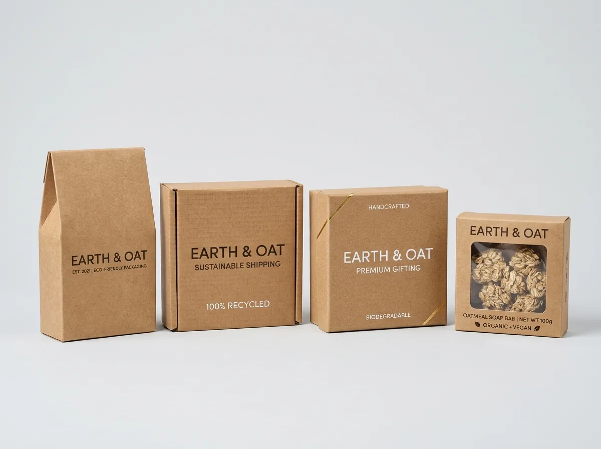
Natural unbleached kraft paperboard provides an attractive rustic background, but its porous, absorbent fibers present distinct prepress printing challenges. When manufacturing custom kraft boxes, graphic designers must account for ink absorption and color shifting across dark uncoated surfaces. Standard translucent four-color CMYK process inks absorb into the brown substrate, causing bright yellows, pinks, and pastels to appear dull, muddy, or brownish. To achieve crisp visual contrast, packaging printers utilize high-opacity titanium dioxide white screen inks deposited in heavy film weights, or apply an opaque white understrike beneath color artwork. Alternatively, designing with dense vector black ink, deep forest greens, navy blues, and warm earth tones produces striking minimalist aesthetics without specialized undercoats. When ordering custom printed brown kraft packaging, our prepress specialists calibrate ink density curves on complimentary digital 3D proofs before press setup.
Why do standard translucent CMYK process inks shift color on brown kraft?
Commercial offset lithography and flexographic printing rely on translucent vegetable oil or acrylic-based inks designed to reflect light off bright white paperboard surfaces. Light passes through the transparent ink film, hits the white clay coating, and reflects back to the human eye as vibrant cyan, magenta, and yellow wavelengths. When transparent inks are applied to dark unbleached kraft paperboard, the brown background absorbs the transmitted light rather than reflecting it. Consequently, a process yellow ink appears dull mustard brown, cyan shifts to dark olive drab, and vibrant magenta appears muddy burgundy. Understanding this optical subtractive color behavior is essential when preparing print-ready vector artwork for kraft packaging.
How does opaque white ink screen printing achieve 90% opacity?
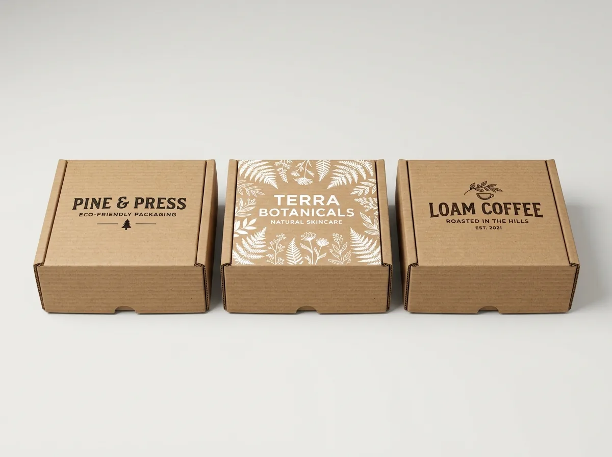
Opaque white ink utilizes concentrated titanium dioxide (TiO2) pigment particles suspended in a dense solvent or UV-curable binder matrix. Achieving complete opacity over dark brown kraft board requires depositing a heavy wet ink film thickness. While standard flexographic print stations deposit an ink film thickness of roughly 2 to 4 microns, rotary screen printing presses deposit between 12 and 25 microns of ink through fine mesh screens. This substantial ink laydown creates a thick, opaque white enamel layer with an opacity rating exceeding 90%. Crisp white typography, botanical line drawings, and brand logos pop with brilliant contrast against the earthy brown background.
What are the advantages of double-hit white ink in flexographic printing?
For high-volume production runs of corrugated kraft mailers and folding cartons where screen printing is cost-prohibitive, packaging converters utilize inline double-hit flexography. The press routes the paperboard sheet through two consecutive print units loaded with identical opaque white ink. The first flexo plate lays down a priming base layer that seals the porous unbleached kraft fibers; the second flexo plate prints in exact mirror registration over the first hit, doubling total pigment density. Double-hit flexography produces clean, uniform white graphics with minimal pinholing at high production speeds exceeding 300 feet per minute.
Know your size? Compare pricing across up to 3 quantities.
Request a Quote →Which Pantone spot colors deliver maximum visual contrast on kraft?
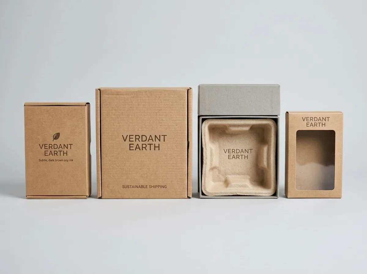
Designing with dark, saturated Pantone PMS spot colors is an exceptionally effective strategy for creating high-impact kraft packaging without the added expense of white ink undercoats. Dense monochromatic black (Pantone Black C), deep midnight navy (Pantone 282 C), rich forest green (Pantone 357 C), and burnt terracotta (Pantone 7586 C) contain high pigment concentrations that overpower the underlying brown tone. These deep shades produce sharp, readable line art and sophisticated minimalist typography. Prepress specialists adjust line weights to a minimum of 0.5 points to ensure delicate serifs do not fill in due to ink spreading on uncoated fibers.
How do you prepare vector dieline artwork for white ink separation layers?
In professional prepress production, opaque white ink must be separated onto an independent vector spot color layer in Adobe Illustrator or packaging CAD software. Designers create a dedicated spot color swatch named 'White_Ink' or 'White_Plate' set to 100% cyan or magenta for screen preview, with the attribute configured to 'Overprint Fill' or 'Overprint Stroke.' This vector layer dictates where the automated plate-making laser engraves the white ink printing plate. When white ink serves as an understrike base beneath CMYK graphics, the white vector shape is choked (spread inward) by 0.25 to 0.5 points relative to the overlying color art to prevent white fringes from showing if press registration drifts slightly.
How does hot metallic foil stamping interact with raw kraft fibers?
Hot metallic foil stamping offers a stunning decorative embellishment that elevates natural kraft packaging into the realm of accessible luxury. Because unbleached kraft board is slightly rough and fibrous, hot stamping dies apply high heat (between 110 and 130 degrees Celsius) and pneumatic pressure to compress the paper fibers flat while simultaneously bonding the metallic foil layer. Reflective gold, copper, rose gold, and bronze foils create a dynamic interplay between smooth, polished mirror reflections and the surrounding earthy matte paperboard texture.
What barcode knockout specifications prevent retail checkout scanning errors?
Retail barcode scanners utilize red laser light that cannot distinguish black bars printed directly over absorbent brown kraft paperboard. The natural brown color absorbs red light, flattening the optical contrast ratio below GS1 decode thresholds. To ensure 100% scannability at supermarket checkouts, prepress engineers design a solid white rectangular knockout box behind every UPC-A or EAN-13 barcode. The white box must extend at least 0.125 inches beyond the outer bars to form required left and right quiet zones. Printing black bars within this pure white background guarantees flawless scanning on every carton.
How do spectrophotometer Delta-E tolerances maintain spot color consistency?
Because natural brown kraft board exhibits subtle batch-to-batch variations in background color reflectance, maintaining precise brand color fidelity requires active press calibration. Packaging printers utilize G7 certified spectrophotometers to measure ink density and spectral reflectance under standard D50 graphic arts illumination. Rather than measuring ink films against ideal white paper reference targets, color technicians calibrate custom press target curves that account for the brown substrate absorption. Press operators hold color variations within a strict Delta-E tolerance of less than 1.8 across long production runs, ensuring that corporate logo spot colors match across different production batches.
What are common mistakes to avoid in kraft box design?
Designing for natural unbleached kraft substrates requires understanding ink absorption and structural fiber grain. Packaging specialists identify four frequent errors
- Printing translucent yellow or pastel CMYK process inks directly onto brown kraft, causing colors to appear muddy and unappealing.
- Printing barcodes directly onto raw brown board without an opaque white background box, leading to retail checkout scan failures.
- Failing to choke white ink understrike vector layers, resulting in visible white outlines around color graphics during minor press shifts.
- Designing delicate positive typography below 6 points on uncoated kraft board, causing fine letter counters to fill in from ink bleed.
Packaging for this


Ready to order kraft boxes? Compare up to 3 quantities with a free 3D mockup.
Request a Quote →Questions about kraft boxes
Can you print white ink on both brown kraft and black kraft board?
Yes. Our high-opacity screen and flexographic white inks produce brilliant contrast on both natural golden-brown kraft and deep dyed-black kraft paperboard substrates, ensuring crisp, professional presentation.
Does white ink printing cost more than standard CMYK?
Adding an opaque white ink screen or understrike adds a single extra ink station plate. On production runs of 1,000 units or more, the unit price difference is typically only a few cents per box.
What is the minimum font size for positive text on kraft board?
We recommend a minimum font size of 7 points for positive text and 8 points for reversed-out text on uncoated kraft board to prevent ink bleed from closing delicate letter openings.
Can I combine white ink with metallic foil stamping?
Yes. Pairing crisp opaque white line art with warm metallic copper or gold foil stamping on brown kraft creates a sophisticated, multi-textural artisan aesthetic that commands retail attention.
How do I set up white ink in my vector artwork file?
Create a dedicated spot color swatch named 'White_Ink', place all white elements on an independent layer above your background dieline, and set attributes to 'Overprint Fill'.
Does CubitPack review white ink vector separations before printing?
Yes. Our prepress specialists inspect all vector artwork files, verifying white ink choke allowances, spot color separations, and barcode quiet zones on your free digital proof.
Still have a question? Ask a packaging specialist.
Request a Quote →Request your kraft boxes quote
Tell us your size and quantities, and one dedicated account manager prepares pricing for each tier.
- Free design & AI-to-print studio + 3D mockup
- No die or plate charges · 4–5 day rush available
- Free shipping to all 50 states
- 10% off your first order
Researched against Paperboard Packaging Council (PPC) folding carton guidelines, TAPPI unbleached pulp standards, and Idealliance G7 Master Color specifications. Verified by CubitPack packaging specialists.
Sources
What changed
- November 11, 2026: Published technical engineering guide for white-ink-and-dark-cmyk-printing-on-uncoated-kraft-board with 5 CAD SVGs and prepress standards.
More guides
New packaging guides by email
Sizes, materials and design tips. Unsubscribe anytime.