
What Are the Best Vector Logo File Formats and Resolution for Custom Box Printing?
Short answer: Vector artwork in Adobe Illustrator (.AI), Encapsulated PostScript (.EPS), or vector PDF format is required for crisp box printing. Unlike pixel-based bitmaps, vector paths scale infinitely without blurriness. Raster images require at least 300 DPI resolution at final print dimensions to prevent jagged edges.
On this page
- Why are vector file formats essential for printing custom boxes with logo
- How do AI, EPS, PDF, and SVG vector formats compare for packaging
- What resolution is required for photographic halftones on custom boxes
- How do line weight and knock-out typography affect logo legibility
- What are the essential color mode rules for logo box printing
- How do our prepress specialists verify your logo files before manufacturing
- How do spot colors and PMS books eliminate color drift on custom boxes
- Common mistakes
- FAQs
Request a custom quoteFree dieline & 3D mockup
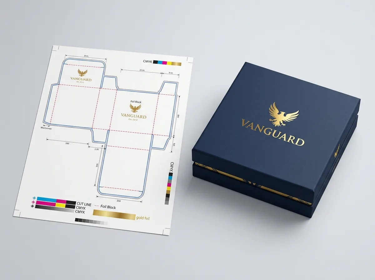
Commercial printing presses reproduce brand logos using physical printing plates or industrial digital printheads that require exact mathematical vector geometry. When ordering custom boxes with logo, submitting raster formats like 72 DPI web PNGs or JPEGs causes pixelation, soft typography contours, and color fringing on press. True vector files define artwork through anchor points and Bézier curves, allowing your logo to scale cleanly from a 1.5-inch drop lip imprint to a 14-inch master shipping panel with zero loss in fidelity. If your packaging design contains photographic elements or complex gradient shading, supply high-resolution raster files at 300 DPI or higher in CMYK color mode. Our prepress packaging team inspects every artwork file, converts fonts to vector curves, and verifies ink separations on a complimentary 2D CAD dieline and interactive 3D digital proof before physical production begins.
Why are vector file formats essential for printing custom boxes with logo?
Commercial packaging printing utilizes physical offset plates, flexographic photopolymer sleeves, or industrial digital inkjet nozzles that deposit microscopic ink droplets onto paperboard. Vector files (.AI.EPS.PDF.SVG) store artwork as mathematical coordinates rather than static pixel grids. When you print custom logo packaging, vector outlines guarantee that letters, geometric crests, and hairline borders reproduce with razor-sharp edge definition across every carton panel. In contrast, enlarging a raster PNG forces prepress RIP software to interpolate and invent adjacent pixels, creating stepped, fuzzy boundaries that appear amateurish under retail store lighting. In addition, vector files allow prepress technicians to isolate brand colors into dedicated spot-color plates for PMS Pantone matching. This prevents color drifting across varying production batches and ensures that your brand identity remains consistent whether printed on solid bleached sulfate card or rustic corrugated board.
How do AI, EPS, PDF, and SVG vector formats compare for packaging?
Understanding the technical differences between common vector file formats prevents costly production delays during prepress onboarding. Adobe Illustrator (.AI) remains the global standard for custom packaging engineering, preserving native artboard layers, spot color channels, cut dielines, and transparency masks in an editable format. Encapsulated PostScript (.EPS) is a legacy vector standard compatible with older lithographic press RIPs, although it lacks support for modern gradient meshes and semi-transparent alpha overlays. Print-ready Portable Document Format (.PDF) complying with PDF/X-1a or PDF/X-4 standards embeds all vector paths, color profiles, and trim boxes securely into a compact, universally readable file. Scalable Vector Graphics (.SVG) is exceptional for digital interfaces and web mockups but lacks support for CMYK process separations and dedicated Pantone ink swatches. For commercial box manufacturing, always supply native layered.AI files or high-resolution PDF/X exports.
What resolution is required for photographic halftones on custom boxes?
When brand packaging incorporates photographic imagery, watercolor illustrations, or intricate drop shadows, raster artwork becomes necessary. For high-definition offset lithography and commercial digital printing, all raster assets must be prepared at a minimum resolution of 300 DPI (dots per inch) calculated at 100% of final printed scale. A common graphic mistake involves placing a 300 DPI image on a packaging artboard and scaling it up by 200%, which effectively reduces its resolution to 150 DPI and introduces visible halftone screening artifacts. For direct flexographic printing on corrugated fluting, raster resolutions between 200 DPI and 300 DPI are acceptable due to the coarser line screen of photopolymer plates. Additionally, all photographic assets should be converted from RGB to the G7 calibrated CMYK color space to avoid unexpected loss of color saturation during press runs.
Know your size? Compare pricing across up to 3 quantities.
Request a Quote →How do line weight and knock-out typography affect logo legibility?
Fine graphic details that look crisp on a backlit computer monitor can easily plug or break up when physical ink transfers onto absorbent paper fibers. For positive printed logos where colored ink sits on a white or kraft background, maintain a minimum vector stroke width of 0.5 pt (0.175 mm). For negative knock-out logos where white text reverses out of a heavy dark flood coat, increase line weight to at least 0.75 pt (0.26 mm) and keep typographic font sizes at 8 pt or larger. Press dot gain naturally causes dark surrounding inks to expand slightly into unprinted white cavities, which can fill in delicate serifs, script loops, and enclosed counters. Incorporating slight choke trapping during prepress file preparation compensates for mechanical press expansion and ensures that intricate brand crests maintain their crisp geometric contours.
What are the essential color mode rules for logo box printing?
Designing packaging in RGB color mode is the most frequent cause of customer disappointment during first-article print reviews. Digital computer screens generate color through transmitted light (Red, Green, Blue), whereas commercial printing presses create color through reflective pigments (Cyan, Magenta, Yellow, Key Black) or pre-mixed spot inks. Vibrant neon greens, electric blues, and deep saturated purples visible on screen often fall outside the printable CMYK gamut. When designing custom boxes with logo, configure your document color profile to GRACoL 2013 or SWOP 2006. If your logo relies on an exact brand hue, specify a standardized Pantone Matching System (PMS) spot color swatch. Our production presses match Pantone spot inks directly to physical swatch books under D50 standard daylight lighting, guaranteeing color accuracy.
How do our prepress specialists verify your logo files before manufacturing?
Every custom packaging order placed with our team undergoes comprehensive automated and manual prepress flightchecking. Our packaging specialists inspect your dieline to ensure that vector artwork is mapped correctly across primary display panels and interior unboxing zones. We verify that a 3.175 mm (0.125 in) bleed margin extends past all perimeter trim lines, preventing unprinted white paperboard slivers from appearing after die-cutting. We check that all live logos and text elements maintain a minimum 4 mm safe margin clearance from all structural crease scorelines to prevent ink cracking during box erection. Finally, we generate a 2D vector CAD dieline layout and an interactive 3D digital proof that lets you spin, open, and inspect your custom logo box from every angle before you approve payment and authorize production.
How do spot colors and PMS books eliminate color drift on custom boxes?
When global brands order custom printed boxes with logo, relying solely on 4-color CMYK process can introduce minor color variation across separate press runs or varying substrates. CMYK process builds color by overlaying tiny cyan, magenta, yellow, and black halftone dot rosettes at precise angles. A microscopic shift in ink fountain key pressure or ambient pressroom humidity can alter the optical balance of delicate secondary tones like warm corporate grays, pale pastels, or brand-specific teals. To ensure total brand uniformity across retail folding cartons, corrugated shipping mailers, and rigid gift boxes, our production lines utilize the Pantone Matching System (PMS). Spot inks are chemically pre-mixed according to exact pigment formulas before reaching the ink fountain. Applying a dedicated solid spot ink guarantees exact color repeatability with Delta E values maintained under 1.5, matching physical Pantone swatch guides under standard D50 pressroom viewing conditions.
What are common logo artwork errors to avoid?
Avoid these critical graphic prepress mistakes when preparing your vector artwork for box production
- Placing low-resolution 72 DPI web screenshots inside an Illustrator artboard and saving as PDF, which embeds a blurry bitmap rather than true vector paths.
- Leaving live typographic fonts active instead of converting text into vector outlines, causing automated press RIPs to substitute incorrect default fonts.
- Failing to convert RGB color palettes to CMYK or Pantone spot colors, leading to unexpected desaturation and muddy tones on physical paperboard.
- Omitting 3.175 mm bleed allowances on background flood coats, leaving unsightly white slivers along trimmed carton edges after mechanical die-cutting.
- Positioning fine logo typography directly over structural fold scorelines, which causes ink cracking and distorted letterforms during carton folding.
Packaging for this
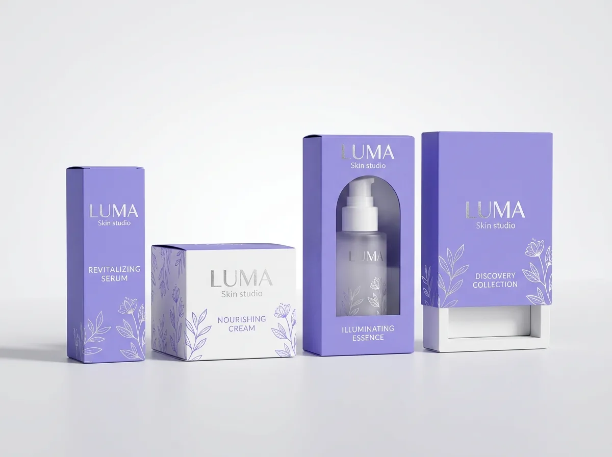
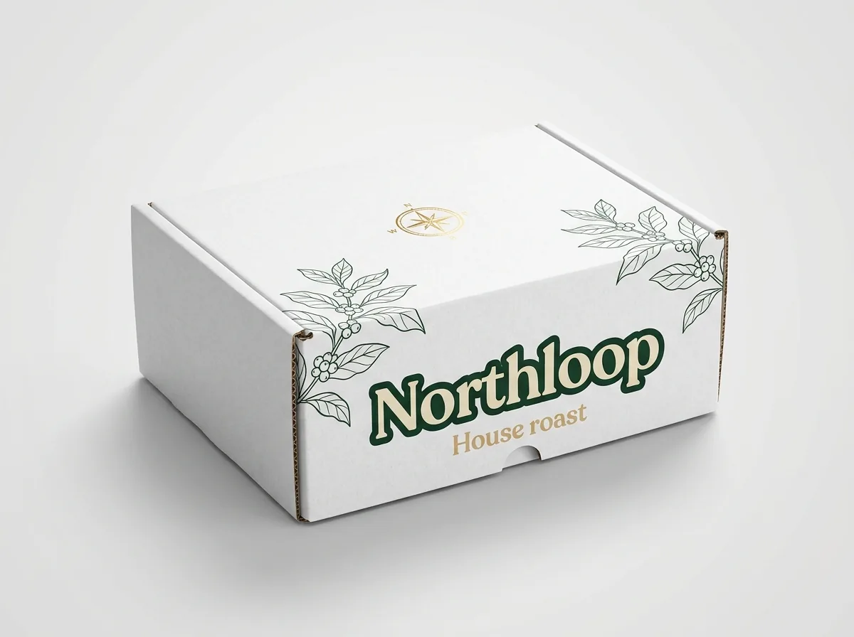
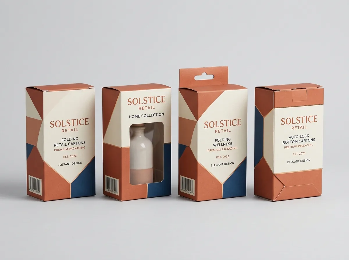
Ready to order boxes with logo? Compare up to 3 quantities with a free 3D mockup.
Request a Quote →Questions about boxes with logo
Can I submit a PNG logo if I do not have a vector file?
Yes. If you only possess a high-resolution PNG file (minimum 300 DPI at print scale with a transparent background), our prepress design team will inspect it for free. In many instances, we can convert simple high-contrast marks into clean vector dieline paths at zero extra charge.
What is the difference between vector artwork and high-res raster?
Vector artwork consists of mathematical anchor points that never lose clarity regardless of magnification. Raster artwork consists of a fixed grid of colored pixels that lose sharpness and blur when scaled beyond their original capture dimensions.
Why do digital fonts need to be converted to outlines?
Converting fonts to outlines turns editable typographic characters into permanent vector shapes. This ensures your custom brand typography prints identically even if the manufacturing prepress workstation does not have your proprietary font file installed.
What color mode should my vector packaging logo use?
Packaging dielines should always be built in CMYK color mode or configured with dedicated Pantone Matching System (PMS) spot colors. Designing in RGB mode causes color shifts because physical printing inks cannot match the high luminance of backlit computer screens.
What is the minimum line thickness for printed vector logos?
Positive printed vector lines should be at least 0.5 pt thick to prevent ink starvation. Reversed-out white lines knocking out of dark background inks should be at least 0.75 pt thick to prevent ink dot gain from plugging the letter openings.
How does bleed allowance prevent unprinted edges on custom boxes?
Bleed allowance extends your background artwork 3.175 mm (0.125 in) past the perimeter cut line. During high-speed mechanical die-cutting, minor sheet movements occur; bleed ensures that the die blade always cuts through solid ink rather than bare white board.
Still have a question? Ask a packaging specialist.
Request a Quote →Request your boxes with logo quote
Tell us your size and quantities, and one dedicated account manager prepares pricing for each tier.
- Free design & AI-to-print studio + 3D mockup
- No die or plate charges · 4–5 day rush available
- Free shipping to all 50 states
- 10% off your first order
Researched across Idealliance G7 Master Color specifications, Paperboard Packaging Council prepress standards, and commercial litho-lamination finishing guidelines. Production facts verified with manufacturing specialists.
What changed
- November 11, 2026: Published technical engineering guide covering logo reproduction, prepress vector dielines, and tactile packaging finishes.
More guides
New packaging guides by email
Sizes, materials and design tips. Unsubscribe anytime.