
Where Should You Place Your Logo on Custom Boxes for Maximum Impact?
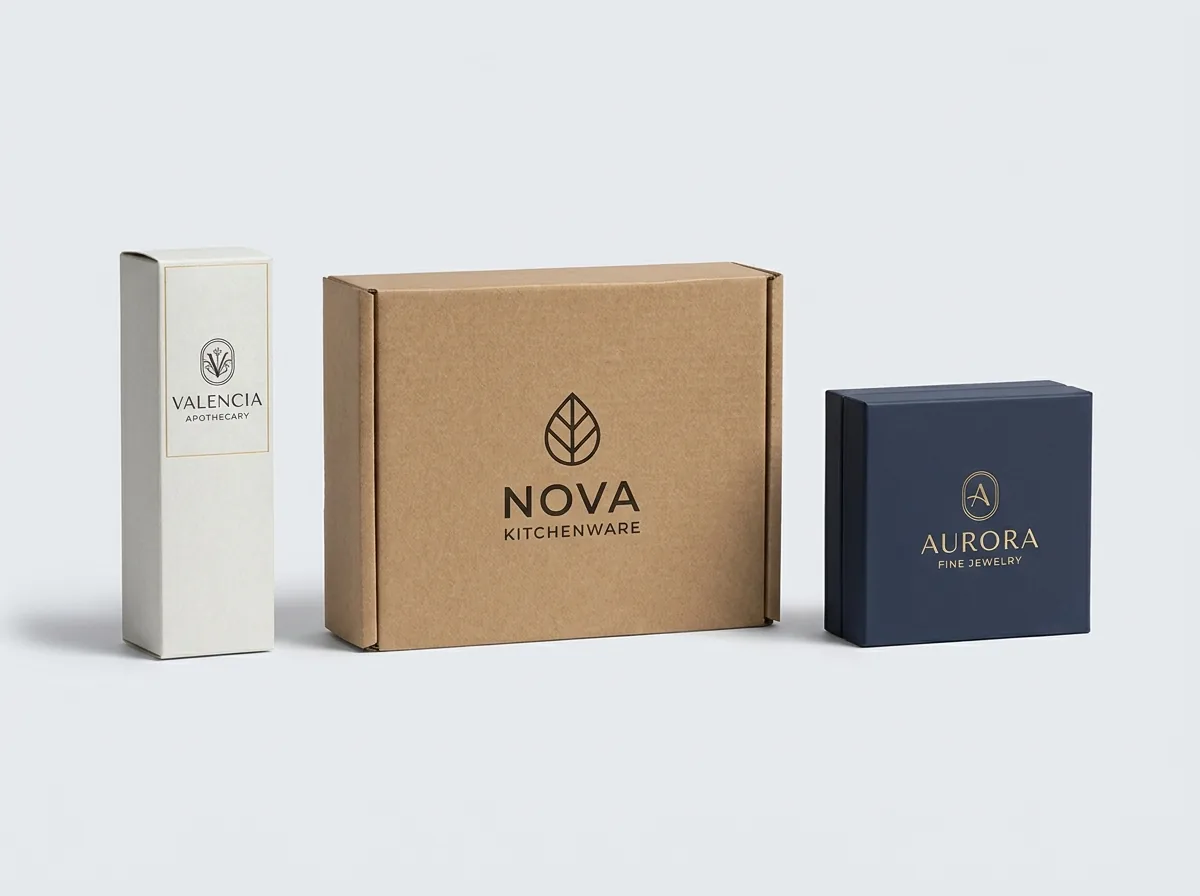
Short answer: Place your primary logo on the optical center or upper third of the exterior top lid with at least 12 mm clearance from all edges. On retail cartons, keep logos in the top half so shelf lips do not hide the brand. Add an interior lid logo for unboxing photos.
On this page
- How do you calculate optical center for box logo placement
- What are safe margins, trim lines, and bleed allowances
- Why is interior lid logo printing so valuable for unboxing
- Where should secondary logos, barcodes, and regulatory text go
- How do panel folds and closures affect logo visibility on retail shelves
- How does CubitPack verify panel orientation on complex dielines
- How do shipping label and carrier zone clearances protect your logo
- What are the rules for multi-panel wrap-around logo graphics
- Common mistakes
- FAQs
Request a custom quoteFree dieline & 3D mockup
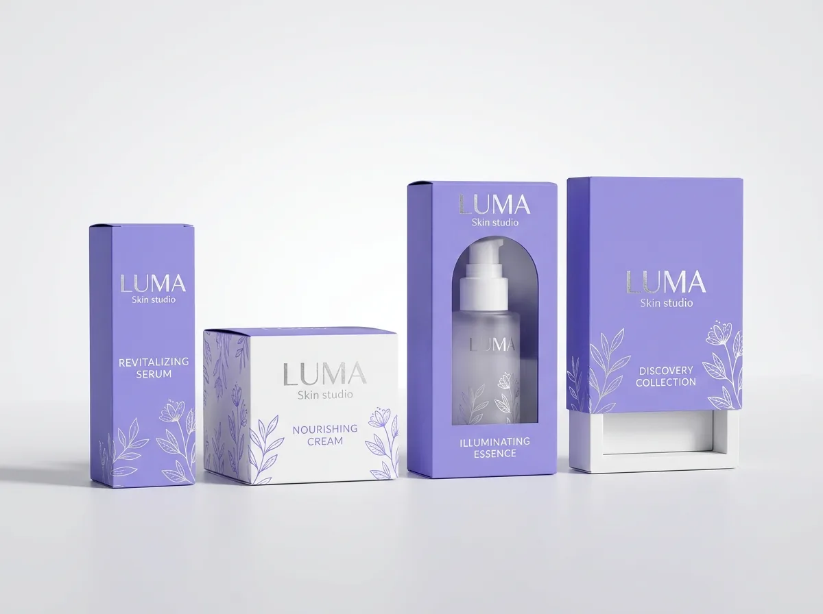
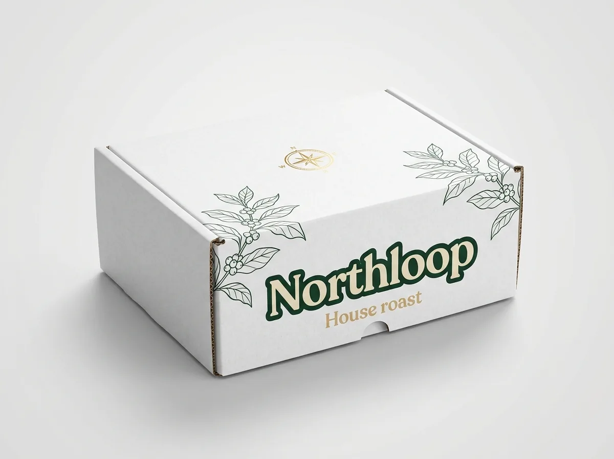
Strategic logo placement determines whether physical packaging commands attention on retail shelves, doorstep deliveries, and social media unboxings. When designing custom boxes with logo, the primary display face is the exterior top lid or front carton panel. Positioning your primary logo lockup slightly above the mathematical center at the optical center creates a natural, balanced focal point. To ensure production integrity during high-speed die-cutting, all critical brand elements must maintain at least 3.175 mm (0.125 in) clearance from cut lines and 4 mm from structural fold creases. Secondary placements, such as the front drop lip or interior lid reveal, provide memorable brand touchpoints when the package is opened. When you order branded packaging boxes, our digital prepress team validates all panel hierarchies and margins on an interactive 3D digital proof before production. Every structural dieline undergoes complete technical review before production.
How do you calculate optical center for box logo placement?
Human visual perception naturally perceives the true geometric center of a rectangular box panel as slightly low and heavy. To counteract this optical illusion, packaging designers position the primary brand logo lockup approximately one-third of the way down from the top edge, or 5% to 8% above the mathematical midpoint. On custom boxes with logo, this optical center positioning creates an open, elegant aesthetic with comfortable negative space framing the wordmark. On retail folding cartons sitting on grocery or cosmetic store shelves, keeping the brand mark within the upper 40% of the front panel prevents price tags and acrylic shelf retaining lips from blocking your name. Maintaining balanced margins on the left and right creates symmetrical stability that draws the consumer's gaze directly to your brand mark.
What are safe margins, trim lines, and bleed allowances?
Packaging dielines feature three critical boundary lines that govern graphic placement. The green cut line represents the exact mechanical blade dimension where the box blank is stamped out. The red bleed line extends 3.175 mm (0.125 in) outward beyond the cut line, ensuring that background flood coats and patterns run all the way to the edge without white paper slivers appearing during slight die movement. The blue safe zone line sits 3.175 mm inward from the cut line. All live logo typography, certification icons, and barcodes must remain strictly inside the safe zone to avoid accidental trimming during mechanical die-cutting and folding.
Why is interior lid logo printing so valuable for unboxing?
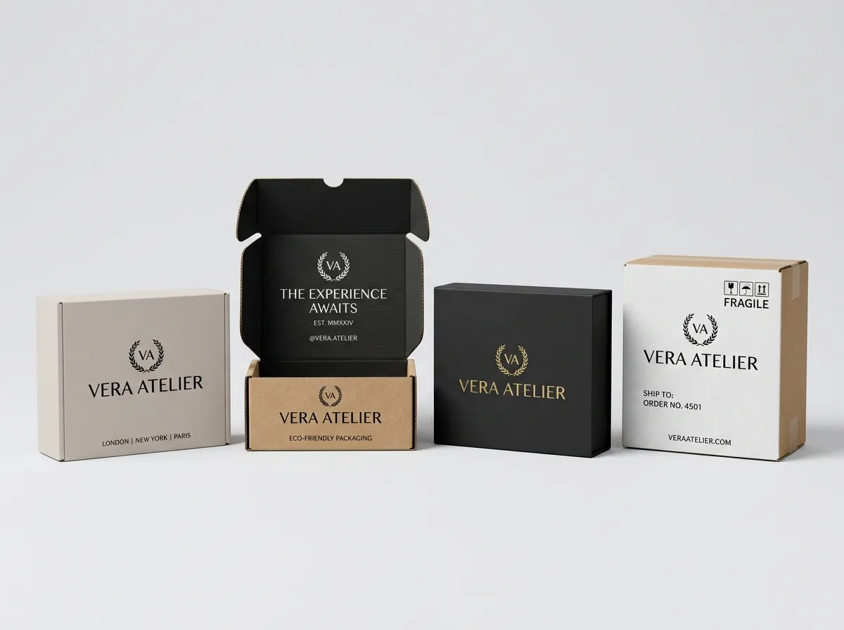
E-commerce and direct-to-consumer subscription brands heavily leverage two-sided printing to craft memorable unboxing experiences. When a recipient lifts the front cherry-locks of a roll-end corrugated mailer, the interior top lid swings upright directly into their field of view. Positioning an inverted white logo or high-contrast brand tagline across the inside lid creates an immediate photographic reveal that encourages social media sharing. Pairing an exterior kraft mailer with an interior cobalt blue or rich forest green flood coat makes the interior white logo pop with dramatic contrast. This dedicated unboxing panel can also incorporate instructional copy, hashtag prompts, or personalized founder messages.
Know your size? Compare pricing across up to 3 quantities.
Request a Quote →Where should secondary logos, barcodes, and regulatory text go?
A well-organized packaging layout establishes a clear visual hierarchy across all panels. While the top lid and front face carry primary brand identity, the side panels and rear face manage supporting communication. The back panel is the universal standard for ingredient listings, nutritional panels, manufacturer contact information, and GS1 barcodes. Always allocate a 25 mm by 35 mm solid white quiet zone rectangle for barcodes to ensure omnidirectional laser scanners read UPC codes effortlessly at retail checkout counters. Side gussets and end flaps work well for secondary logo monograms, social media handles, and recyclable certification badges.
How do panel folds and closures affect logo visibility on retail shelves?
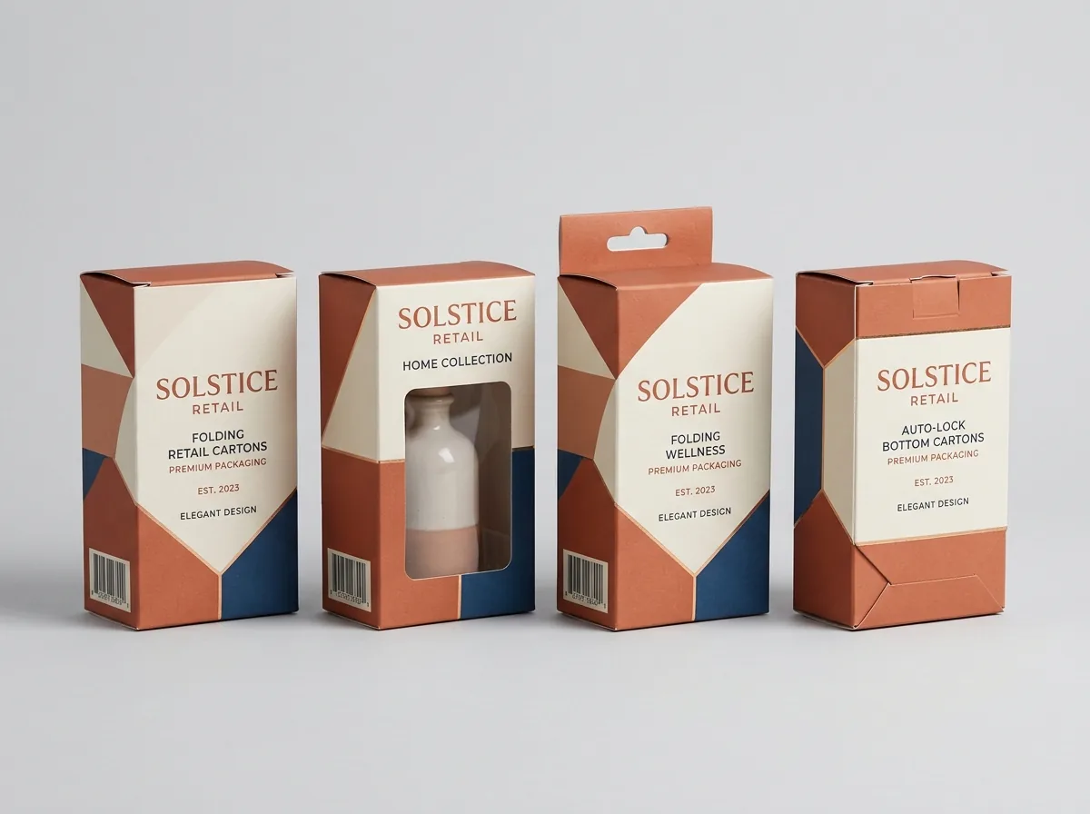
Different box styles present unique structural faces to retail shoppers. On straight tuck end and reverse tuck end paperboard cartons, the top closure flap folds backward or forward, creating a smooth front billboard. On auto-lock bottom cartons, the bottom interlocks mechanically, leaving the lower front edge completely flat and unencumbered. When designing retail packaging, place primary brand logos on both the front face and the top closure flap. This ensures brand recognition whether cartons stand vertically on display shelves or lay horizontally in checkout impulse bins. Avoid placing essential graphics across thumb notches or tuck-tab insertion slots where paper edges break the continuous visual flow.
How does CubitPack verify panel orientation on complex dielines?
Complex packaging dielines with roll-over double side walls or inverted interior panels can confuse graphic designers accustomed to flat web graphics. On a flat 2D dieline, the interior lid panel must be positioned 180 degrees upside down relative to the exterior top lid so that both panels display right-side up once folded. Our packaging specialists validates graphic panel orientations automatically during prepress flightchecking. We build an interactive 3D digital proof that folds the carton digitally in real time. You can zoom, rotate, and inspect every fold line, confirming that every logo, tagline, and barcode appears in the correct orientation before we authorize physical press runs.
How do shipping label and carrier zone clearances protect your logo?
When designing e-commerce mailers or master shipping boxes, failure to allocate clear space for shipping labels and carrier barcodes can ruin an otherwise beautiful packaging presentation. Standard direct thermal 4 × 6 inch shipping labels generated by carriers like USPS, UPS, and FedEx are affixed to the top exterior panel of the box during warehouse fulfillment. If your primary brand logo occupies the exact geometric center of a compact 8 × 6 × 3 inch mailer, warehouse packing personnel will inevitably paste the large white shipping label directly across your logo. To prevent this brand dilution, packaging designers utilize asymmetric panel mapping. By positioning your primary brand wordmark in the upper-left quadrant or along the front drop flap, you reserve a dedicated 4.5 × 6.5 inch clear zone in the center or lower-right for transit postage. On larger cartons, printing a subtle dotted boundary line labeled 'Carrier Label Here' ensures consistent label application across third-party fulfillment centers without obscuring your custom logo.
What are the rules for multi-panel wrap-around logo graphics?
Ambitious brand packaging often features continuous graphic patterns or extended typography that wraps continuously across two or three adjacent carton panels. Executing wrap-around graphics requires precise structural dieline compensation to account for paperboard fold thickness and scoreline displacement. When paperboard folds at a 90-degree angle, the outer fiber layer stretches while the inner fiber layer compresses. On 18 pt to 24 pt folding cartons, this fold radius introduces a 0.5 mm to 1.0 mm displacement between adjacent panels. On thicker E-flute and B-flute corrugated board, the fold allowance can exceed 2.0 mm to 3.5 mm. If a horizontal logo stroke or brand pattern crosses directly over a crease without mechanical fold compensation, the artwork will appear misaligned or broken once the box is folded into three-dimensional form. Our prepress team adjusts vector path coordinates across crease lines to guarantee that wrap-around branding aligns with millimeter precision.
What logo placement mistakes ruin packaging aesthetics?
Avoid these common packaging design errors when positioning brand graphics across dieline panels
- Placing logos directly over 90-degree fold creases, causing paperboard fibers to stretch, crack ink, and distort letterforms.
- Crowding the perimeter cut lines without adequate safe zone margins, leading to cropped text during high-speed die-cutting.
- Printing orientation mismatches where the interior lid graphic appears upside-down when opened by the recipient.
- Failing to account for retail shelf lip clearance, leaving the brand name obscured behind store display dividers.
- Omitting solid white quiet zones around barcodes, resulting in scanning failures at retail checkout registers.
Packaging for this
Ready to order boxes with logo? Compare up to 3 quantities with a free 3D mockup.
Request a Quote →Questions about boxes with logo
How far should my logo be from the edge of the box?
Maintain at least 12 mm to 15 mm of margin from all outer cut edges and score lines on exterior panels. This creates clean negative space and ensures that high-speed die-cutting tolerances never compromise your typography.
Should my logo be centered or off-center on a mailer box?
Centered logo placement is the industry standard for symmetrical elegance on top mailer lids. However, modern asymmetrical layouts placing the logo in the lower right or top left can work effectively when balanced by contrasting color blocks.
Can I print my logo across both the exterior and interior of the box?
Yes. We offer two-sided printing across all corrugated mailers and paperboard folding cartons. You can print an exterior brand logo and an interior unboxing greeting message or pattern in a single production pass.
Where should the UPC barcode be positioned relative to the logo?
The barcode should always be positioned on the back or bottom panel away from the primary brand logo. Keep the barcode flat and unbent with a solid white quiet zone background to ensure optical scanner reliability.
How do I ensure interior lid printing does not appear upside down?
On roll-end tuck-front mailers, the interior lid panel must be oriented 180 degrees opposite to the exterior lid panel on the flat 2D dieline. Our prepress team reviews orientation on your 3D digital proof before production.
What is the best logo placement on small retail cartons?
On small retail cartons under 4 inches in height, place the logo in the top 35% of the front panel. This preserves the bottom panel area for product volume, flavor names, and net weight declarations while preventing retail shelf lip obstruction.
Still have a question? Ask a packaging specialist.
Request a Quote →Request your boxes with logo quote
Tell us your size and quantities, and one dedicated account manager prepares pricing for each tier.
- Free design & AI-to-print studio + 3D mockup
- No die or plate charges · 4–5 day rush available
- Free shipping to all 50 states
- 10% off your first order
Researched across Idealliance G7 Master Color specifications, Paperboard Packaging Council prepress standards, and commercial litho-lamination finishing guidelines. Production facts verified with manufacturing specialists.
What changed
- November 11, 2026: Published technical engineering guide covering logo reproduction, prepress vector dielines, and tactile packaging finishes.
More guides
New packaging guides by email
Sizes, materials and design tips. Unsubscribe anytime.