
How do I design a jar label that sells on the shelf and online?
Short answer: Keep your brand name, product title and hero flavor inside the center 33% of the jar's circumference so shoppers read everything in one glance without turning the glass. For custom jar labels, match your label stock to the contents inside and move barcodes and ingredients to the side panels.
On this page
- How should I organize the front, side and lid panels on a jar
- Should I choose clear, metallic foil or opaque stock for my jar
- What font sizes and barcode orientations work on curved glass jars
- How do I design one jar label system that scales across 5 or 10 flavors
- How do I set up bleed, safe margins and custom shapes for a jar label
- Common mistakes
- FAQs
Request a custom quoteFree dieline & 3D mockup
A jar label has to work on a curved 3D cylinder rather than a flat poster board. When a customer walks past a retail grocery shelf or scrolls through product thumbnails on a phone, they only see the front 120 degrees of a round jar cleanly before the left and right edges curve away into shadow. Putting a wide logo across half the circumference forces the shopper to pick up and twist the jar just to read your brand name. A strong jar layout locks the brand mark, product name, flavor callout and net weight inside that front one-third viewing zone, uses the contents inside the glass as part of the color palette, and places the ingredient list, nutrition panel and barcode on the back panels. At CubitPack, minimum orders start at 500 labels, design help is free, and you see a 3D mockup on your jar before you pay.
How should I organize the front, side and lid panels on a jar?
Every successful retail jar divides its messaging into three distinct visual zones: the front principal display panel (PDP) that stops a shopper from 4 feet away, the side or back information panels that answer ingredient and usage questions once they pick the jar up, and the top lid circle that identifies the flavor when jars sit in a crate or kitchen drawer. The table below breaks down what belongs in each zone and the typography targets our prepress team recommends when setting up printed jar labels. Keeping each piece of text in its own zone leaves breathing room around your logo instead of crowding the front of the glass.
| Jar label zone | What to include | Design & sizing rule |
|---|---|---|
| Front center (120° arc) | Brand logo, product name, flavor, net weight | Keep inside 33% of circumference; 3 lines of text max |
| Right side / back panel | Ingredient list, nutrition facts, maker address | 6 pt minimum font size (7–8 pt preferred) with high contrast |
| Left side panel | 2-sentence origin story, pairing note or batch box | Leave 0.25 in quiet margin before the back seam |
| Barcode zone | UPC-A or EAN-13 retail barcode (black bars on white) | 1.25 × 0.75 in minimum; orient bars vertically on small jars |
| Top lid circle | Flavor color badge, floral source or tamper seal | Measure flat inner lid ring minus 0.125 in clearance |
| Bottom base sticker | Candle burn warning or batch/lot date code | 1.5 in to 2.5 in circle recessed inside the glass base |
Should I choose clear, metallic foil or opaque stock for my jar?
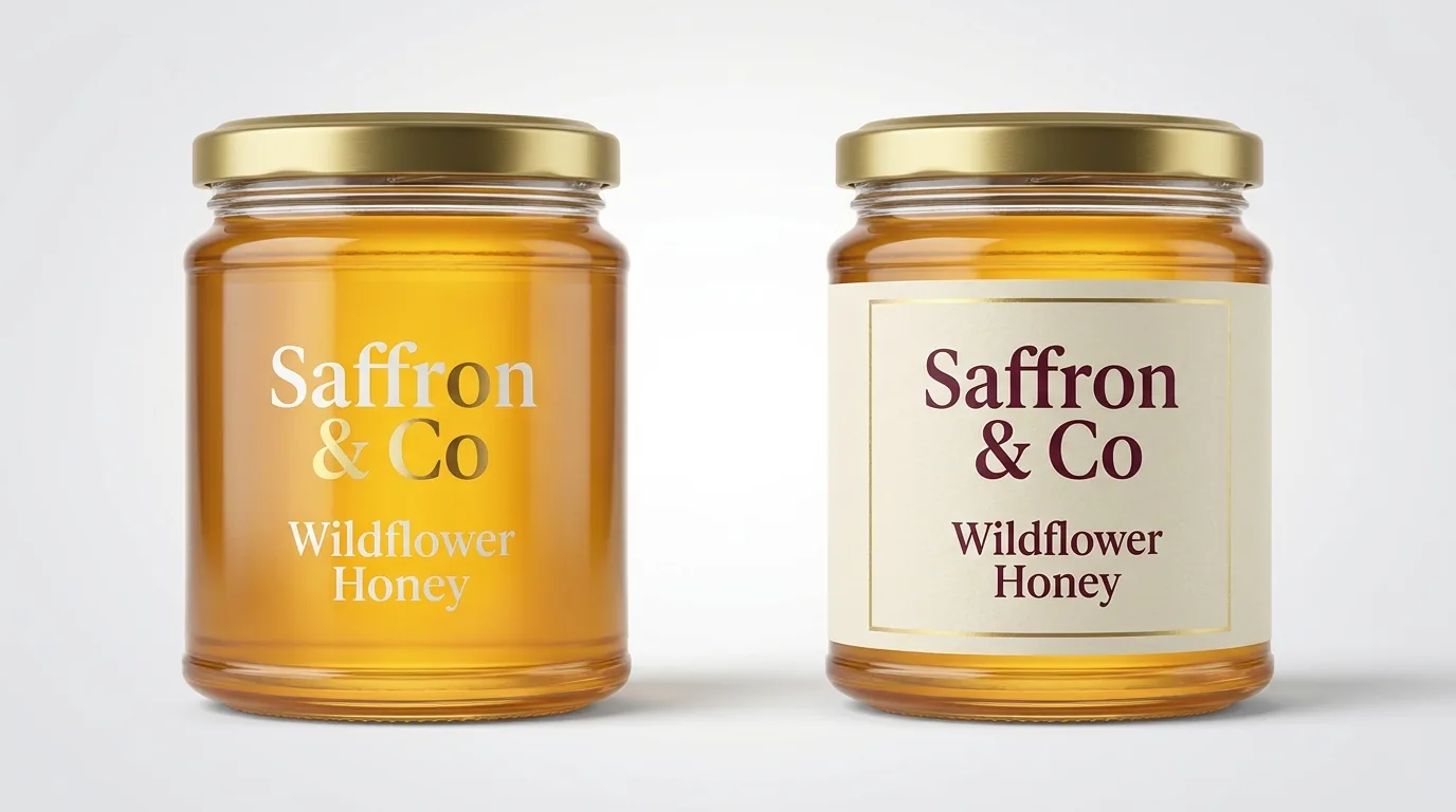
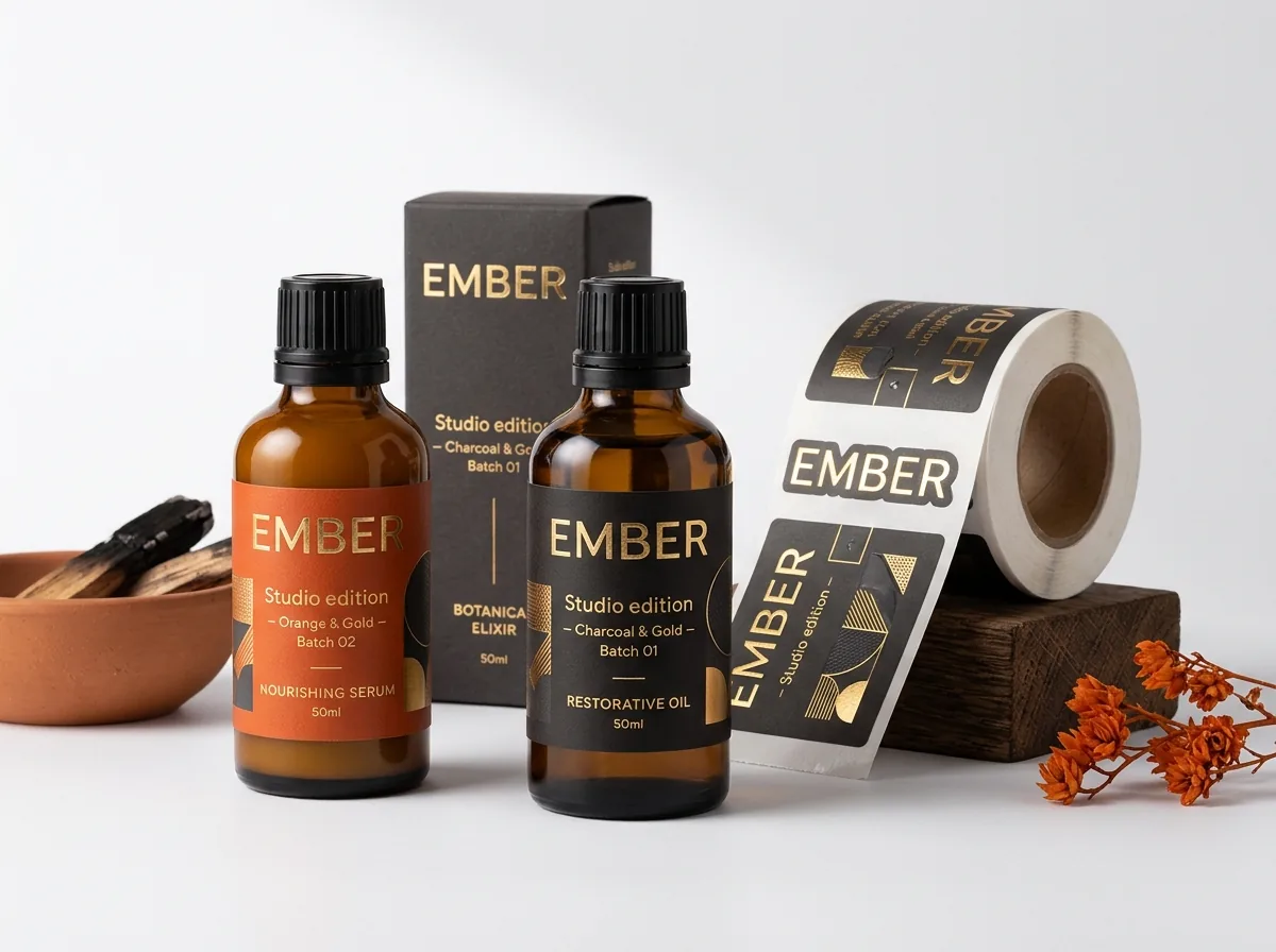
Because most jars are clear amber, flint or frosted glass, the food, wax or cream inside the jar acts as the background layer behind your label. When you choose custom clear labels for golden wildflower honey, bright red strawberry preserves or layered bath salts, the transparent film disappears on the glass and lets the natural color of the product sell itself. However, clear film requires high-contrast ink: dark charcoal text vanishes against dark blackberry jam or espresso body scrub, while white or metallic gold ink pops immediately. When the product inside is pale white coconut wax, beige peanut butter or opaque cosmetic cream, a rich colored label printed on opaque stock or custom foil labels adds the visual weight the container needs. You can also combine matte finish with foil stamping or raised spot UV on just the brand crest so light catches the jar when a customer walks down the aisle.
- Clear film + white ink: ideal for amber honey, vibrant red hot sauce, pickled vegetables and colored gel cosmetics.
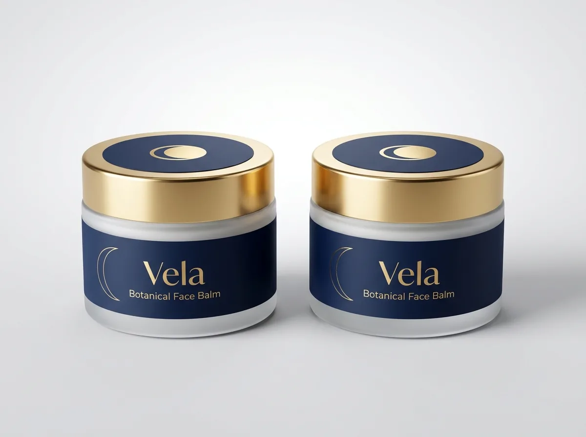
- Matte dark stock + gold foil stamping: gives 9 oz soy candles, face creams and truffle spreads a warm luxury look.
- Warm kraft-look designs + 1 dark Pantone ink: suits farmers market jams, raw local honey and small-batch spice rubs.
- Bright white stock + gloss or matte finish: best for detailed botanical illustrations, nutrition panels and pastel palettes.
- Moisture & oil exposure: tell us if your jar lives in a refrigerator, shower or kitchen counter so we match the stock ().
What font sizes and barcode orientations work on curved glass jars?
Curved glass distorts horizontal lines of text much faster than a flat folding carton does. A wide, ultra-thin script font or light gray 5-point ingredient list that looks legible on a 27-inch computer monitor becomes unreadable once wrapped around a 2 inch diameter spice bottle or a 2.5 inch 8 oz mason jar. For ingredient lists, allergen statements and directions on the back panel, use a clean sans-serif typeface at 6.5 to 8 points with dark ink on a light background, and add at least 1.5 points of line spacing so letters never touch on the curve. Retail UPC barcodes also need special attention on small diameter jars. When a standard horizontal barcode wraps around a tight 1.75 inch or 2 inch jar cylinder, the outer left and right bars curve away from the checkout scanner beam, causing scan failures at grocery registers. Rotating the barcode 90 degrees into a ladder orientation (where the black bars run horizontally stacked up the vertical wall) keeps every bar at the exact same focal distance from the laser. Always print barcodes in 100% black ink on a solid white rectangle with at least 0.125 inches of quiet white margin on the left and right ends.
Know your size? Compare pricing across up to 3 quantities.
Request a Quote →How do I design one jar label system that scales across 5 or 10 flavors?
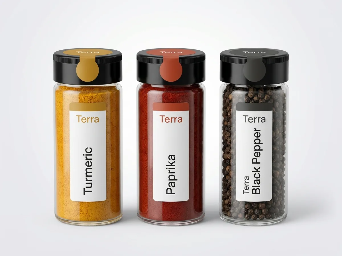
Small-batch food, honey, spice and candle makers rarely sell just one SKU. Ordering ten completely different full-wrap designs means managing ten separate inventory counts and ten artwork setups. A modular label architecture solves both problems while making your brand look much more cohesive when three or four flavors sit side by side on a retail shelf. Start with a locked master grid where your brand wordmark, origin badge, net weight and back panel layout stay in the exact same position on every jar. To distinguish flavors across custom honey labels, custom spice labels or custom candle labels, change only one high-visibility band: either swap a single Pantone accent stripe and the flavor title on the front wrap, or print one universal body wrap and pair it with color-coded custom circle labels on the lid for each flavor. Because every flavor shares the exact same die-cut dimensions, you can group multiple designs into one combined CubitPack order.
How do I set up bleed, safe margins and custom shapes for a jar label?
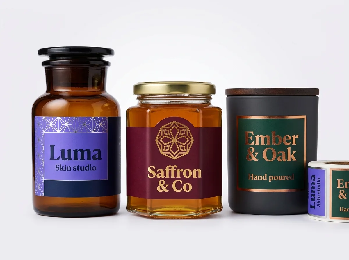
You do not have to stick to a plain sharp-cornered rectangle. Adding a 0.125 inch corner radius prevents rectangular wrap corners from catching on sweater sleeves or shipping dividers, and arched crest tops, scalloped custom oval labels or custom botanical outlines cost no extra because CubitPack never charges die or plate fees. When preparing your file (or sending a sketch for our free design team to build), extend background colors and patterns 0.125 inches (⅛ inch) past the cut line on all sides for bleed, and keep all text, borders and barcodes at least 0.125 inches inside the cut line. Before your 500-label order goes into 10–14 business day production, we send you a flat 2D digital proof plus a 3D mockup rendered right onto a jar so you can check the 120-degree front viewing arc and confirm how the artwork meets at the back gap.
What are the most common jar label design mistakes?
Most design issues happen when a layout is judged only as a flat rectangle on screen without testing how it wraps around a filled glass cylinder. Avoid these five mistakes
- Stretching the brand logo and product title across 50% of the wrap width, which hides the first and last letters around the curved sides of the jar.
- Printing dark text on a clear label over dark jam, honey or coffee scrubs without a white ink underbase or an opaque contrast badge.
- Placing a wide horizontal barcode on a narrow 2 inch spice or honey jar, where cylinder curvature prevents retail checkout scanners from reading the outer bars.
- Putting a thin border line 0.03 inches from the trim edge, where normal die-cutting tolerance makes the border look slightly uneven.
- Crowding candle burn warnings or long ingredient lists onto the front panel instead of moving them to the back wrap or a bottom base sticker.
Find your label size
Suggested label size: 9⅛ × 2¾ in (width × height)
A typical starting point. Your account manager confirms the size on the proof.
Quote this size →Packaging for this
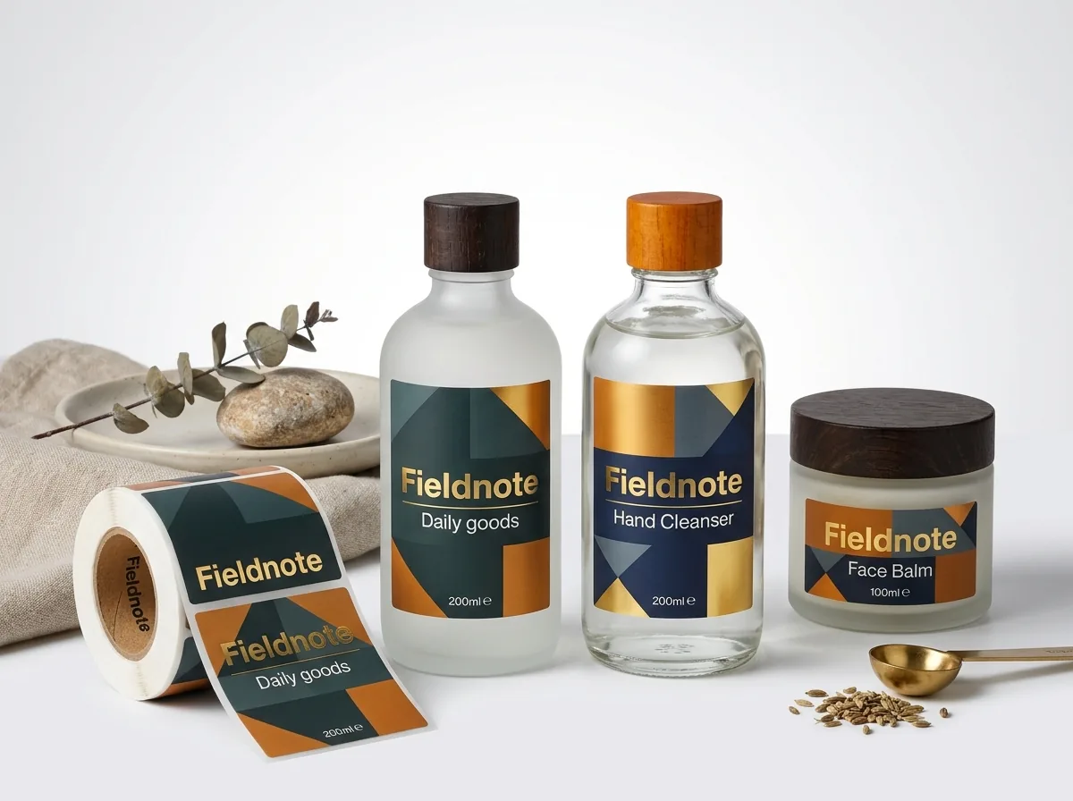
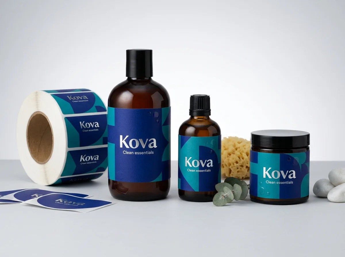
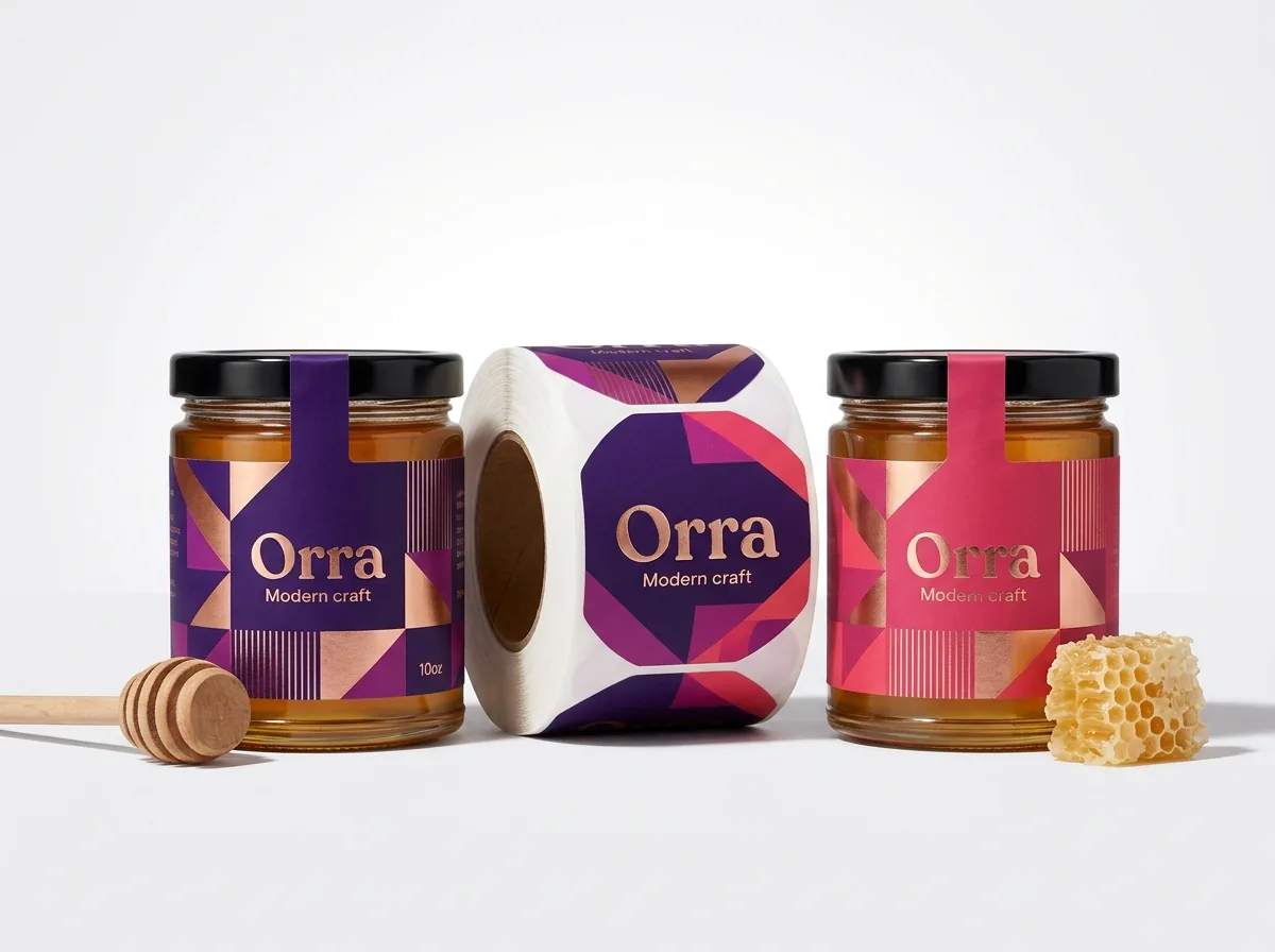
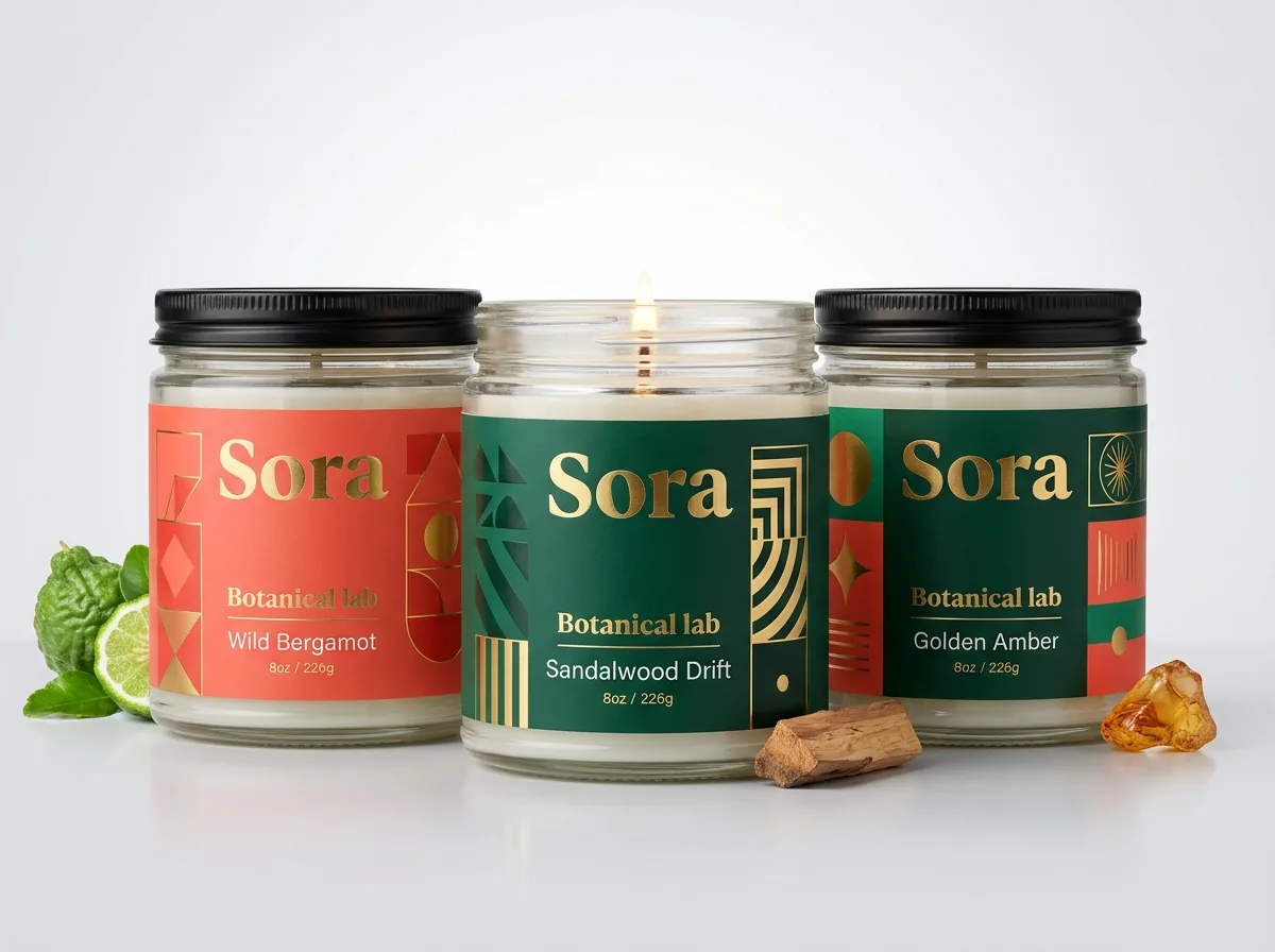
Ready to order jar labels? Compare up to 3 quantities with a free 3D mockup.
Request a Quote →Questions about jar labels
How wide should the front design area be on a full-wrap jar label?
Keep your primary brand logo, product name and flavor callout within roughly 30% to 33% of the total jar circumference (the front 110 to 120 degrees). That ensures a shopper standing in front of the shelf can read the whole front message without turning the jar.
Can CubitPack help me design my jar label if I only have a logo or sketch?
Yes. Free design help is included with every order. Send your logo, text, jar measurements or even an AI concept image with your quote, and our designers will lay out your jar label and send a digital proof and 3D mockup before you pay.
How do you make white text or light colors show up on a clear jar label?
We print an opaque white ink layer directly on the clear film, either by itself for crisp white lettering or as an underbase directly beneath your colored logo and illustrations so the jar's contents do not dull your colors.
What is the smallest font size that prints clearly on a custom jar label?
We recommend at least 6 point type (and 7 to 8 point type whenever space allows) for positive dark text on a light background, and at least 7 point bold type when reversing light or white text out of a dark background.
Can I add gold foil stamping or a custom die-cut shape to my jar labels?
Yes. You can order any custom outline with no die or plate charges, and you can add metallic gold or silver foil stamping, spot UV, matte finish or gloss finish to make your jar stand out on the shelf.
Can I order multiple flavor designs in a single 500-label jar order?
Yes. Choose the number of designs in the quote form and note your flavor list. Keeping the same label dimensions across all flavors lets us group them into one production run.
Still have a question? Ask a packaging specialist.
Request a Quote →Request your jar labels quote
Tell us your size and quantities, and one dedicated account manager prepares pricing for each tier.
- Free design & AI-to-print studio + 3D mockup
- No die or plate charges · 4–5 day rush available
- Free shipping to all 50 states
- 10% off your first order
This guide combines retail shelf viewing-angle geometry (the 120-degree front cylinder arc), GS1 barcode orientation standards for curved containers, and CubitPack's decided prepress specifications. A packaging specialist reviewed every section. Spot something wrong? Tell us and we will fix it.
Sources
What changed
- October 22, 2026: First published.
- October 22, 2026: Updated specifications, terminology, and verified source links.
More guides
New packaging guides by email
Sizes, materials and design tips. Unsubscribe anytime.