
How do I set up a white ink underbase for custom clear labels?
Short answer: To set up a white ink underbase for custom clear labels, duplicate all artwork elements that should look solid onto a separate vector layer named White_Ink, fill them with a 100% cyan or magenta spot swatch, and choke the edge inward by 0.25 pt. Or upload your normal file and we build it for free.
On this page
- Why do CMYK colors look translucent on clear film without white ink
- How do I build a White_Ink spot-color layer in Adobe Illustrator
- What are the prepress specs for white ink, choke and barcodes on clear labels
- Why do you choke the white underbase by 0.25 pt under colored logos
- What if I do not know how to set up a spot white ink channel
- Common mistakes
- FAQs
Request a custom quoteFree dieline & 3D mockup
Standard CMYK printing inks are formulated to be semi-transparent so light can pass through them, bounce off white paper and reflect color back to your eye. When you print CMYK inks directly onto transparent film without a white background underneath, the colors behave like stained glass: yellow and light green vanish, and darker colors turn muddy against amber glass or dark liquids. To make your logo, illustrations and text look solid and vivid on a custom clear label, we print an opaque white ink underbase layer directly beneath your CMYK or Pantone artwork while leaving the surrounding background 100% transparent. You can set up this White_Ink spot channel yourself in Adobe Illustrator, or simply upload your regular artwork file and let CubitPack's prepress team create the white underbase mask and 3D mockup for free before you pay.
Why do CMYK colors look translucent on clear film without white ink?
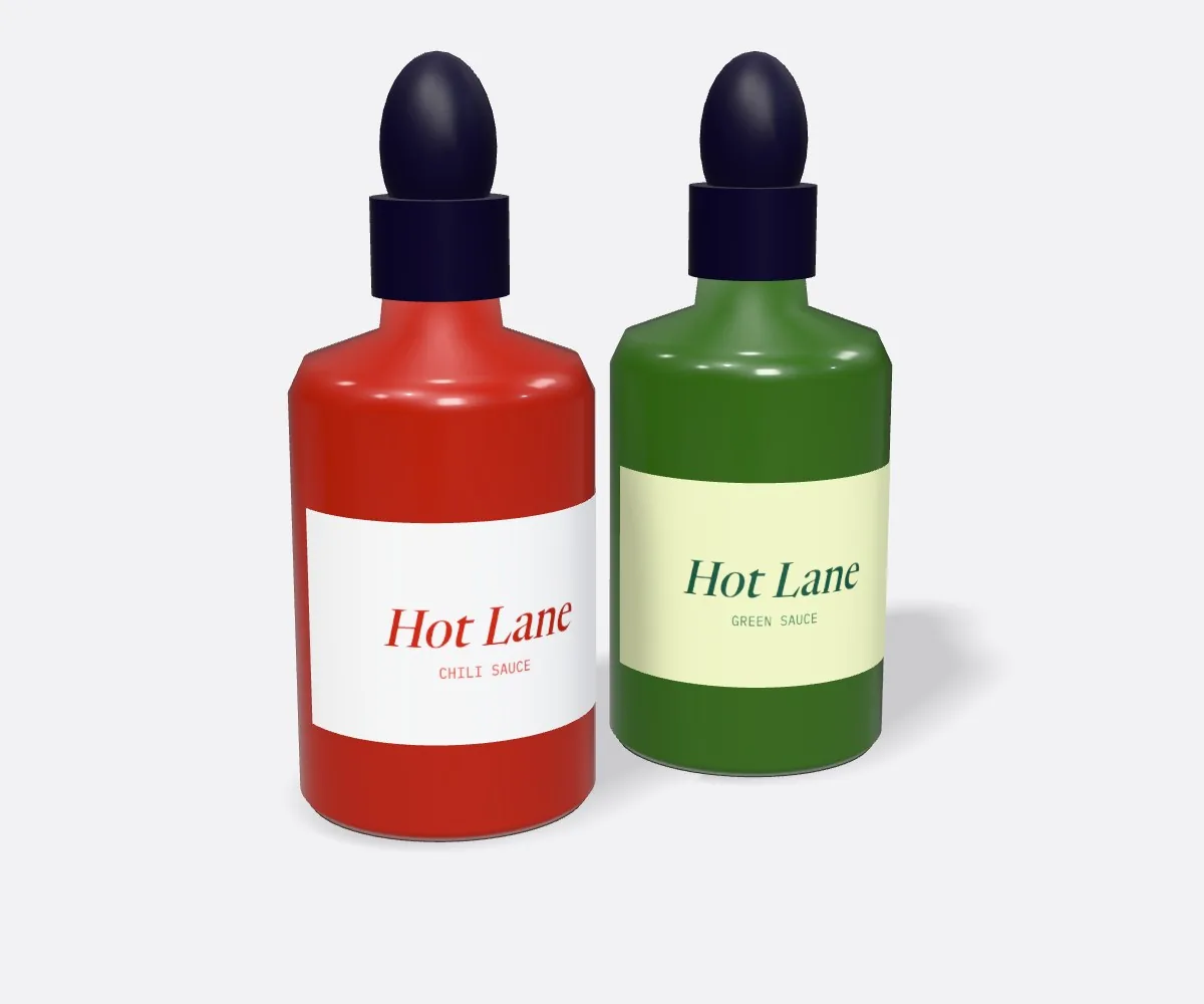
On a normal desktop or commercial press printing on white paper, the paper itself supplies 100% of the white brightness in your design. There is no white cartridge in standard four-color CMYK printing: when you leave an area white on your screen, the press simply lays down 0% ink and lets the paper show through. When you switch the material from white paper to transparent custom clear labels, any area with 0% ink becomes completely see-through, and any CMYK color printed directly on the clear film lets 40% to 70% of the background light pass right through it. By laying down a dedicated 5th ink channel of high-opacity titanium-white ink on the clear film milliseconds before the CMYK and Pantone colors are printed on top, we create a precision white canvas exclusively underneath your graphics. Everywhere else on the label stays crystal clear.
- Pure white text & monograms: printed with 100% opaque white ink and zero CMYK on top.
- Solid opaque CMYK & Pantone colors: printed on top of a matching 100% opaque white ink underbase.
- Translucent stained-glass tint zones: printed with CMYK ink directly on the clear film (0% white ink underneath).
- 100% transparent background & windows: left completely unprinted (0% white ink and 0% CMYK).
How do I build a White_Ink spot-color layer in Adobe Illustrator?
If you are building your own print-ready vector file in Adobe Illustrator, Affinity Designer or InDesign, never color your white ink areas with standard CMYK white (C=0, M=0, Y=0, K=0), because RIP software reads 0% CMYK as 'print nothing at all.' Instead, represent white ink using a dedicated Spot Color swatch on its own layer so the press knows exactly where to fire the white printhead. Follow these five steps to build a clean White_Ink channel in less than three minutes, or skip straight to uploading your artwork and let our prepress team build the channel for you at no charge.
- Step 1 · Create a new Spot Color swatch: open the Swatches panel, click New Swatch, name it exactly White_Ink, set Color Type to Spot Color, and set the preview color to 100% Cyan (or 100% Magenta) so you can see it clearly on screen.
- Step 2 · Create a layer named White_Ink: place it directly above or below your CMYK Artwork layer, and keep your CutLine layer at the very top.
- Step 3 · Duplicate opaque elements onto White_Ink: copy all logos, text, barcode boxes and illustrations that need to be solid white or opaque color, paste in place (Cmd/Ctrl+F) on the White_Ink layer, and fill them with the White_Ink spot swatch.
- Step 4 · Choke underbase edges by 0.25 pt (0.0035 in): on colored elements that have white ink underneath, inset the White_Ink shape by −0.25 pt so a tiny hairline of white never peeks out from under the color.
- Step 5 · Turn on Overprint Fill & Stroke: select everything on the White_Ink layer, open the Attributes panel (Window > Attributes), and check Overprint Fill and Overprint Stroke.
What are the prepress specs for white ink, choke and barcodes on clear labels?
Use the reference table below to verify your clear label file before exporting a PDF/X-4 or Adobe Illustrator file. Every specification here is designed to keep small ingredient text razor-sharp and ensure retail barcode scanners read your UPC code on the first pass. If you are also adding metallic gold or silver accents, you can combine a White_Ink layer with a Foil_Stamp spot layer on the same label, or compare full metallic stocks on our custom foil labels page.
| Prepress element | Required specification | Why it matters on clear film |
|---|---|---|
| Spot swatch name | Spot Color named White_Ink (100% tint) | Tells the press where to lay down opaque white ink instead of leaving clear film |
| Overprint attribute | Overprint Fill = ON for White_Ink layer | Prevents the White_Ink layer from knocking out the CMYK artwork layer |
| Underbase choke | −0.25 pt (−0.0035 in) inset under dark colors | Prevents a tiny white halo from peeking out at the edge of colored logos |
| Pure white elements | 0 pt choke (exact 100% size on White_Ink) | Standalone white text and lines print at their full intended stroke weight |
| Minimum white font size | 5.5 pt positive white text; 0.5 pt min line weight | Keeps fine ingredient text crisp without bridging on smooth film |
| Barcode backing box | Solid 100% White_Ink rectangle behind UPC/EAN | Provides mandatory light reflectance so checkout scanners read the black bars |
| Bleed & safe margin | +0.125 in (⅛ in) bleed; −0.125 in safe zone | Protects text and background borders from normal cutting blade tolerance |
Know your size? Compare pricing across up to 3 quantities.
Request a Quote →Why do you choke the white underbase by 0.25 pt under colored logos?
When a press prints white ink first and CMYK colors second on a moving web of clear film, even a microscopic registration shift of two thousandths of an inch could allow a sliver of the white underbase to peek out along one side of a dark green, navy or burgundy logo. In prepress, we prevent that by applying a 0.25 pt (roughly 0.0035 inch) choke, shrinking the white underbase path inward by a fraction of a hair underneath colored objects. Notice that you only choke the white underbase when another color sits directly on top of it. For elements that are meant to appear pure white (such as white ingredient text, white borders or a white logo), keep the White_Ink shape at 100% full size with zero choke. And for retail barcodes on custom bottle labels and custom jar labels, always place a solid 100% White_Ink rectangle extending at least ⅛ inch outside the left and right quiet zones of the black barcode bars.
What if I do not know how to set up a spot white ink channel?
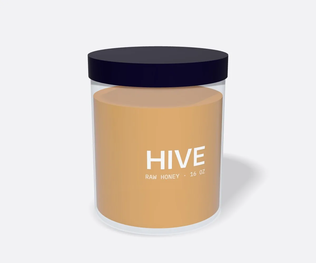
You never have to touch spot channels or choke settings if you do not want to. More than three-quarters of brands ordering custom clear labels from CubitPack simply upload their normal PDF, AI, PSD or high-resolution PNG file in Step 3 of the quote form and write a quick note like 'Back all logos and text with white ink, leave background clear.' Our prepress specialists build the White_Ink spot channel, apply the 0.25 pt underbase choke under colored graphics, add a solid white backing box behind your barcode, and send you a clear two-part digital proof plus a 3D container mockup before you pay. On the proof, we show both the finished realistic view and a magenta/cyan mask view so you can confirm every square millimeter of white ink.
What are the most common white ink setup mistakes on clear labels?
Our prepress check catches these automatically on every order, but if you build your own files, watch out for these five white-ink traps
- Coloring white text with 0% CMYK (paper white) instead of a Spot Color swatch, which tells the press to leave those letters unprinted and transparent.
- Forgetting to check Overprint Fill on the White_Ink spot layer, which causes the white layer to knock out the CMYK colors sitting on top of it.
- Applying a −0.25 pt choke to standalone thin white text instead of only choking the white underbase beneath colored shapes.
- Leaving the area behind a black UPC barcode transparent, making the barcode unreadable against dark liquids or amber glass.
- Using a soft raster drop shadow over a clear background without deciding whether the shadow should fade to white or fade to clear.
Find your label size
Suggested label size: 9⅛ × 2¾ in (width × height)
A typical starting point. Your account manager confirms the size on the proof.
Quote this size →Packaging for this
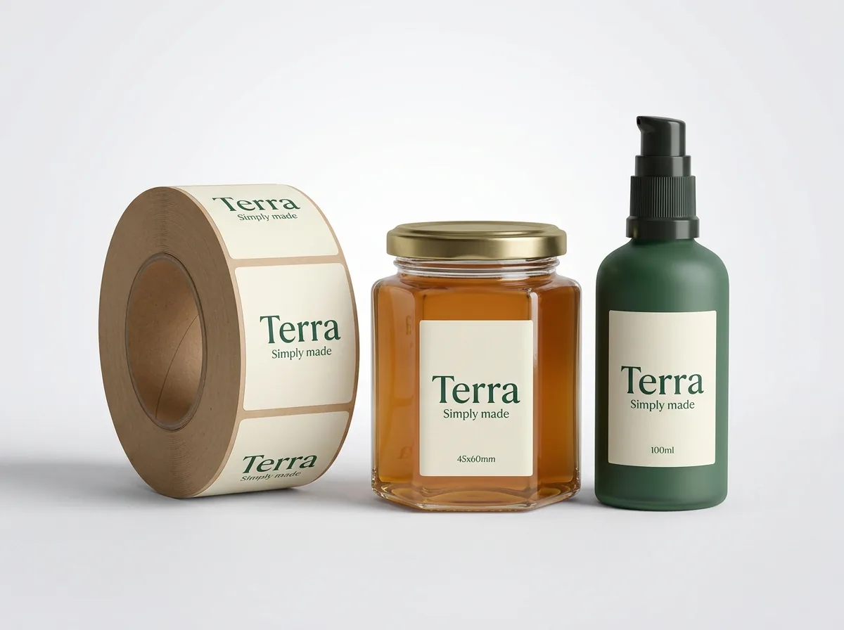
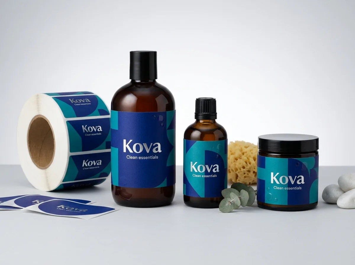
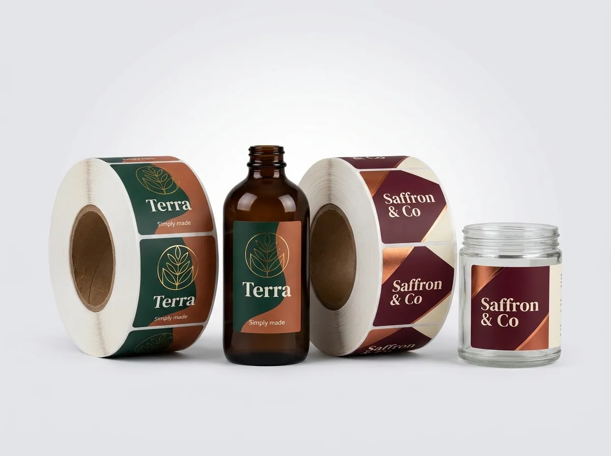

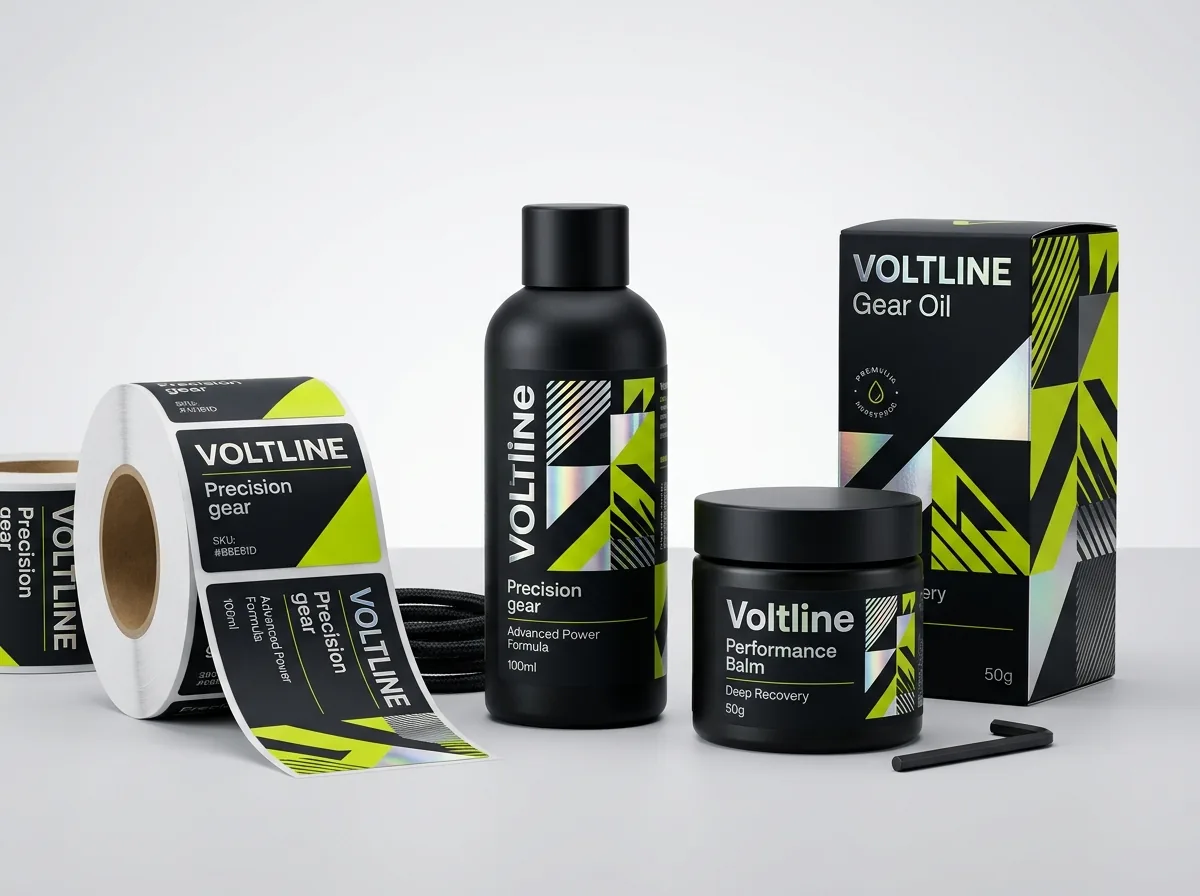
Ready to order clear labels? Compare up to 3 quantities with a free 3D mockup.
Request a Quote →Questions about clear labels
Does CubitPack charge extra to set up the white ink layer on my file?
No. White-ink prepress setup, underbase choking, barcode backing and contour dieline setup are 100% free with every order, and you review the exact white-ink mask on your digital proof before payment.
What happens if I purposely leave out white ink behind a colored shape?
Without a white ink underbase, CMYK ink printed on clear film looks translucent, like stained glass or tinted cellophane. Some beverage and candle designers use that intentionally for subtle background watermarks while backing the main logo with solid white.
Can I print variable opacity or gradients in white ink on a clear label?
Solid 100% spot white ink gives the cleanest, most uniform opacity across text and logos. If your artwork has a soft fade or gradient that transitions into the clear film, show it to our prepress team and we will advise the cleanest way to print it.
Do black logos and black text need a white ink underbase on clear labels?
Rich black ink is naturally opaque on clear glass filled with light-colored products, but adding a choked white ink underbase beneath large black shapes makes the black look even deeper and prevents dark liquids from muting the contrast.
How do you show the white ink layer on my digital proof since white is invisible on a white screen?
On your digital proof PDF, we show two views side by side: a realistic simulation over a gray/checkerboard or container background, and a technical mask view where all White_Ink areas are highlighted in bright magenta or cyan.
Can I combine white ink, full-color CMYK and hot gold foil on one clear label?
Yes. Combining an opaque white ink underbase, full CMYK or Pantone colors, and hot gold or silver foil stamping on a clear label is a popular choice for luxury skincare serums, perfumes, candles and spirits.
Still have a question? Ask a packaging specialist.
Request a Quote →Request your clear labels quote
Tell us your size and quantities, and one dedicated account manager prepares pricing for each tier.
- Free design & AI-to-print studio + 3D mockup
- No die or plate charges · 4–5 day rush available
- Free shipping to all 50 states
- 10% off your first order
The White_Ink spot channel workflow, Overprint Fill rules, −0.25 pt underbase choke tolerance and barcode reflectance specs in this guide come from CubitPack's prepress checklist and were verified by a packaging specialist. Spot something wrong? Tell us and we will fix it.
Sources
What changed
- October 22, 2026: First published.
- October 22, 2026: Updated specifications, terminology, and verified source links.
More guides
New packaging guides by email
Sizes, materials and design tips. Unsubscribe anytime.