
How do I lay out a product label with ingredients, barcodes and net weight?
Short answer: Divide your dieline into a center Principal Display Panel (brand logo, product identity, and net weight in the bottom 30%) and a right-hand Information Panel (nutrition or Supplement Facts, ingredient list, distributor address and a 100% black UPC barcode) when designing custom product labels.
On this page
- How do I divide a wrap-around product label into three clean columns
- What are the layout and typography rules for each part of a product label
- Why should I rotate my barcode 90 degrees (ladder style) on narrow bottles
- How do I keep 6-point ingredient lists sharp and readable on press
- How do I plan lot-code zones and color bands for multi-SKU lines
- Common mistakes
- FAQs
Request a custom quoteFree dieline & 3D mockup
A well-structured retail product label organizes mandatory details and brand storytelling into two or three distinct vertical columns so neither the shopper nor the checkout scanner has to hunt for information. On a standard 360-degree wrap-around label, place the Principal Display Panel (PDP) in the center third: this holds your brand mark at the top, the statement of identity (what the product is) in the middle, and the dual net weight or volume declaration in the lower 30% of the panel. Place the Information Panel immediately to the right of the PDP to hold your Nutrition or Supplement Facts box, descending ingredient list, allergen statement, manufacturer/distributor city and state, and a high-contrast 100% black UPC barcode. Use the left third for usage directions, brand story and an unvarnished lot-code stamp box. At CubitPack, our prepress team checks your layout and bleed for free.
How do I divide a wrap-around product label into three clean columns?
The fastest way to avoid a cluttered bottle or jar is to draw two vertical guide lines across your Illustrator or Canva artboard before you place a single word of text. On a 360-degree wrap-around label (for example, a 7.5 × 2.5 inch wrap for an 8 oz jar), divide the total width into three logical zones: a left panel (about 30% of total width), a center Principal Display Panel (about 35% of total width), and a right Information Panel (about 35% of total width). When the label wraps around the cylinder, the center 35% faces straight out toward the retail aisle, while the left and right panels curve cleanly around the back seam. When you order printed product labels from CubitPack, our designers verify that your center panel aligns properly with your container's diameter on a 3D mockup before you pay.
- Center column (Principal Display Panel, ~35% width): brand logo, product name, flavor/scent variant, and net weight/volume in the bottom 30%.
- Right column (Information Panel, ~35% width): Nutrition/Supplement Facts, ingredient list, warnings, distributor line, and UPC barcode.
- Left column (Story & Directions Panel, ~30% width): how-to-use steps, storage icons, QR code, and batch/expiration stamp box.
- Outer margins: extend background color ⅛ inch (0.125 in) past the cut line for bleed, and keep all text ⅛ inch inside the cut line.
What are the layout and typography rules for each part of a product label?
Retail buyers, marketplace compliance teams and shoppers expect specific elements in predictable places and readable type sizes. Use the reference table below when setting up your typography, barcode box and margin spacing. While your team is responsible for the regulatory accuracy of your ingredient and claim wording, our prepress team checks print sharpness, minimum font sizes and barcode contrast on every proof, and flags any small text that could fill in on press.
| Label element | Where it goes on the dieline | Recommended print & typography spec |
|---|---|---|
| Brand mark & product identity | Upper and middle of center PDP | High contrast, readable from 3 to 5 feet away on a shelf |
| Net quantity (weight / fl oz) | Bottom 30% of the center PDP | Parallel to container base; dual US (oz / fl oz) + metric (g / ml) |
| Ingredient list & allergens | Right Information Panel | Minimum 5.5 pt to 6 pt sans-serif with 1 to 1.5 pt leading |
| Company name & address | Bottom of Right Information Panel | Manufactured or distributed by line with city, state and ZIP |
| Retail UPC-A barcode | Lower corner of Right or Back Panel | 100% black (K) bars on solid white box (min 1.25 × 0.75 in at 80% scale) |
| Barcode orientation on curves | Narrow bottles (< 2 in diameter) | Rotate 90° (ladder style) so bars run parallel to the curve |
| Lot / expiration stamp box | Side panel or bottom edge | 0.375 × 1 in white or light box for inkjet/thermal coding |
| Bleed & safe zone margin | All 4 outer edges of dieline | +⅛ in (0.125 in) bleed outside cut; −⅛ in safe zone inside cut |
Why should I rotate my barcode 90 degrees (ladder style) on narrow bottles?
A standard retail UPC-A barcode is about 1.46 inches wide at 100% magnification (or about 1.17 inches wide at the minimum 80% magnification), including the mandatory white quiet zones on the left and right. If you place that barcode horizontally (picket-fence style) on a narrow 1 oz dropper bottle, lip tube or slim beverage can, the left and right edges of the barcode wrap steeply away from the camera or laser beam. The scanner sees foreshortened outer bars and rejects the scan at the checkout register. Rotating the barcode 90 degrees so the bars stack vertically like rungs on a ladder solves the curvature problem completely: every single bar sits on the exact same vertical plane of the cylinder from top to bottom. Whether you order custom bottle labels or custom cosmetic labels, ladder orientation is the safest choice on any round container under 2.25 inches in diameter. Always print barcode bars in 100% black ink over a solid white rectangle with at least ⅛ inch of clear white quiet zone above and below the bars.
Know your size? Compare pricing across up to 3 quantities.
Request a Quote →How do I keep 6-point ingredient lists sharp and readable on press?
Cosmetic INCI lists, supplement amino-acid breakdowns and multi-ingredient food panels often pack 100 to 250 words into a 1.5 × 2 inch space. When text is set at 5 pt or 6 pt, two common design choices can ruin legibility on press: printing white text reversed out of a 4-color rich black background, or placing fine serif fonts over a high-glare metallic or glossy surface. If you want light text on a dark background, ask our prepress team to choke the background or print dark text inside a clean cream or light tint panel. If you are printing on custom clear labels or custom foil labels, we lay down a 100% opaque white ink underbase beneath the entire ingredient panel and barcode box so neither glass transparency nor metallic glare interferes with small type.
How do I plan lot-code zones and color bands for multi-SKU lines?
Before sending your first product label to press, think about how your team or co-packer will mark batch numbers, roast dates or expiration dates after filling, and how you will add future flavors or scents. If your filling line uses a date coder, thermal transfer ribbon or hand ink stamp, glossy lamination and dark inks can cause stamping ink to smear or hide. Leaving a small ⅜ × 1 inch white box in the lower corner of the side panel gives you a high-contrast target for lot codes. To make expanding from 1 SKU to 5 or 10 SKUs effortless, build a modular master grid: lock your brand logo, net weight position, nutrition panel frame and barcode box in fixed spots, and use a single horizontal or vertical color band in the center PDP to swap Pantone colors and flavor names across your custom food labels.
- 100% K black text: use single-channel black for all body copy under 8 pt so tiny letters never blur.
- Quiet zones on barcodes: leave at least ⅛ inch of plain white space to the left and right of the outer barcode bars.
- Matte finish for dense text: choose matte lamination when your back panel is packed with small ingredient copy.
- Free prepress check: upload your draft file and we send a digital proof and 3D mockup before payment.
What are the most common product label layout mistakes?
Most prepress holds and retail rejection notices trace back to barcode orientation, tiny reverse-out text or missing safe margins. Avoid these five layout mistakes
- Placing a wide horizontal picket-fence barcode around a narrow 1 oz or 2 oz bottle where cylinder curvature blocks scanner lasers.
- Setting 5-point white ingredient text reversed out of a 4-color rich black background, where slight ink spread fills in the letters.
- Cropping out the white quiet-zone margins on the left and right sides of a UPC barcode, which causes POS scanners to fail.
- Putting the net weight or ingredient list within 1/16 inch of the cut line where rotary die tolerances can clip the text.
- Printing dark colored or metallic ink across the area where your filling line needs to ink-stamp a black lot number and expiration date.
Find your label size
Suggested label size: 9⅛ × 2¾ in (width × height)
A typical starting point. Your account manager confirms the size on the proof.
Quote this size →Packaging for this
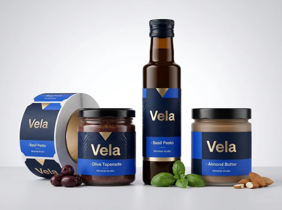
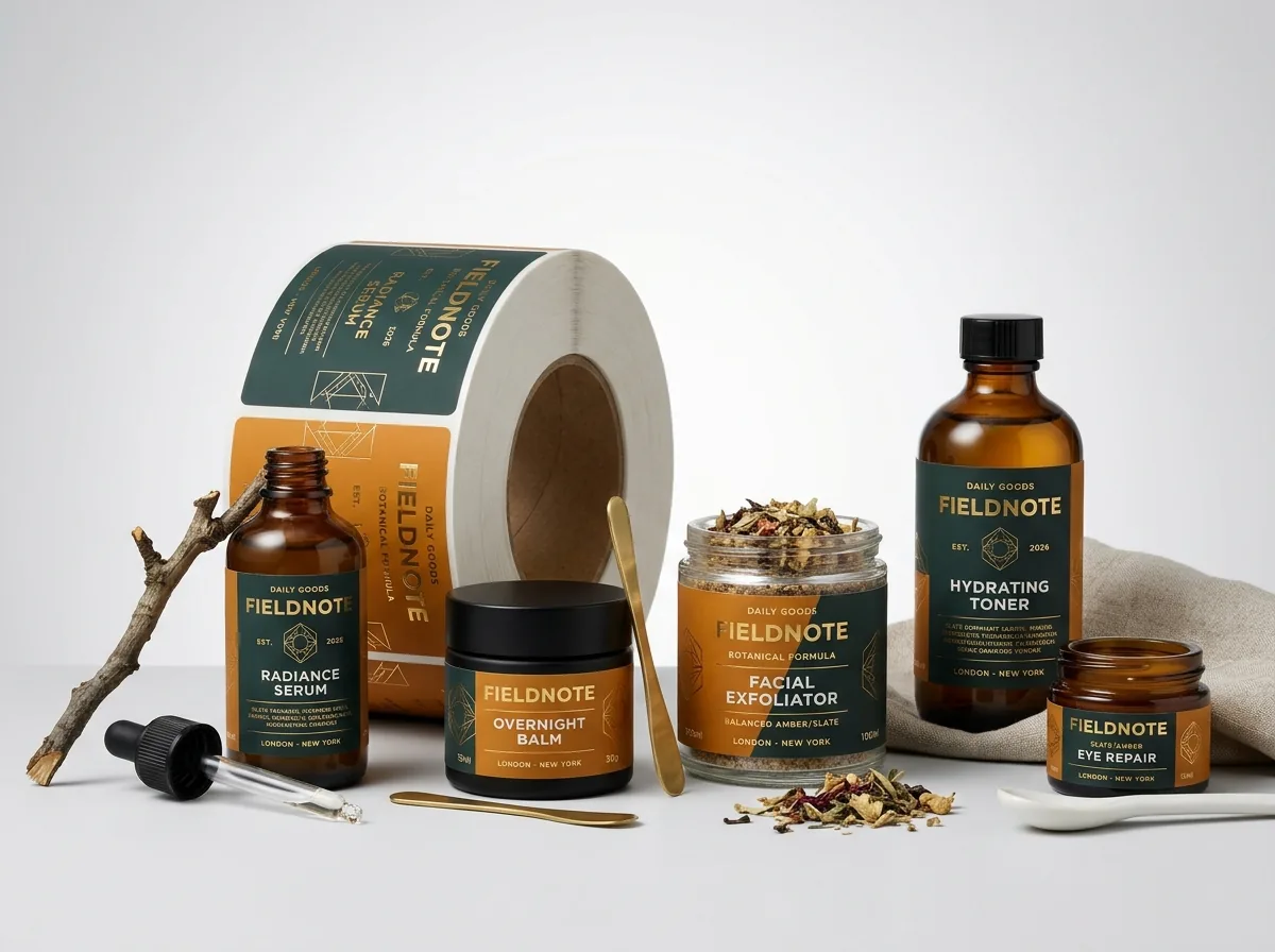
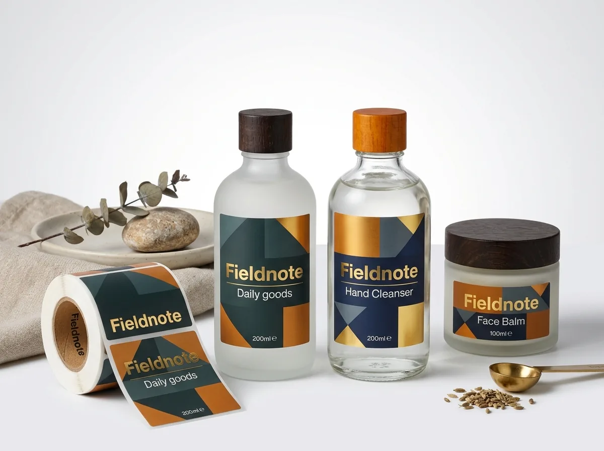
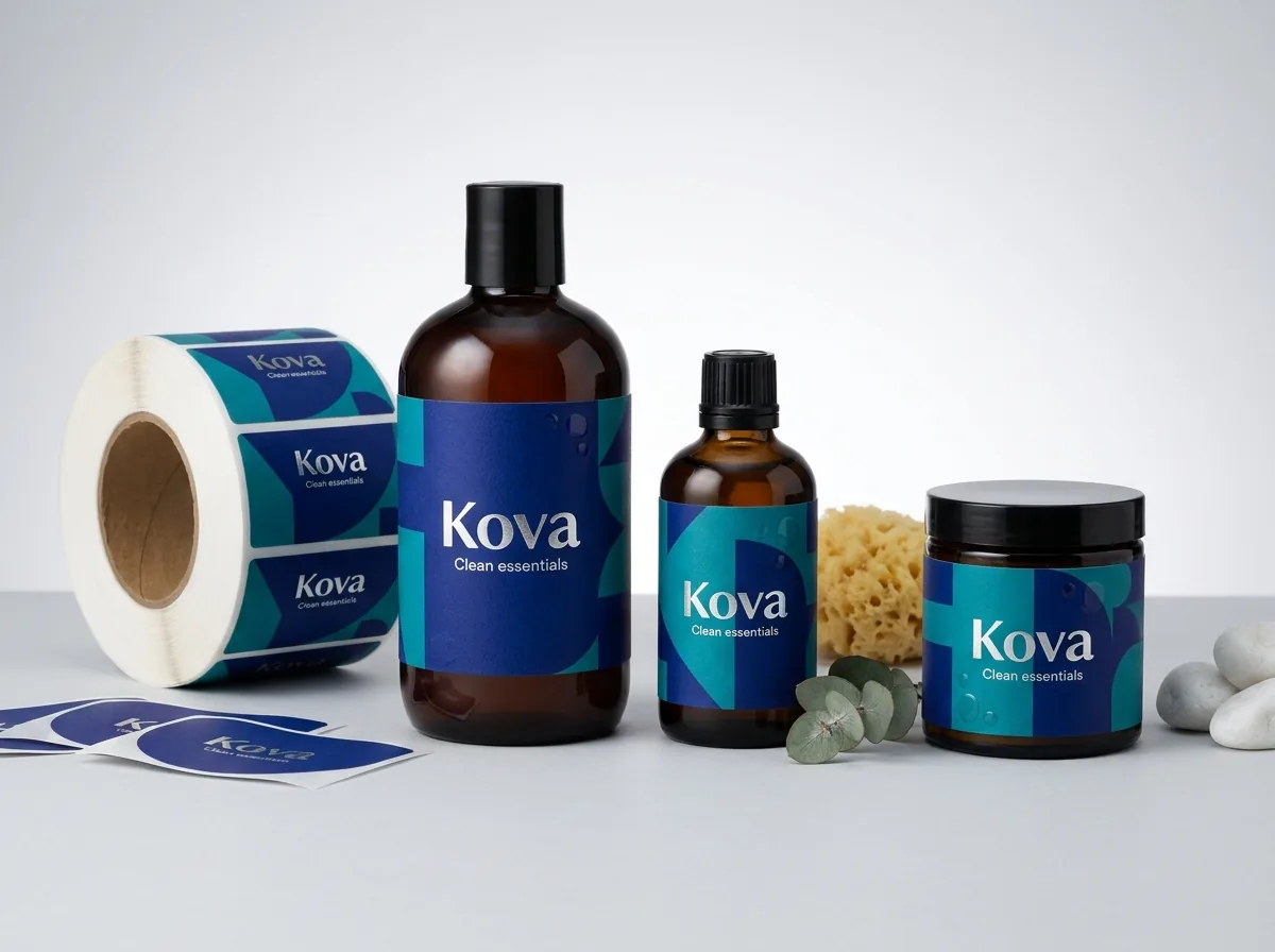
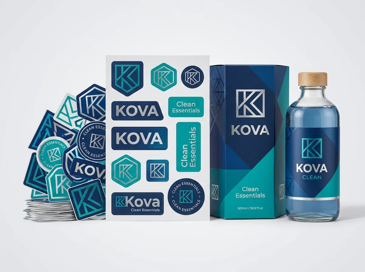
Ready to order product labels? Compare up to 3 quantities with a free 3D mockup.
Request a Quote →Questions about product labels
Where does the net weight statement belong on a retail product label?
Place the net quantity of contents (such as Net Wt 8 oz / 227 g or 1 fl oz / 30 ml) in the bottom 30% of the front Principal Display Panel (PDP), running parallel to the base of the container in a clean, unobstructed font.
What is the difference between a picket-fence and a ladder barcode?
A picket-fence barcode sits horizontally with vertical bars, which works well on flat pouches, boxes and wide jars. A ladder barcode is rotated 90 degrees so the bars stack horizontally like ladder rungs, which prevents cylinder curvature from distorting the scan on narrow bottles.
What is the smallest font size that prints clearly on a product label?
For dark text printed on a white or light background, 5 pt to 6 pt sans-serif type prints crisply. For light text reversed out of a dark background, stay at 6.5 pt to 7 pt or larger with slightly bolder stroke weights.
Can I print my barcode in a color other than black?
Barcodes scan using red light, which means dark black, dark navy or deep forest green bars on a solid white background scan reliably. Never print barcode bars in red, orange, yellow, metallic gold or silver, as red laser scanners cannot see them.
How do I leave space to stamp lot numbers and expiration dates?
Add a small ⅜ × 1 inch white rectangle on the side or back panel of your artwork. If you tell us on your quote how you apply batch codes (ink stamp, thermal ribbon or laser), we will advise on the right finish.
Will CubitPack check my product label layout before printing?
Yes. Every order includes a free prepress review, digital proof and 3D mockup before you pay. We check your bleed, safe margins, font sharpness and barcode contrast, and we can set up your dieline for free.
Still have a question? Ask a packaging specialist.
Request a Quote →Request your product labels quote
Tell us your size and quantities, and one dedicated account manager prepares pricing for each tier.
- Free design & AI-to-print studio + 3D mockup
- No die or plate charges · 4–5 day rush available
- Free shipping to all 50 states
- 10% off your first order
The three-column layout structure, Principal Display Panel placement conventions, 100% K typography rules and ladder barcode guidelines in this article were compiled and checked by a CubitPack packaging specialist. Spot something wrong? Tell us and we will fix it.
Sources
What changed
- October 22, 2026: First published.
- October 22, 2026: Updated specifications, terminology, and verified source links.
More guides
New packaging guides by email
Sizes, materials and design tips. Unsubscribe anytime.