
How do you design custom cosmetic labels with INCI ingredients and foil?
Short answer: Divide your wrap into three zones: a front display panel (center 35% of width) for brand, product identity and net contents, and two side wings for directions, warnings, INCI ingredients and barcode. Set small text in 100% black (100K) at 5 pt to 6 pt, and order custom cosmetic labels from 500 pieces.
On this page
- How do you divide a cosmetic wrap label into front and side panels
- How do you keep 5 pt to 6 pt INCI ingredient lists sharp and readable
- How do you set up artwork for foil stamping, spot UV and white ink on clear labels
- How do you organize multi-shade or multi-scent cosmetic label files
- What if you only have a rough sketch, Canva draft or AI concept
- Common mistakes
- FAQs
Request a custom quoteFree dieline & 3D mockup
Designing a cosmetic label that looks calm on a vanity shelf while carrying every required retail detail comes down to disciplined spatial hierarchy and prepress setup. On a cylindrical bottle or jar, only the front 35% to 40% of the circumference is visible straight-on without rotating the container. Keep that center zone clean with your brand mark, product identity statement, key active callout and net contents in both US fluid ounces and milliliters (for example, 1 fl oz / 30 ml). Place your INCI ingredient declaration, usage directions, distributor address, open-jar PAO icon (12M), batch lot box and barcode on the left and right wrap wings, on a 1.5 in to 1.75 in bottom circle sticker, or on your matching outer folding carton. Extend background colors 0.125 in (⅛ in) past the cut line for bleed, keep text 0.125 in inside the cut line, and put foil stamping or white ink on a separate vector spot-color layer.
How do you divide a cosmetic wrap label into front and side panels?
What is an INCI ingredient list on a cosmetic label? An INCI (International Nomenclature of Cosmetic Ingredients) list is the standardized scientific and Latin botanical naming system used to declare every ingredient in a skincare, makeup or haircare product in descending order of predominance on the packaging information panel. The number-one layout mistake on cylindrical serum droppers, toner pumps and cream jars is treating a flat rectangular dieline like a flat postcard. When a 3.75 × 1.75 in label wraps around a 1.31 in diameter (1 oz / 30 ml) Boston round bottle, the left and right edges curve sharply away from the viewer. Before placing a single line of type on your custom skincare and cosmetic labels, divide your canvas vertically into three distinct columns
| Label zone | Share of wrap width | Width on 3.75 in serum wrap | What belongs in this zone |
|---|---|---|---|
| Center Principal Display Panel (PDP) | Center 35% to 40% | 1.35 in to 1.50 in wide | Brand logo, product name, identity statement, net contents (fl oz / ml) |
| Left information wing | Left 30% to 32% | 1.10 in to 1.20 in wide | How to use directions, skin-type benefits, caution statements, PAO icon |
| Right ingredient & retail wing | Right 30% to 32% | 1.10 in to 1.20 in wide | INCI ingredient list, distributor city/state/ZIP, batch code zone, barcode |
| Optional bottom base circle | Separate circle sticker | 0.5 in to 1.75 in diameter | Shade name/number on lip tubes, or overflow INCI and lot code under jars |
How do you keep 5 pt to 6 pt INCI ingredient lists sharp and readable?
Modern skincare formulas routinely list 20 to 45 botanical extracts, peptides, humectants and preservatives by their International Nomenclature of Cosmetic Ingredients (INCI) names. Fitting that paragraph onto a 1.75 in tall serum bottle wrap or a 1.5 in tall cream jar band requires strict typography and ink rules so the letters don't plug up on press. Follow these five prepress rules whenever setting small cosmetic copy
- Set dark text on light backgrounds in 100% K (one-color black): Never build 5 pt or 6 pt ingredient text out of four-color rich black (C+M+Y+K). Even a 0.002 in registration shift between cyan, magenta and black plates makes tiny serifs look blurry.
- Use clean humanist sans-serif fonts at 5 pt minimum (6 pt+ preferred): Pick a regular or medium weight with an open x-height and at least 6.5 pt to 7.5 pt line spacing. Avoid ultra-thin light weights or condensed display fonts for ingredients.
- Go up 1 pt when reversing white text out of dark backgrounds: If your brand uses a deep forest green, espresso or navy background, set white knock-out text at 6 pt minimum in a medium weight so dark background ink doesn't close up thin letter strokes.
- Move overflow text to a bottom sticker or outer carton: When a 10 ml roller, 15 ml eye serum or 0.15 oz lip balm simply lacks room for a 30-line INCI panel, keep the primary identity and net weight on the bottle wrap and print the full ingredient panel on your outer custom cosmetic boxes or a bottom circle label.
- Keep UPC and EAN barcodes vertical (ladder orientation) on tight curves: On bottles under 1.5 in in diameter, rotate the barcode 90 degrees so the bars run vertically up the bottle wall; that stops the cylinder curve from distorting the laser scan width.
How do you set up artwork for foil stamping, spot UV and white ink on clear labels?
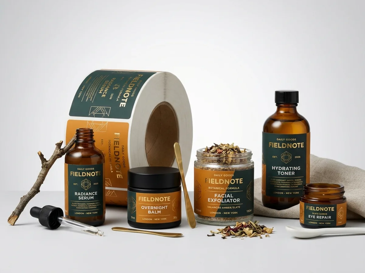
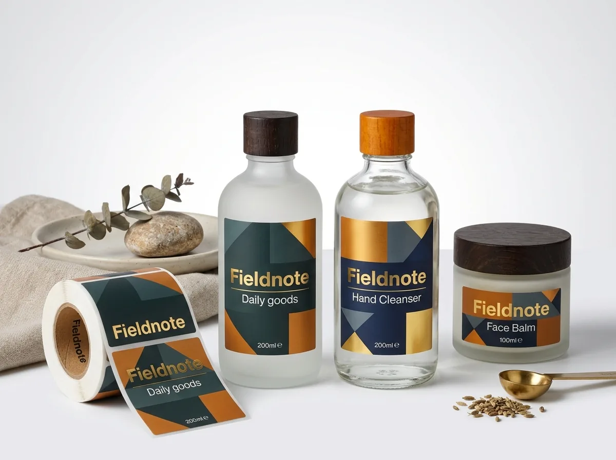
Special finishes turn a simple stock dropper vial or frosted jar into prestige counter packaging, and setting them up in Adobe Illustrator or your design tool takes only one extra vector layer. If you don't have a designer, CubitPack's prepress team sets up foil masks, spot UV layers and white ink underbases for free as part of our free design help. Here is how each specialty layer works on press: - Hot foil stamping (/finishes/foil-stamping) and foil stocks (/custom-foil-labels): Create a separate vector layer named FOIL, set every element to 100% spot magenta (no gradients or soft drop shadows), and keep fine line weights at 0.5 pt (0.007 in) or thicker with at least 0.015 in gap between adjacent foil lines. - Spot UV (/finishes/spot-uv) over matte: Create a vector layer named SPOT_UV for the logos, monograms or botanical patterns you want raised and glossy against your matte label. - White ink underbase on [custom clear labels](/custom-clear-labels): CMYK inks are transparent like stained glass. When printing on clear stock for amber, cobalt or frosted bottles, we place a 100% opaque white ink backup plate directly behind your colored text, shade bars and barcode (choked back 0.003 in around edges so no white halo peeks out). (Close-up of gold foil stamping on a matte custom cosmetic roll label.)
Know your size? Compare pricing across up to 3 quantities.
Request a Quote →How do you organize multi-shade or multi-scent cosmetic label files?
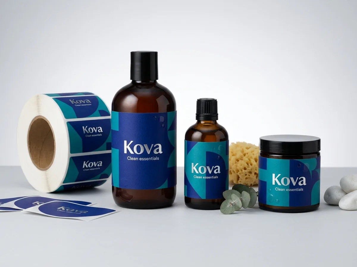
Most beauty brands launch with multiple SKUs at once, such as four facial serums (Vitamin C, Hyaluronic Acid, Niacinamide, Retinol) in identical 1 oz dropper bottles, or twelve lip gloss shades using 0.625 in bottom circle stickers. Standardizing your master dieline saves setup time and lets you group multiple SKUs into one order. Set up your multi-SKU artwork with these four production habits: 1. Include 0.125 in (⅛ in) bleed and 0.125 in safety margin: Extend all background colors and patterns 0.125 in past the red die-cut line on all sides, and keep all text, borders and logos at least 0.125 in inside the cut line. 2. Add 0.0625 in (1/16 in) corner radius on rectangle wraps: Rounded corners prevent the sharp 90-degree corners of a wrap label from catching on cosmetic bags or lifting during bottle roller application. 3. Lock one master template across every SKU in a container family: Keep the exact same width, height, corner radius, stock and finish across all four serums or all twelve shade dots, swapping only the Pantone accent bar, product title, INCI list and barcode on separate artboards. 4. Coordinate Pantone codes with your outer cartons: Share the same Pantone Swatch code across your bottle label and your custom serum boxes or custom skincare boxes. CubitPack backs every order with a Pantone match guarantee and sends a free digital proof and 3D mockup before you pay. (Coordinated front panels with color-coded bars across a multi-SKU skincare line.)
What if you only have a rough sketch, Canva draft or AI concept?
You don't need press-ready vector files to get started. In Step 2 of the CubitPack quote form, you can select Help me with my design, upload a rough Canva layout, a smartphone sketch or an AI concept image, and tell us your bottle dimensions and ingredient text. Our packaging designers will build your exact dieline free of charge, format your INCI panel and barcode for crisp legibility, and send a digital proof and 3D container mockup for your approval before payment. If you are launching a brand from scratch and need a complete visual system, our decided Brand identity package is $250 for 3 design options (+$50 per extra round), credited back on qualifying production orders.
What are the most common cosmetic label design mistakes?
Even beautiful skincare branding can fail on press if the wrap geometry or small-text ink setup is off. Watch out for these five prepress mistakes
- Making the front logo and product title wider than 40% of the wrap width, so the edges curve out of sight on a 1 oz dropper bottle.
- Setting 5 pt INCI ingredient text in four-color rich black (CMYK) or metallic foil stamping instead of crisp 100% K black.
- Forgetting to include a 0.125 in (⅛ in) background bleed past the cut line, which leaves an uneven white sliver along the label edge.
- Designing a clear label for an amber or dark glass bottle without an opaque white ink underbase behind colored logos and text.
- Placing a horizontal barcode around a narrow 10 ml roller or 15 ml dropper vial where the tight curve stops retail scanners from reading the bars.
Find your label size
Suggested label size: 9⅛ × 2¾ in (width × height)
A typical starting point. Your account manager confirms the size on the proof.
Quote this size →Packaging for this
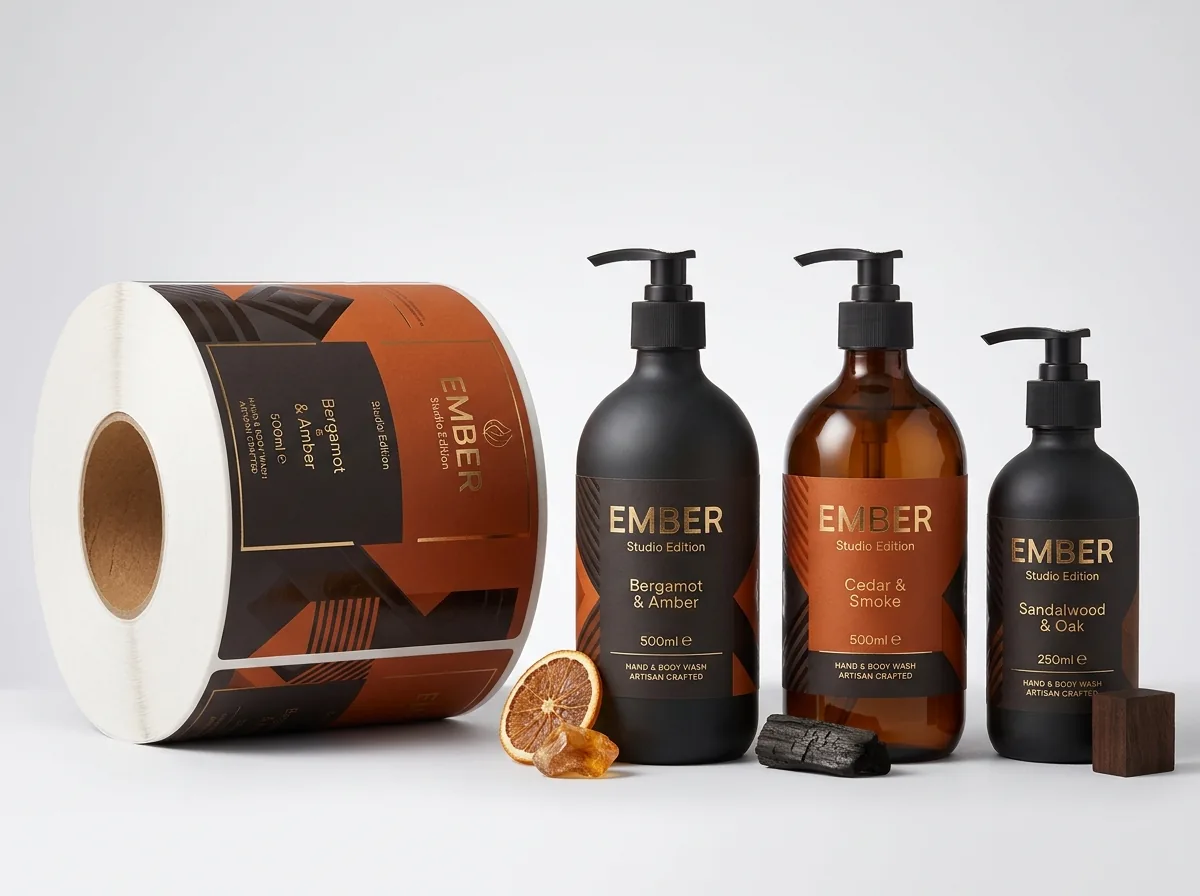
Ready to order cosmetic labels? Compare up to 3 quantities with a free 3D mockup.
Request a Quote →Questions about cosmetic labels
What has to go on the front Principal Display Panel of a cosmetic label?
Under US cosmetic labeling rules, the front Principal Display Panel (PDP) must clearly show the product identity statement (what the product is, such as 'Facial Serum' or 'Lip Balm') and the net quantity of contents in both US customary and metric units (such as '1 fl oz (30 ml)').
Can I put the INCI ingredient list on my outer cosmetic box instead of the bottle?
When a cosmetic bottle or jar is sold inside an outer retail folding carton, the outer carton is required to carry the full INCI ingredient declaration, while the inner bottle label still carries the brand, product identity, net contents and any necessary warnings. Many brands print a concise wrap on the bottle and the full list on the box.
What is the smallest font size that prints clearly on custom cosmetic labels?
We recommend 5 pt minimum (and 6 pt or larger whenever space allows) for dark text on a light background, and 6 pt minimum for white text reversed out of a dark background. Always set small dark text in 100% K black rather than four-color CMYK.
How do I set up my file for gold or silver foil stamping?
Place all foil-stamped elements on a separate vector layer named 'FOIL' in 100% spot color, with a minimum line weight of 0.5 pt. If you aren't sure how to set up spot layers or white ink masks, upload your regular artwork and our team will prepare the print files for free.
Can I print multiple makeup shades or skincare formulas in one 500-label order?
Yes. Choose 2 designs or 3+ designs in Step 2 of the quote form and keep the same label width, height, shape and material across all shades. Your account manager will quote the combined run in 5-7 minutes.
Do I see a proof before paying for my custom cosmetic labels?
Yes. Every CubitPack order includes a free digital proof and a 3D container mockup showing your wrap placement, bleed, foil areas and ingredient legibility. You only pay after you approve the proof, and production takes 10-14 business days (4-5 days with rush).
Still have a question? Ask a packaging specialist.
Request a Quote →Request your cosmetic labels quote
Tell us your size and quantities, and one dedicated account manager prepares pricing for each tier.
- Free design & AI-to-print studio + 3D mockup
- No die or plate charges · 4–5 day rush available
- Free shipping to all 50 states
- 10% off your first order
The layout ratios, bleed rules (0.125 in), small-type specs (5-6 pt in 100% K) and foil/white-ink prepress steps in this guide come from our packaging prepress team and FDA cosmetic labeling overview documents. Every CubitPack offer (500 minimum, 10-14 business days, free design help, $250 brand identity option) comes from our decided facts. Spot something wrong? Tell us and we will fix it.
Sources
What changed
- October 22, 2026: First published.
- October 22, 2026: Updated specifications, terminology, and verified source links.
More guides
New packaging guides by email
Sizes, materials and design tips. Unsubscribe anytime.