
Should you choose CMYK process or PMS Pantone spot-color printing for your custom printed boxes?
Short answer: Choose 4-color CMYK process printing when your box features full-color photography, multi-color illustrations, or smooth gradients; choose PMS Pantone spot-color printing when your design relies on a solid edge-to-edge brand flood coat, a trademarked logo color, or pastel/neon shades outside the CMYK gamut.
On this page
Request a custom quoteFree dieline & 3D mockup
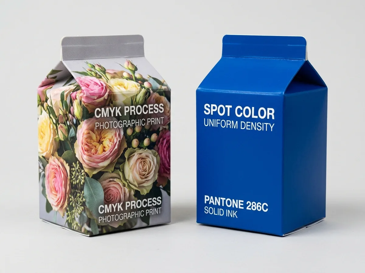
When ordering custom printed boxes, choosing between 4-color CMYK process printing and PMS (Pantone Matching System) spot-color printing determines both color accuracy across repeat production runs and how solid backgrounds appear under retail lighting. CMYK builds every shade on the sheet by overlapping microscopic halftone dots of Cyan, Magenta, Yellow, and Key (Black) at 150 to 175 lines per inch (LPI), making it the gold standard for photographic imagery and complex illustrations. By contrast, Pantone spot printing uses a pre-mixed liquid ink formulated by weight to a specific Pantone book recipe, laying down a 100% solid, dot-free film with a tight Delta E < 2.0 tolerance. Brands can also run a hybrid 5- or 6-color press pass that combines CMYK imagery with 1 or 2 Pantone spot inks. Every order includes zero plate fees, a free 2D vector CAD dieline, and an interactive 3D proof before payment.
How do CMYK process and PMS Pantone spot inks compare side by side?
Whether you are printing 20 pt retail custom product boxes, 32 ECT custom mailer boxes, or 1500 gsm custom rigid boxes on our custom printed boxes line, understanding how ink goes onto the paperboard helps you pick the right color system before prepress. Compare 4-color CMYK process, PMS Pantone spot ink, and hybrid CMYK + Pantone printing side by side: Why does a large solid background color (such as Tiffany-style robin's-egg blue, warm terracotta, pastel lavender, or deep forest green) look smoother in Pantone than in 4-color CMYK? When CMYK simulates a secondary shade using a 35% Cyan + 15% Yellow halftone screen, slight press water-ink balance shifts from the start to the end of a 5,000-sheet run can shift the hue slightly warmer or cooler. A pre-mixed Pantone spot ink prints at 100% solid coverage with zero halftone rosettes, locking the exact same shade from box number-one to box number-one0,000. When planning inventory across seasonal drops, retail wholesale rollouts, and recurring subscription shipments, locking your core brand color to a universal Pantone number ensures that your primary paperboard folding carton, your D2C corrugated mailer, and your woven or paper-wrapped rigid gift box all match on the customer's table.
- Choose CMYK process when your box design includes full-color photos, shaded illustrations, or 4+ distinct artwork colors.
- Choose PMS Pantone spot color when your box features a signature 1- or 2-color flood coat, fine reverse-out white text, or colors outside the CMYK gamut.
- Choose CMYK + Pantone when you need photographic product renders alongside an unvarying trademark brand color.
| Color system | How ink is applied | Repeat-order Delta E tolerance | Plate / setup fee at CubitPack | Best packaging artwork fit |
|---|---|---|---|---|
| 4-Color CMYK Process | Overlapping C, M, Y, K halftone dot screens (175 LPI) | Delta E ≤ 2.5–3.0 (G7 calibrated) | Zero plate fees | Product photography, botanical art, multi-color gradients |
| PMS Pantone Spot Color (1–3 Inks) | Pre-mixed solid ink laid down at 100% coverage | Delta E < 1.5–2.0 (spectrophotometer) | Zero plate fees | Edge-to-edge solid flood coats, minimalist logos, pastels |
| Hybrid CMYK + 1–2 Pantone Inks | 4 CMYK units + 5th/6th Pantone spot ink units | Exact spot brand color + full-color photos | Zero plate fees | CPG retail cartons with product photo + trademark brand band |
When should you specify Pantone Coated (C) versus Pantone Uncoated (U)?
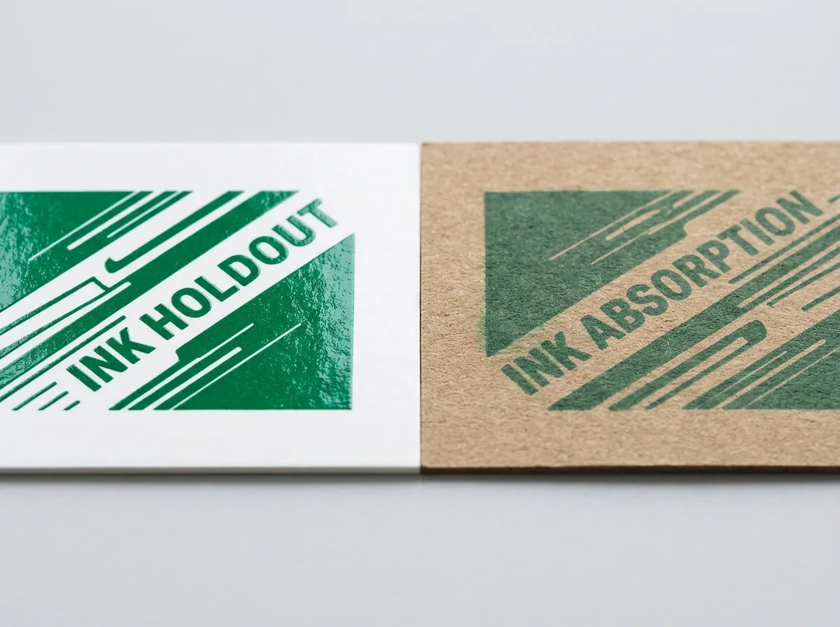
The exact same liquid Pantone ink pigment looks noticeably different depending on whether it is printed onto clay-coated white SBS paperboard or porous unbleached kraft/cotton stock. That is why the Pantone Matching System publishes two separate reference guides - Pantone Formula Guide Coated (C) and Pantone Formula Guide Uncoated (U): When testing a new shade across multiple packaging substrates, our prepress team verifies your target Pantone swatch against the actual paperboard or corrugated linerboard before generating your digital proof.
- Specify Pantone Coated (C) Swatches (e.g., PMS 286 C) when printing on smooth clay-coated white SBS paperboard, litho-laminated white E-flute mailers, or coated rigid box wraps that will receive gloss, matte, or soft-touch lamination.
- Specify Pantone Uncoated (U) Swatches (e.g., PMS 286 U) when printing on uncoated white paperboard, pulp-dyed cotton rigid wraps, or unbleached natural brown kraft board where ink absorbs into the surface fibers.
- Account for Film Lamination Shift: Applying Matte or Velvet Soft-Touch Lamination over a printed sheet slightly softens contrast by 3–5%, while Gloss Lamination deepens dark tones.
Why do RGB and web HEX colors shift on press, and how do we prevent it?
Computer monitors and phone screens emit light using RGB (Red, Green, Blue) additive color, which has a much wider neon and electric-blue gamut than reflective printing inks on paper. If an RGB PDF is sent straight to a press RIP without profile management, bright screen blues turn purple and neon greens turn muted olive. Compare how our prepress specialists translate your digital brand palette into print-ready packaging ink
- Set your Adobe Illustrator document color mode to CMYK (File > Document Color Mode > CMYK Color) before placing artwork on your dieline.
- Read our companion guide on digital vs offset litho printing for custom printed boxes.
- Follow our step-by-step checklist in the print-ready dieline artwork setup: bleed, DPI, and color profiles guide.
| Brand color scenario | Why raw RGB conversion fails | CubitPack prepress solution |
|---|---|---|
| Vibrant Cobalt / Electric Blue | Standard CMYK adds magenta, shifting blue toward purple | Map to a dedicated PMS Pantone Coated blue or clean C+M build |
| Pale Blush, Sage, or Cream Pastel | 4-color CMYK halftone dots can look grainy at <10% tint | Formulate a custom pastel PMS Pantone spot ink for 100% solid smoothness |
| Bright Orange, Coral, or Terracotta | CMYK yellow + magenta can look slightly muted on uncoated stock | Run a warm Pantone spot orange/terracotta or G7-calibrated CMYK profile |
| White Ink on Brown Kraft Board | Standard CMYK has no white ink (0/0/0/0 = unprinted brown board) | Add a dedicated Spot White opaque ink base layer in your dieline |
Know your size? Compare pricing across up to 3 quantities.
Request a Quote →How do you request a custom printed box quote and 3D proof?
Every production order is backed by our zero-plate-fee policy, free 2D vector CAD dieline engineering, and an interactive 3D digital proof so your team can inspect outside panels and interior print zones before production begins. Follow these four steps to launch from 100 mailers or 500 cartons: You can also upload your artwork or AI concept through our Print Your AI Design service for free prepress color setup. When auditing production press sheets during a live press check or reviewing wet physical proofs shipped before full production, packaging buyers should evaluate color accuracy under standardized D50 (5000K) daylight viewing booths rather than office fluorescent or warm LED lighting. Metameric shift occurs when two ink formulations appear identical under warm store lighting but diverge visibly under natural daylight. Pantone PMS solid spot inks minimize metameric drift across multiple production runs because the pigment recipe is mixed by weight from base Pantone Mixing System colorants before the press run begins. By contrast, four-color CMYK builds rely on optical halftone dot patterns printed at specific screen angles for cyan, magenta, yellow, and black; even minor fluctuations in ink water balance, blanket pressure, or substrate brightness can shift a sensitive neutral gray, pastel lavender, or warm terracotta tone by 1.5 to 2.5 Delta E across a 10,000-sheet press run. For multi-SKU product lines that combine folding cartons, corrugated mailers, and rigid gift boxes, establishing a master brand color standard early prevents mismatch on retail shelves. Specify Pantone Uncoated (PMS U) targets when printing directly onto natural brown kraft or uncoated text paper wraps, and specify Pantone Coated (PMS C) targets when printing onto clay-coated SBS, CUK, or CCNB paperboard that will receive gloss, matte, or soft-touch lamination. Furthermore, always account for the optical shift introduced by post-press protective coatings: matte and soft-touch BOPP films scatter reflected light and slightly soften dark saturated hues, whereas high-gloss UV and gloss lamination deepen perceived contrast and saturation. Requesting a coated drawdown or pre-production wet proof on your exact production caliper ensures your finished boxes match your approved brand standards.
- Step 1: Select your box style, Inside Dimensions (L × W × H), and quantities in CubitPack's 3-step quote form.
- Step 2: Choose 1-sided or 2-sided printing and note any target PMS Pantone swatches.
- Step 3: Review your free 2D prepress proof and interactive 3D digital mockup before payment.
- Step 4: Approve for 10–14 business day turnaround (4–5 day rush) with zero plate fees and free US shipping.
What 5 color mistakes happen most often on custom printed boxes?
Our prepress team audits every file's color swatches and ink density before plating, preventing these five common errors
- Designing in RGB mode and picking neon screen colors without checking their CMYK or Pantone equivalents first.
- Using 100% K (single-channel black) for a large solid black background instead of Rich Black (60/40/40/100), resulting in a washed-out gray box.
- Exceeding 300% Total Area Coverage (TAC) in 4-color CMYK builds (such as 100C/100M/100Y/100K registration black), which causes slow drying and ink set-off.
- Expecting white elements in a CMYK file to print white on natural brown kraft board without specifying a Spot White ink layer.
- Using 6 pt reverse-out white text inside a 4-color CMYK rich-black background without a single-color keep-away stroke, risking slight halftone softness.
Packaging for this
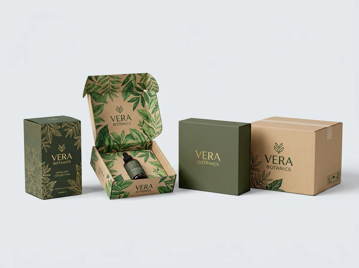
Ready to order printed boxes? Compare up to 3 quantities with a free 3D mockup.
Request a Quote →Questions about printed boxes
How do 4-color CMYK process printing and PMS Pantone spot-color printing compare on custom boxes?
CMYK combines tiny halftone dots of Cyan, Magenta, Yellow, and Black to reproduce full-color photos and gradients; PMS Pantone uses pre-mixed solid liquid inks to print dot-free brand flood coats, pastel/neon shades, and exact logo colors with Delta E < 2.0 accuracy. Every order includes a free 2D vector CAD dieline and interactive 3D proof before payment.
When should I specify a Pantone Coated (C) vs Pantone Uncoated (U) swatch for my box substrate?
Specify Pantone Coated (C) when printing on smooth clay-coated white paperboard, litho-laminated white corrugated mailers, or laminated rigid wraps; specify Pantone Uncoated (U) when printing on porous unbleached brown kraft or uncoated cotton paper. Every order includes a free 2D vector CAD dieline and interactive 3D proof before payment.
Why do solid brand backgrounds and bright pastel/neon shades look cleaner in Pantone than CMYK?
Because a Pantone ink is mixed to the exact target hue before going on press, it prints as a 100% solid layer without visible halftone screening dots, preventing subtle color drift across large solid panels. Every order includes a free 2D vector CAD dieline and interactive 3D proof before payment.
Can I combine CMYK photography and a 5th-station Pantone spot ink on the same custom printed box?
Yes. Our multi-unit offset presses can run 4-color CMYK process photography alongside 1 or 2 dedicated PMS Pantone spot ink stations in a single pass with zero plate setup fees. Every order includes a free 2D vector CAD dieline and interactive 3D proof before payment.
Does CubitPack charge extra printing plate fees for CMYK or Pantone custom boxes?
No. CubitPack charges zero printing plate fees and zero cutting die setup charges across all custom printed boxes, with free US ground shipping. Every order includes a free 2D vector CAD dieline and interactive 3D proof before payment.
Still have a question? Ask a packaging specialist.
Request a Quote →Request your printed boxes quote
Tell us your size and quantities, and one dedicated account manager prepares pricing for each tier.
- Free design & AI-to-print studio + 3D mockup
- No die or plate charges · 4–5 day rush available
- Free shipping to all 50 states
- 10% off your first order
We verified CMYK halftone screen rulings (150–175 LPI), Total Area Coverage limits (≤280–300% TAC), Rich Black formulas (60/40/40/100), and PMS Pantone Delta E < 2.0 spectrophotometer tolerances against Idealliance G7 Master Color and Paperboard Packaging Council (PPC) standards. Spot something wrong? Tell us and we fix it.
Sources
What changed
- November 11, 2026: First published with CMYK vs Pantone comparison matrix, Coated vs Uncoated rules, and RGB-to-print conversion guide.
More guides
New packaging guides by email
Sizes, materials and design tips. Unsubscribe anytime.