
Why do AI-generated RGB packaging colors shift in print (and should you use CMYK or Pantone)?
Short answer: AI packaging mockups shift in print because generators use backlit sRGB screen pixels and fake studio shadows that reflective paper inks cannot reproduce directly. To keep custom colored mailer boxes vibrant, our studio strips out camera glare, calibrates CMYK builds, and maps solid brand hues to guaranteed Pantone spot inks.
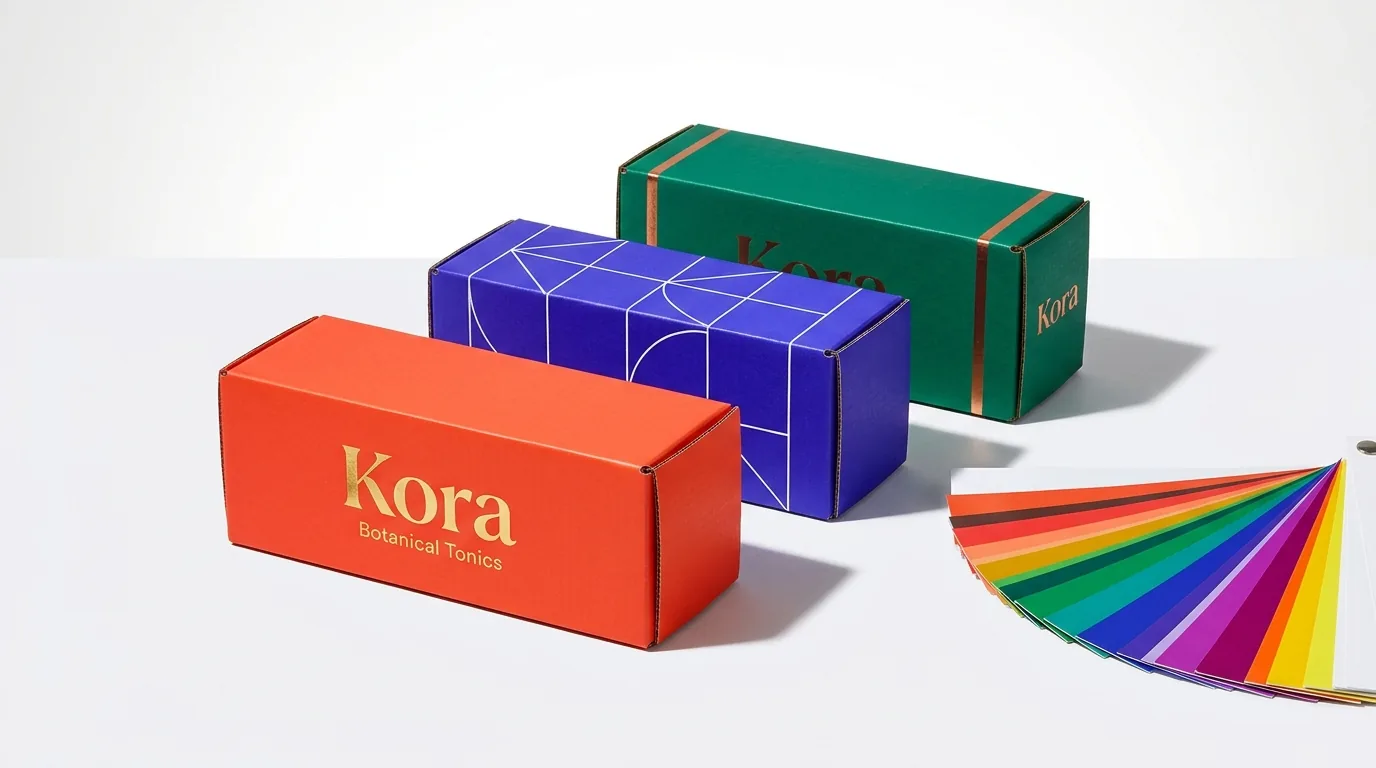
On this page
- How do sRGB AI screen pixels compare to CMYK process ink and Pantone spot ink
- Why must fake 3D lighting and shadows be stripped from an AI render before color matching
- How does white clay-coated board versus brown kraft board change your AI colors
- When should you combine 4-color CMYK with a 5th Pantone spot ink on the same box
- How does CubitPack's Pantone color match guarantee protect your order
- Common mistakes
- FAQs
Request a custom quoteFree dieline & 3D mockup
Every image exported from Google Gemini, ChatGPT, Midjourney, or Canva AI is encoded in the sRGB color space, where red, green, and blue pixels shine light directly into your eyes from a backlit monitor. Physical packaging works the opposite way: ambient room light hits paperboard or corrugated fibers and reflects through translucent cyan, magenta, yellow, and black (CMYK) process inks or pre-mixed Pantone (PMS) spot inks. Furthermore, AI generators paint fake 3D lighting, bright white glare on the top lid and dark gray shadow gradients on the side wall, which makes a box print unevenly if sent straight to press. Through our free AI-generated packaging rebuild service, we sample the true intended brand hues from your AI render, flatten out artificial camera shadows, and help you choose between 4-color CMYK and guaranteed Pantone spot inks.
How do sRGB AI screen pixels compare to CMYK process ink and Pantone spot ink?
Not every color you see on an OLED phone or laptop monitor exists in standard 4-color CMYK printing. Electric cobalt blues, neon limes, bright corals, and deep saturated violets sit outside the CMYK gamut, so an automatic RGB-to-CMYK conversion makes them look muted or muddy on printed colored mailer boxes. Pre-mixed Pantone (PMS) spot inks bridge that gap by using fourteen base pigments (including vibrant orange, warm red, reflex blue, violet, and green) mixed to an exact formula before going on press. Every panel, score rule, glue tab, and bleed margin is verified by a packaging specialist before your digital proof and 3D mockup are sent for approval.
| Color system | How color is created | Best use on AI-designed packaging | Color consistency & guarantee |
|---|---|---|---|
| sRGB (Raw AI Export) | Backlit red, green & blue monitor pixels (16.7M colors) | Concept ideation on screen only; never sent raw to press | Varies wildly across phones, laptops & brightness settings |
| 4-Color CMYK Process | Tiny halftone dots of Cyan, Magenta, Yellow & Black ink | Multi-color illustrations, gradients, photos & botanical art | Calibrated to proof; slight tolerance across board stocks |
| Pantone Coated (PMS C) | Solid pre-mixed spot ink printed on clay-coated white board | Solid color floods, brand logos, and out-of-gamut bright hues | Guaranteed match at CubitPack: if clearly off, we reprint |
| Pantone Uncoated (PMS U) | Solid pre-mixed spot ink formulated for absorbent uncoated paper | Natural brown kraft and uncoated recycled paperboard cartons | Guaranteed match to the Pantone Uncoated (U) swatch book |
| White Ink + CMYK/PMS | Opaque white base layer printed under colors on brown kraft | Keeping bright AI palettes vivid on natural brown kraft board | Prevents brown kraft fibers from muddying light pastel/bright inks |
Why must fake 3D lighting and shadows be stripped from an AI render before color matching?
If you use an eyedropper tool on three different spots of a solid-colored AI box render, you will get three completely different hex codes: a washed-out tint on the top lid where the AI painted a studio softbox reflection, a mid-tone on the front face, and a dark muddy shade on the shadowed side wall. Printing those pixels directly produces a box with fake gray dirt printed down one side. When comparing a glossy screen preview to a physical press sheet, remember that ink drying and protective coatings also shift perceived saturation. Aqueous coating provides a clean, neutral protective seal over CMYK ink without changing hue, while gloss film lamination increases contrast and deepens rich blacks and navy tones.
- Step 1, Sample the true mid-tone target hue: Our prepress designers sample the clean, unshadowed focal area of your AI mockup (or your existing brand guide) to identify the single intended color for each element.
- Step 2, Replace shaded pixel gradients with uniform solid ink fills: So your physical box looks uniform from every real-world angle, we replace the AI camera shadows with a 100% even Pantone spot ink or clean CMYK build across all six panels.
- Step 3, Check out-of-gamut RGB warnings: When your AI mockup features electric coral, deep royal violet, or emerald green that CMYK would dull down, we flag the shift and recommend the closest Pantone color printing swatch.
- Step 4, Match lamination to the AI surface sheen: Gloss lamination deepens dark blacks and makes colors pop like a backlit screen, whereas matte or soft-touch lamination softens contrast by 5 to 8 percent for a velvety luxury look.
- Step 5, Verify on your digital proof and 3D mockup: You see the exact CMYK values or Pantone PMS numbers listed on your flat proof before paying.
How does white clay-coated board versus brown kraft board change your AI colors?
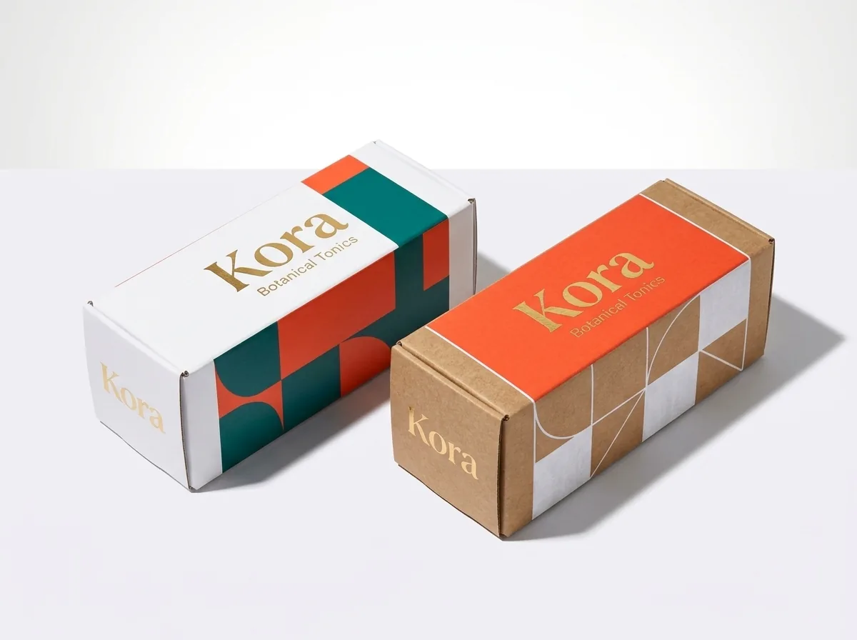
Paper is the fifth ink in packaging printing. Because printing inks are semi-transparent, the brightness and coating of the board underneath directly control how vibrant your rebuilt AI design looks in hand. By contrast, matte and soft-touch laminations scatter reflected room light across a microscopic velvet surface, softening dark shadows by five to eight percent. Our prepress specialists factor your chosen lamination into the CMYK or Pantone proof so the finished box matches your expectations.
- Clay-coated white board (SBS paperboard & white corrugated): Reflects maximum light back through the ink layer, delivering the widest color gamut and sharpest contrast on custom white mailer boxes and retail cartons.
- Natural brown kraft board (uncoated): Absorbs wet ink into the raw wood fibers and adds a warm brown undertone to every color. Dark navy, forest green, burgundy, and black look rich on kraft, while yellow, baby blue, and pink turn muddy unless backed by white ink on kraft.
- Deep Flood-Printed Black or Colored Boxes: Flood-printing dark ink over white board with matte or soft-touch lamination gives you rich, scuff-resistant exterior walls while keeping the inside bright white for two-sided contrast.
Know your size? Compare pricing across up to 3 quantities.
Request a Quote →When should you combine 4-color CMYK with a 5th Pantone spot ink on the same box?
Many AI packaging designs pair a detailed multi-color botanical or geometric illustration with a bold, solid-colored brand background and logo. You do not have to choose exclusively between CMYK and Pantone, offset packaging presses routinely print both in a single pass.
- Solid color flood + CMYK artwork: Use a Pantone spot ink for the main background flood and brand wordmark so every reorder matches 100%, while printing the multi-color illustration in full-color CMYK.
- One- or two-color Pantone runs on kraft: If your AI concept is a minimalist 1-color or 2-color design on kraft board, printing with Pantone spot inks often costs less than full-color process printing.
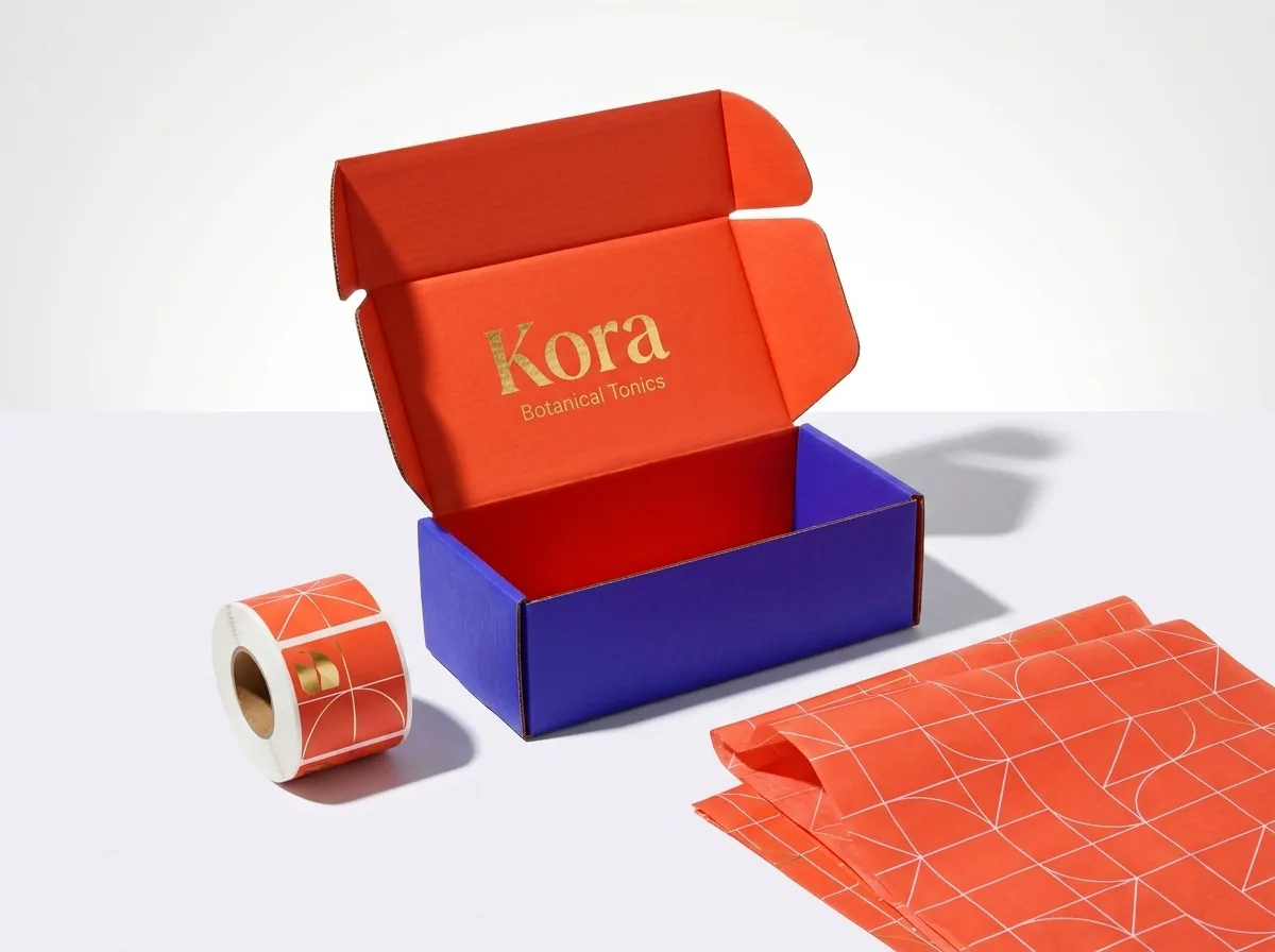
- Matching boxes, labels, and tissue paper: Because corrugated mailers, BOPP roll labels, and tissue paper have different surface coatings, specifying a Pantone code lets our studio match your brand color across your entire unboxing kit.
How does CubitPack's Pantone color match guarantee protect your order?
When you specify Pantone (PMS) codes on your custom quote, our color match is guaranteed (Decision 59): if a printed Pantone color on your order is clearly off from the official Pantone reference swatch, we reprint it. You don't even need a physical Pantone book to start, send us your AI packaging image, hex codes, or existing brand guidelines, and our prepress specialists identify and confirm the exact Pantone Coated (C) or Uncoated (U) code on your free digital proof and 3D mockup before you pay. Minimums start at 50 rigid boxes, 250 mailer boxes, 500 labels, and 1,000 folding cartons, with no die or plate charges and free shipping to all 50 US states. When your brand ships a coordinated packaging line across corrugated mailers, paperboard folding cartons, and waterproof BOPP roll labels, our prepress team also adjusts ink density curves for each substrate so an uncoated kraft box, a matte-laminated carton, and a gloss film label maintain visual harmony under retail store LEDs and daylight.
What color mistakes make AI packaging designs print dull, dark, or blotchy?
Avoid these five color-conversion pitfalls when taking an AI mockup from screen to press
- Sending an unedited sRGB file straight to a CMYK press. Out-of-gamut neon blues, greens, and oranges clip automatically into dull, lifeless mid-tones.
- Leaving AI camera shadows and softbox glare in the artwork. The press prints those lighting gradients as uneven dirty gray streaks across solid panels.
- Printing light pastel CMYK colors directly onto brown kraft board without a white ink underbase. The brown kraft fibers show through and turn pastels tan.
- Using 400% total ink coverage (100C 100M 100Y 100K) for black backgrounds. Excess wet ink causes offsetting and cracking at fold creases; rich black should use a balanced 60C 40M 40Y 100K build or Pantone Black.
- Comparing a backlit phone screen at 100% brightness to a matte-laminated box in dim room light. Always approve colors against Pantone references and coating specs.
Packaging for this
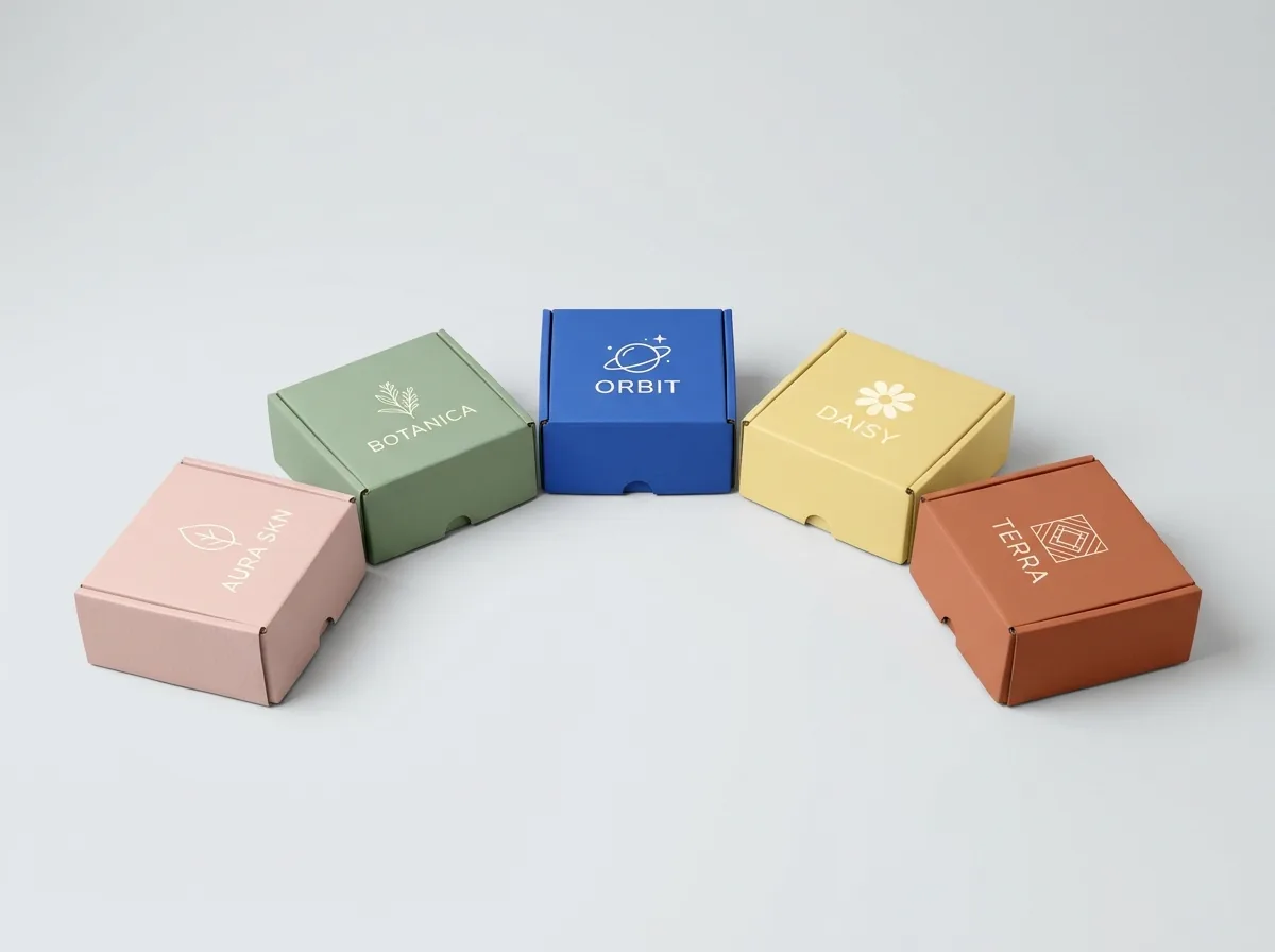
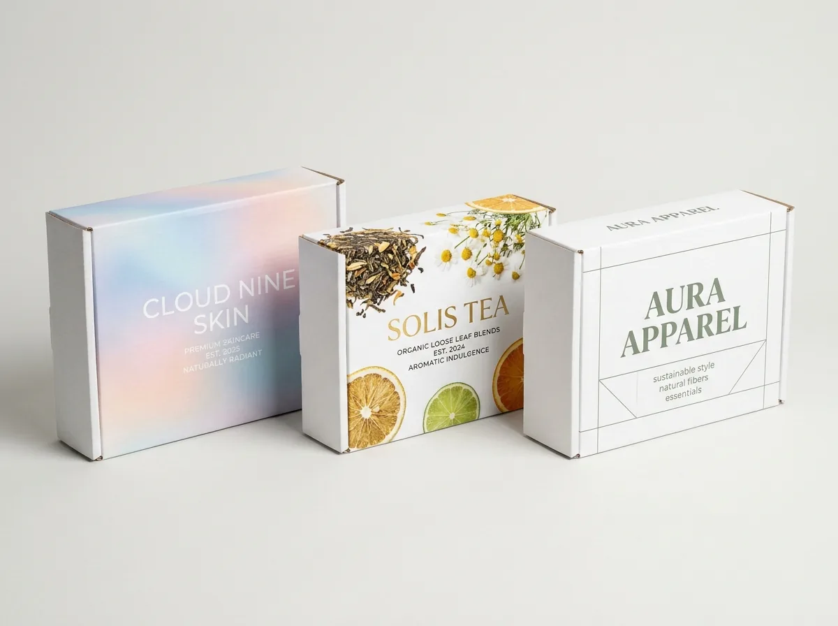
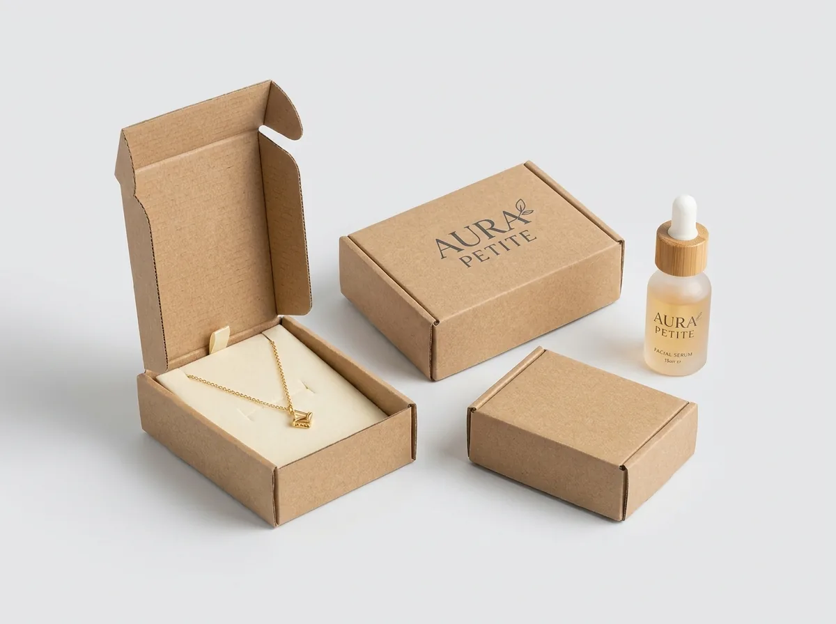
Ready to order colored mailer boxes? Compare up to 3 quantities with a free 3D mockup.
Request a Quote →Questions about colored mailer boxes
Why did my AI box design look bright on my laptop but print darker on another site?
Laptop screens emit light in sRGB, which has a much brighter gamut than standard 4-color CMYK ink on paper. Self-serve upload sites run an automatic RGB-to-CMYK filter that crushes bright blues, greens, and corals. At CubitPack, our designers manually balance CMYK curves or map bright brand colors to Pantone spot inks.
What if I only have an AI image or a hex code (#FF5A4E) and don't know my Pantone code?
No problem. Send us your AI image or hex codes with your quote. Our prepress studio converts your palette to the closest Pantone Coated (C) or Uncoated (U) swatch numbers and lists them on your free proof.
How does CubitPack's Pantone color match guarantee work?
When you order Pantone spot-color printing and approve the Pantone code on your digital proof, we mix and print to that official Pantone reference. If the printed Pantone color on your delivered packaging is clearly off from the Pantone swatch, we reprint it.
Should I choose CMYK or Pantone for an AI packaging design with photos and gradients?
Use full-color CMYK for photographic art, complex gradients, and multi-color illustrations, and use Pantone spot ink when your design relies on a solid brand color flood, a 1- or 2-color logo, or a bright hue outside the CMYK gamut. You can also combine both on the same box.
Can you print bright colors from an AI mockup onto natural brown kraft boxes?
Yes. By printing an opaque white ink underbase beneath your CMYK or Pantone colors on brown kraft board, we keep bright colors vivid against the natural kraft background.
Are there extra plate charges for CMYK or Pantone printing at CubitPack?
No. There are no die or plate charges at CubitPack, and every order includes free prepress color setup, a digital proof, a 3D mockup before payment, and free US shipping across all 50 states.
Still have a question? Ask a packaging specialist.
Request a Quote →Request your colored mailer boxes quote
Tell us your size and quantities, and one dedicated account manager prepares pricing for each tier.
- Free design & AI-to-print studio + 3D mockup
- No die or plate charges · 4–5 day rush available
- Free shipping to all 50 states
- 10% off your first order
We compared sRGB display gamut boundaries against ISO 12647-2 / G7 CMYK offset printing standards and Pantone Formula Guide (Coated and Uncoated) spot-ink specifications across white SBS, white corrugated, and natural kraft substrates, checked by a CubitPack packaging specialist.
Sources
What changed
- November 16, 2026: Published complete technical prepress and buyer guide for why ai rgb colors shift in print cmyk vs pantone.
More guides
New packaging guides by email
Sizes, materials and design tips. Unsubscribe anytime.