
How do you set up artwork for custom kraft mailer boxes using black ink, white ink, and CMYK dieline layers?
Short answer: For the sharpest results on unbleached brown kraft mailer boxes, design primary logos in 100% black ink (K=100), high-density dark Pantone colors, or standalone opaque white ink. Place an opaque white ink underbase vector spot layer beneath any light or vibrant CMYK colors, and extend bleed 0.125 inches past all cut lines.
On this page
- How do black ink, dark Pantones, opaque white ink, and CMYK behave on brown kraft board
- How do you set up a WHITE_INK spot layer and two-sided inside/outside dieline in Illustrator
- Where are the bleed, score-line clearance, and no-ink glue/lock zones on a FEFCO 0427 kraft dieline
- How do you run a 4-step prepress check before approving your 3D kraft mailer proof
- Common mistakes
- FAQs
Request a custom quoteFree dieline & 3D mockup
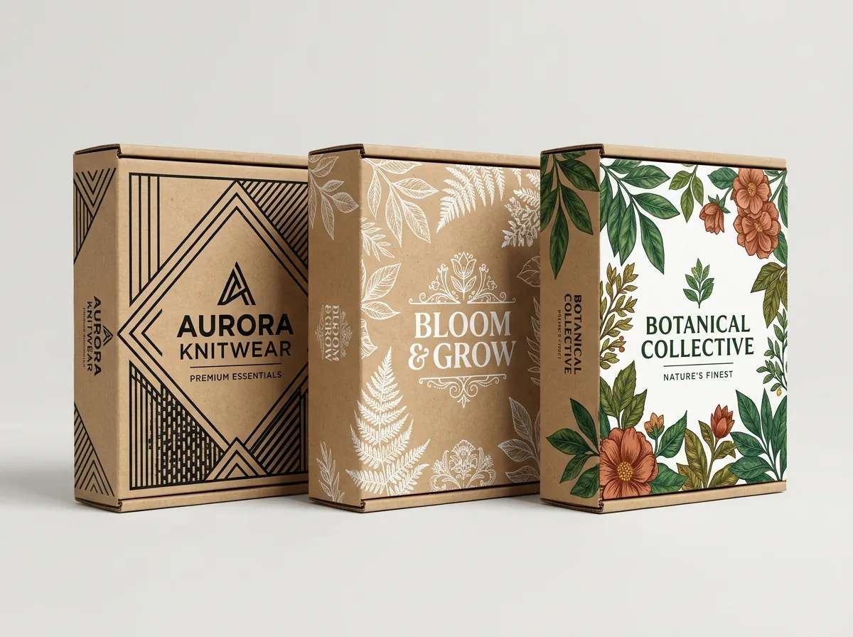
Preparing print-ready artwork for custom kraft mailer boxes differs from designing for white paperboard because unbleached natural brown kraft linerboard is both warm-toned (similar to Pantone 465 U / 466 U) and uncoated and porous. Standard process CMYK inks are translucent - they rely on white paper reflecting light back through the ink film. When printed directly onto brown kraft, the tan fibers absorb blue light and shift every translucent color darker and warmer. By combining 100% black ink, saturated dark Pantones, and a dedicated WHITE_INK spot layer on your FEFCO 0427 CAD dieline, you achieve razor-sharp contrast across both the outer shipping panels and the inner unboxing lid. Every order from 250 units at CubitPack includes a free prepress review, custom 2D vector dieline, and interactive 3D proof showing your exact ink contrast on brown kraft before payment.
How do black ink, dark Pantones, opaque white ink, and CMYK behave on brown kraft board?
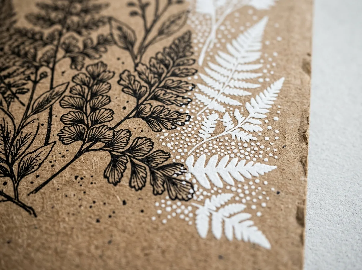
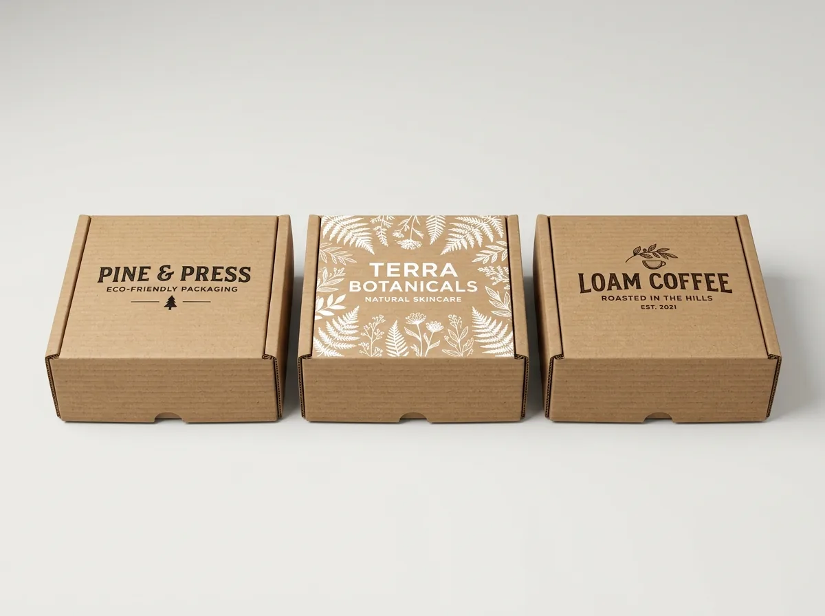
Compare how the five main ink approaches render on unbleached brown kraft across printed kraft mailer boxes, custom printed inside mailer boxes, and custom coffee boxes: Choosing the right ink recipe before laying out your CAD dieline avoids muddy midtones and keeps fine typography crisp over corrugated flutes. Unlike glossy clay-coated white board that holds ink pigment on a sealed surface, unbleached kraft linerboard has exposed cellulose fibers that drink in liquid ink slightly on contact. High-pigment dark inks such as 100% black, espresso brown, deep navy, forest green, and burgundy lock into those fibers to create a rich, velvety matte imprint that never peels or flakes during parcel transit.
- Set black text and line art to 100% K (one-color black) rather than 4-color rich black for fine typography under 12 pt so single-plate registration stays razor-sharp.
- Simulate brown kraft on screen in Adobe Illustrator: Place a locked bottom rectangle filled with #B8926A (22C 40M 65Y 5K) and set your CMYK artwork layer to Multiply blend mode to preview how unbacked inks will darken on kraft.
- Keep barcodes on a high-contrast zone: Print UPC or SKU barcodes in 100% black ink directly on clean brown kraft (or over an opaque white rectangle) and never in red, green, or light metallic ink.
| Ink strategy on brown kraft | Visual result on unbleached board | Opacity & contrast rating | Minimum positive / knock-out type | Best graphic application |
|---|---|---|---|---|
| 100% Black Ink (0C 0M 0Y 100K) | Deep, crisp matte charcoal-black against warm tan kraft | Highest contrast · Zero color shift | 7 pt positive / 10 pt knock-out | Apothecary type, barcodes, fine botanical line art |
| Dark Saturated Pantone (Navy, Forest, Espresso, Burgundy) | Rich, earthy heritage tones that harmonize with brown fibers | High contrast · Predictable shade | 7 pt positive / 10 pt knock-out | Brand wordmarks, solid lid borders, heritage crests |
| Standalone Opaque White Ink | Crisp chalk-white highlights that pop against raw brown board | High contrast · Tactile screen/flexo look | 8 pt positive / 11 pt knock-out | Minimalist Nordic logos, geometric frames, inside lids |
| Opaque White Underbase + CMYK / Pantone Overprint | True-to-brand bright colors shielded from brown fiber shift | High vibrancy · Two-layer registration | 8 pt positive (choke white 0.25 pt) | Bright brand icons, fruit/flavor badges, multi-color seals |
| Direct Unbacked Light CMYK (Yellow, Baby Pink, Sky Blue) | Shifts muddy olive, warm beige, or muted brown-gray | Low contrast · Not recommended | Avoid for small text or pale tints | Use only for vintage distressed background washes |
How do you set up a WHITE_INK spot layer and two-sided inside/outside dieline in Illustrator?
When your artwork uses standalone white graphics or a white underbase beneath bright CMYK elements on custom subscription boxes or custom unboxing boxes, our prepress team reads a dedicated vector spot-color channel in your PDF or AI file
- Create a Spot Color Swatch named WHITE_INK: In Adobe Illustrator, create a new swatch, set Color Type to Spot Color, set Color Mode to CMYK (for example, 100% Cyan or 100% Magenta for screen visibility), and turn on Overprint Fill and Overprint Stroke in the Attributes panel.
- Choke White Underbases by 0.25 pt to 0.50 pt (0.09–0.18 mm): When placing a white underbase directly beneath a colored logo, inset (choke) the white vector path by 0.25 pt so a tiny halo of white ink never peeks out around the edges during corrugated press movement.
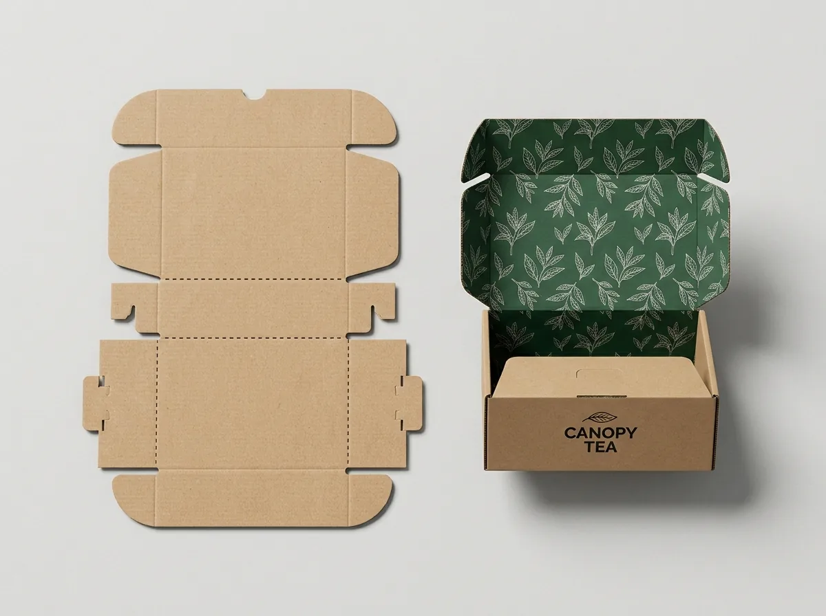
- Supply Two Separate Artboards for Outside + Inside Printing: Place exterior panels on Artboard 1 (OUTSIDE_PRINT) and interior unboxing panels on Artboard 2 (INSIDE_PRINT). Remember that when the hinged lid opens 180 degrees toward the back, the inside lid artwork reads right-side up when oriented with its top edge toward the front tuck flap.
Where are the bleed, score-line clearance, and no-ink glue/lock zones on a FEFCO 0427 kraft dieline?
A FEFCO 0427 roll-end tuck-front dieline uses three color-coded CAD layers: Solid Blue/Black Cut Lines (where the steel rule slices through the board), Dashed Red/Green Score Lines (where rounded creasing rules compress the flutes to fold), and Green Bleed & Safe Margins. Because corrugated board has a fluted inner arch, heavy solid ink blocks crossing outer 180-degree rollover creases can experience slight fiber micro-cracking if unlaminated. Follow these exact prepress tolerances across all panels: When laying out two-sided artwork for brown kraft corrugated mailers, pay special attention to the rear lid hinge crease and the two side rollover channels. Keeping solid flood coats at least 0.25 inches away from the inner locking slots and outer 180-degree bends prevents ink rub on automated folding rails and keeps your unboxing edges clean.
- Keep fine text off the 6 bottom floor locking slots: The three rectangular slots along the left and right edges of the base floor receive the rolled side wall tabs; keep copy at least 0.25 inches inward.
- Align front flap graphics with the cherry-lock ear cutouts: The front tuck lip tapers at both ends into rounded locking ears; center front-lip taglines away from the ear neck creases.
- Download starter templates or request a custom CAD file: Browse our dieline templates or enter your exact L × W × H in our quote form for a free custom vector dieline.
| Prepress zone or element | E-Flute / B-Flute kraft specification | Why it matters on corrugated kraft |
|---|---|---|
| Outer bleed extension | 0.125 in to 0.25 in (3.18 to 6.35 mm) past all cut lines | Prevents unprinted edge slivers during steel-rule die-cutting |
| Inner safe zone from score lines | 0.25 in (6.35 mm) clear of all fold creases and slots | Keeps logos and QR codes from distorting over twin-score bends |
| Minimum line / stroke thickness | 0.75 pt positive stroke / 1.0 pt reversed knock-out stroke | Prevents porous brown kraft fibers from closing up thin hairlines |
| Minimum typography size | 7 pt positive dark ink / 10 pt reversed knock-out in solid ink | Maintains legibility over 90 flutes/ft (E) or 47 flutes/ft (B) |
| Carrier shipping label clear zone | 4.25 × 6.25 in uncreased zone on bottom base or top lid | Ensures thermal 4 × 6 in USPS/UPS/FedEx labels adhere flat |
Know your size? Compare pricing across up to 3 quantities.
Request a Quote →How do you run a 4-step prepress check before approving your 3D kraft mailer proof?
Combine this prepress guide with our kraft mailer box sizes and E-flute vs B-flute guide, our comparison of kraft mailer boxes vs white mailer boxes and shipping cartons, and our parent walkthrough of roll-end tuck-front mailer box dielines explained: During our complimentary prepress check, our packaging specialists inspect every vector path, text outline, barcode quiet zone, and WHITE_INK overprint setting on your FEFCO 0427 CAD template before generating your interactive 3D digital proof. That way you can rotate the virtual brown kraft mailer box 360 degrees, inspect both the outside lid and the inside unboxing reveal, and approve your exact ink contrast with complete confidence before production begins.
- Step 1: Convert all fonts to vector outlines (Type > Create Outlines) and embed any linked high-resolution 300 DPI images in CMYK color mode.
- Step 2: Verify that every white ink element or white underbase sits on a separate WHITE_INK spot-color layer set to Overprint, choked 0.25 pt under overlapping color fills.
- Step 3: Check your inside lid orientation so the welcome message reads right-side up when a customer hinges the lid open from the front.
- Step 4: Upload your AI, PDF, or EPS file in CubitPack's quote form (or select Free Design Help) to receive a free 2D prepress check and interactive 3D digital proof before payment.
What artwork and dieline mistakes happen most often on custom kraft mailer boxes?
Prevent muddy colors, upside-down inside lids, and filled-in fine print by avoiding these five prepress pitfalls
- Leaving pastel yellow, light cyan, or soft pink CMYK elements unbacked on raw brown kraft, where the brown fibers turn them olive-tan instead of bright pastel.
- Designing the inside lid artwork in the same top-to-bottom orientation as the outside lid on the flat dieline, which makes the interior message appear upside down when the lid opens.
- Setting small ingredient or legal copy in 5 pt reversed knock-out text inside a solid black or forest green ink block, which fills in due to dot gain on uncoated kraft.
- Flattening the CAD dieline cut and score lines into the printable artwork layer instead of keeping the DIELINE layer separate and non-printing.
- Placing a QR code or barcode directly across a corrugated score line or flute ridge at low contrast, making smartphone cameras and warehouse scanners fail to read it.
Packaging for this

Ready to order kraft mailer boxes? Compare up to 3 quantities with a free 3D mockup.
Request a Quote →Questions about kraft mailer boxes
Why do CMYK colors shift warmer and darker on brown kraft mailer boxes?
Standard CMYK inks are translucent and rely on light reflecting off the paper surface beneath them. Because unbleached brown kraft linerboard has a natural tan-brown base (around Pantone 465 U), it absorbs blue light and adds a warm brown cast to every unbacked ink color. Dark inks like black, navy, forest green, and burgundy stay rich and crisp, while light pastels require a white ink underbase.
How do I set up white ink on my custom kraft mailer box dieline?
Create a separate vector layer in Adobe Illustrator named WHITE_INK, assign all white artwork or underbase shapes to a Spot Color swatch named WHITE_INK, and enable Overprint Fill. If you don't have Illustrator, upload your logo in our quote form and our prepress team builds the white ink layer for you free of charge.
How should I orient artwork on the inside lid of a roll-end tuck-front kraft mailer?
On a flat FEFCO 0427 dieline where the front tuck flap points upward at the top of the sheet, the inside of the top lid must be oriented with the top of your text pointing toward the front tuck flap (upside down relative to the back wall on the flat sheet) so it reads right-side up when the customer opens the box.
What is the minimum font size and line weight for printing on corrugated kraft mailers?
Keep positive dark text at 7 pt or larger (with minimum 0.75 pt line strokes) and reversed knock-out text inside solid ink fills at 10 pt or larger (with minimum 1.0 pt strokes) so porous kraft fibers and corrugated flutes print cleanly without filling in.
Does CubitPack check my kraft mailer dieline and provide a 3D mockup before printing?
Yes. Every order from 250 boxes includes free prepress file verification, a custom 2D vector CAD dieline, and an interactive 3D digital proof showing both exterior and interior ink appearance on brown kraft before you pay, with zero die or plate charges.
Still have a question? Ask a packaging specialist.
Request a Quote →Request your kraft mailer boxes quote
Tell us your size and quantities, and one dedicated account manager prepares pricing for each tier.
- Free design & AI-to-print studio + 3D mockup
- No die or plate charges · 4–5 day rush available
- Free shipping to all 50 states
- 10% off your first order
We verified translucent CMYK vs opaque white ink optical behavior on unbleached kraft linerboard, minimum flexo/digital/litho typography and stroke tolerances, and FEFCO 0427 two-sided dieline orientation rules against TAPPI T 400 standards, FEFCO Case Code specifications, and Fibre Box Association (FBA) prepress guidelines. Spot something wrong? Tell us and we fix it.
Sources
- Translucent CMYK color shift on unbleached kraft, opaque white ink underbase choking (0.25 pt), and minimum stroke weights.
- FEFCO 0427 flat dieline panel layout, inside lid orientation, and locking slot safe zones.
- 0.125 in bleed extensions and 0.25 in score-line clearance rules on E-flute and B-flute corrugated blanks.
What changed
- November 10, 2026: First published with 5-ink-system kraft swatch matrix, WHITE_INK spot layer setup rules, and annotated FEFCO 0427 two-sided CAD dieline.
More guides
New packaging guides by email
Sizes, materials and design tips. Unsubscribe anytime.