
Kraft vs white bakery boxes: which should you choose?
Short answer: Choose brown kraft board when you want a warm, natural bakery look with dark one-color or two-color ink, or white ink accents. Choose bleached white card for custom bakery boxes when your artwork relies on pastel tones, color photography, metallic foil or exact Pantone color matching across every side.
On this page
- How do kraft and white bakery boxes compare side by side
- Why do ink colors look different on brown kraft vs white card
- Which board handles butter, condensation and refrigerator moisture better
- How do windows, foil stamping and laminations look on each board
- Can I combine kraft and white across my bakery packaging lineup
- Common mistakes
- FAQs
Request a custom quoteFree dieline & 3D mockup
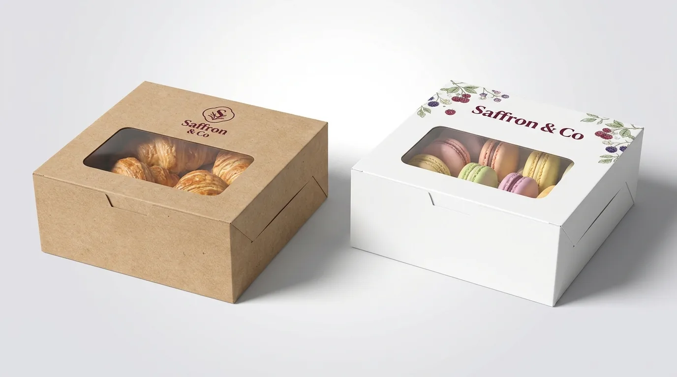
The difference between brown kraft and white paperboard bakery boxes comes down to how the paper surface handles ink and what story your counter display tells. Unbleached natural kraft keeps its warm brown wood fibers visible, which pairs naturally with sourdough loaves, rustic tarts, cinnamon rolls and small-batch cookies when printed with deep espresso, burgundy, navy or forest green ink. Because standard printing inks are semi-transparent, light pastel inks sink into brown kraft and shift warmer unless we lay down an opaque white ink underbase first. Bleached white card gives you a smooth, bright white surface that reflects light evenly, so pale pinks, mint greens, halftone gradients and full-color product photos print true to your screen proof. Both boards are available from 1,000 units at CubitPack, can be ordered with clear pastry windows or food-safe barriers on request, and come with free design help.
How do kraft and white bakery boxes compare side by side?
When bakeries ask us to quote both boards, they usually compare five practical details: how their logo colors will shift on press, whether the box needs lamination, how the surface hides fingerprints at the counter, and which decorative finishes stand out cleanly. Uncoated brown kraft has a slightly toothy, fibrous texture that feels handmade in a customer's hands and hides minor scuffs during local delivery. White card has a clay-coated exterior made for high-resolution offset and digital presses, giving sharp edges on fine serif typography and intricate pastry illustrations. You do not have to guess which board suits your recipe lineup before seeing both. When you request a quote for printed bakery boxes, our prepress team can build a 3D mockup on both brown kraft and white card so you can compare your exact logo side by side before approving production.
| Feature | Brown kraft board | White card (paperboard) |
|---|---|---|
| Base color & texture | Warm natural brown, visible paper fibers | Bright smooth white, clay-coated print face |
| Best ink palette | Black, espresso, burgundy, navy, forest, white ink | Any CMYK photo, pastels, neon or exact Pantone |
| Pastel & light colors | Requires opaque white ink backup to prevent browning | Prints directly without color shift |
| Lamination options | Usually left uncoated; matte lamination optional | Matte, gloss or velvety soft-touch lamination |
| Special finishes | Gold/copper foil, blind deboss, clear window | Foil stamping, embossing, spot UV, clear window |
| Inside appearance | Natural brown inside, or kraft outside / white inside | Clean white inside, optional interior pattern print |
| Typical bakery match | Artisan bread, cookies, croissants, rustic pies | Celebration cakes, macarons, frosted cupcakes, gifts |
Why do ink colors look different on brown kraft vs white card?
Offset and digital CMYK inks work like watercolor washes rather than thick house paint: light passes through the thin ink layer, bounces off the paperboard underneath, and travels back to your eye. On bleached white card, nearly all of that light reflects cleanly, so a soft strawberry pink or buttercream yellow looks bright and accurate. On unbleached brown kraft, the warm tan fibers underneath act like a brown filter that darkens and warms every transparent ink printed on top of it. Dark colors with heavy pigment loads handle that brown background effortlessly. Deep charcoal, black, rich burgundy, hunter green and dark navy look crisp and saturated on kraft paperboard without any extra press pass. If your bakery brand uses cream, blush pink or sky blue and you still want a brown kraft box, the press operators print a layer of opaque white ink directly onto the kraft first, either as a standalone white logo or as a solid underbase beneath your colored ink.
- Dark Pantone inks (black, navy, maroon, forest green, chocolate brown) print crisply directly on brown kraft.
- Yellow, peach, baby blue and lavender turn muddy on raw kraft unless backed by an opaque white ink layer.
- Opaque white ink printed alone on brown kraft creates a clean, high-contrast chalk-style bakery look.
- White card lets you print full-bleed background colors, soft gradients and lifelike food photography on every panel.
- You can also choose white card and print a kraft-textured background only where you want it, keeping logo areas bright white.
Which board handles butter, condensation and refrigerator moisture better?
Croissants, kouign-amann, butter cookies and buttercream cakes release both oil and moisture depending on whether they sit in a warm pastry case or a chilled display refrigerator. Raw, uncoated paperboard, whether brown kraft or uncoated white, will absorb butter or oil over time if a pastry rests directly against the wall, leaving a dark translucent spot that shows through to the outside of the box. For dry or lightly glazed bakes that only spend an hour travelling home from the counter, standard paperboard paired with a sheet of custom butter paper or a parchment liner is the simplest setup. When cakes or cream-filled pastries go into a commercial refrigerator or sit in the box overnight, condensation and grease resistance matter much more. Food-contact liners, grease-resistant barriers and low-migration inks are available on request for both kraft and white boards through our certified partner facilities (). You can also specify a hybrid board with natural brown kraft on the outside and a smooth white or barrier-coated interior.
Know your size? Compare pricing across up to 3 quantities.
Request a Quote →How do windows, foil stamping and laminations look on each board?
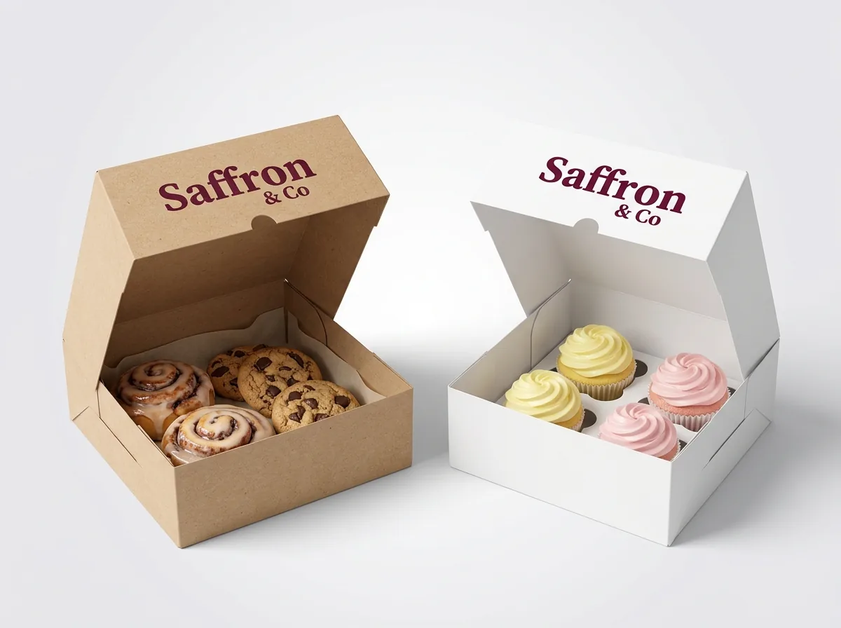
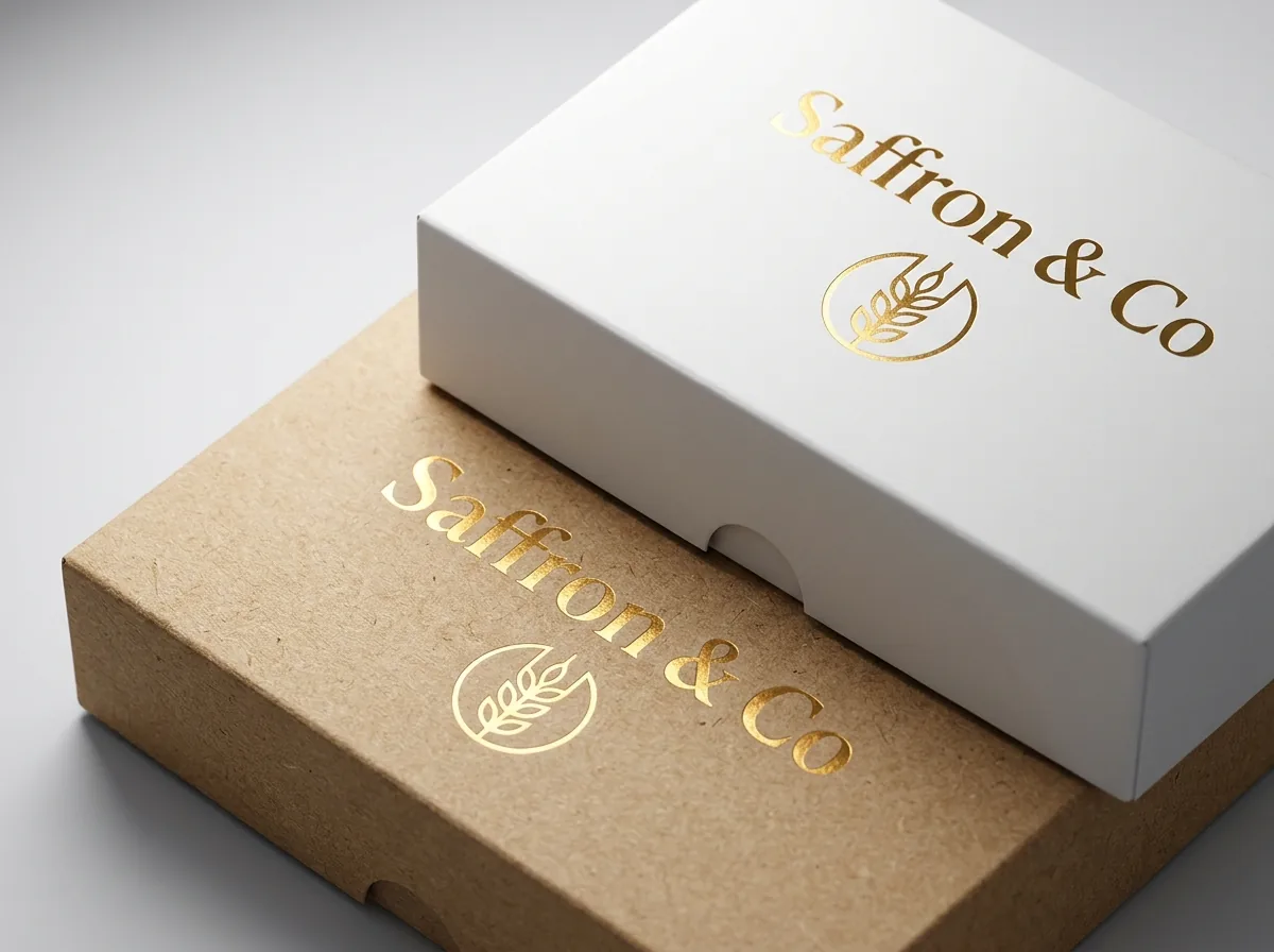
Both brown kraft and white card cut and crease cleanly on the same die-cutting equipment, so structural add-ons like a clear window patch, a gable carry handle or a scalloped lid edge work equally well on either stock. Visually, a clear window on a brown kraft box frames golden-brown crusts, chocolate chip cookies and cinnamon rolls with warm contrast, while a window on a bright white box makes colorful macaron shells, berry tarts and pastel cupcake swirls pop. Surface finishes behave differently across the two boards because of fiber texture. Uncoated brown kraft feels best when you keep the raw paper exposed and add a single tactile accent such as gold foil stamping, copper foil or a blind deboss pressed into the lid. Wrapping brown kraft in high-gloss plastic film usually works against its natural charm. White paperboard, on the other hand, takes matte lamination, gloss lamination, velvety soft-touch film and raised spot UV with razor-sharp contrast.
Can I combine kraft and white across my bakery packaging lineup?
Many bakeries use both boards strategically rather than forcing one stock across every menu item. A neighborhood cafe often packs daily counter items like 4 × 4 × 2.5 in morning muffins, 6 × 6 × 4 in scones and 8 × 8 × 2.5 in custom cookie boxes in unbleached Natural Kraft printed with a 1-color or 2-color logo, while reserving Solid Bleached Sulfate white card for 10 × 10 × 5 in custom celebration orders in custom cake boxes and 6-piece or 12-piece gift assortments in custom macaron boxes. Keeping the same Pantone Matching System ink, 2 in seal sticker or ribbon color ties the 2 boards into a recognizable family across all 50 states. Another popular option is 2-sided or interior printing. You can order 18 pt or 24 pt white card printed with a rich solid brand color on the outside while leaving the inside bright white around the pastry, or choose a kraft-faced board with a clean white interior so customers see a bright stage when they lift the lid. Our $50 sample kit, which is credited toward your first 1,000-box order, includes printed samples of both brown kraft and white card so you can test them under your own shop lights before 10–14 day production.
What are the most common mistakes when choosing kraft vs white bakery boxes?
Most board regrets happen when artwork designed on a bright white monitor is sent straight to brown paperboard without adjusting ink contrast. Watch out for these five pitfalls
- Printing pale pastel pink, yellow or light blue directly on brown kraft without a white ink underbase, which turns the colors dull brown.
- Putting high-gloss film lamination over unbleached kraft board, which hides the natural paper texture customers expect from kraft.
- Packing buttery croissants or frosted cakes directly against uncoated board without a grease barrier or a sheet of butter paper.
- Using tiny, thin-stroke light gray text on brown kraft, where low contrast between ink and paper fibers makes ingredients hard to read.
- Assuming brown kraft and white card require different dielines. Both boards use the exact same structural template and window cutouts.
Find your size
Suggested inside size: 4 × 4 × 2.5 in
A starting point. Your account manager confirms the size with you before the proof.
Quote this size →Packaging for this
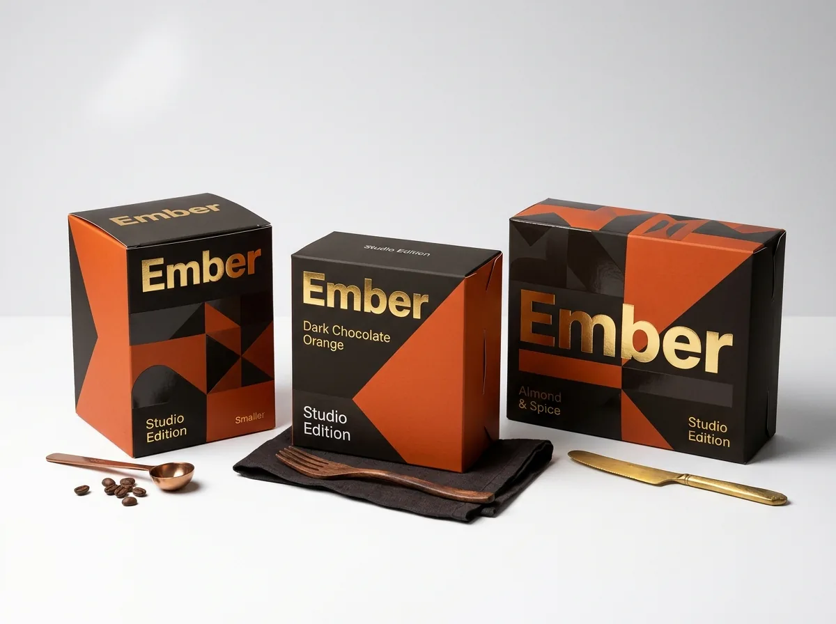
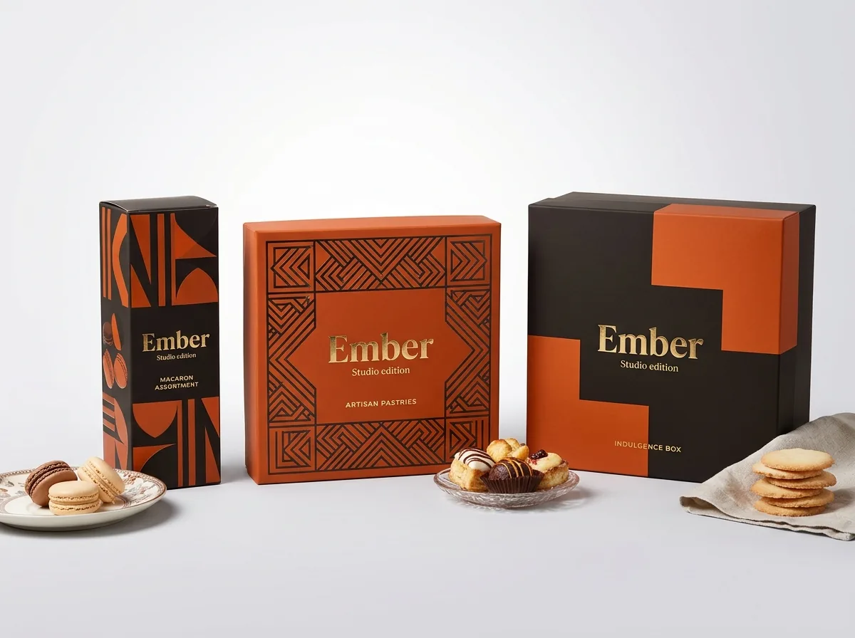
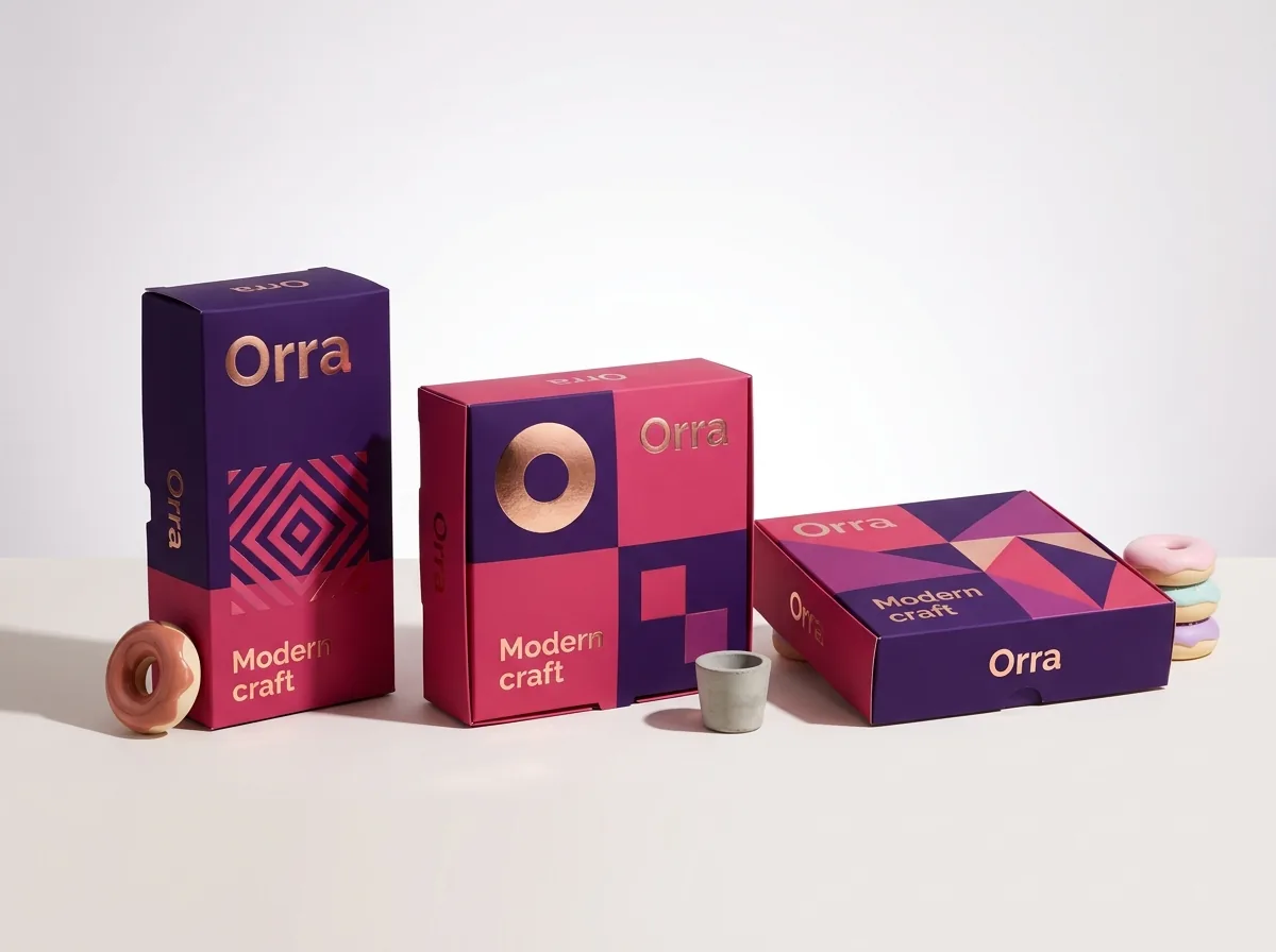
Ready to order bakery boxes? Compare up to 3 quantities with a free 3D mockup.
Request a Quote →Questions about bakery boxes
Does brown kraft cost less than white paperboard for custom bakery boxes?
Base board costs for kraft and white card are very close at the 1,000-box minimum. What changes the total quote more is how many ink passes and finishes you add: a one-color print on uncoated kraft costs less than a full-color white box with lamination and foil.
Can you print bright white ink on a brown kraft bakery box?
Yes. We print opaque white ink directly onto brown kraft board, either by itself for a clean white-on-brown logo or as a base layer underneath colored inks so lighter brand colors stay bright against the brown fibers.
Are kraft and white bakery boxes equally strong for heavy cakes?
Strength comes from board thickness (caliper or flute) and box style rather than whether the paper is brown or white. For heavy tiered cakes, both kraft and white boxes can be made in heavier card or corrugated board with an auto lock bottom.
Can I get a box that is brown kraft on the outside and white on the inside?
Yes. Kraft-top white-back board gives you the natural brown look on the exterior while keeping a clean white interior around your frosted cupcakes or cakes. Ask for kraft outside with a white inside in your quote notes.
Are both kraft and white bakery boxes available with food-safe materials?
Yes. Food-safe boards, grease-resistant barriers and low-migration inks are available on request for both brown kraft and white card through our certified partner facilities. Tell us whether your baked goods touch the board directly when you request a quote.
Can I compare both kraft and white in one quote before deciding?
Yes. Mention in your quote notes that you want pricing and 3D mockups for both brown kraft and white card at your dimensions. Your account manager will send both options back in 5-7 minutes so you can compare.
Still have a question? Ask a packaging specialist.
Request a Quote →Request your bakery boxes quote
Tell us your size and quantities, and one dedicated account manager prepares pricing for each tier.
- Free design & AI-to-print studio + 3D mockup
- No die or plate charges · 4–5 day rush available
- Free shipping to all 50 states
- 10% off your first order
This comparison is based on standard offset and digital press behavior on unbleached natural kraft and bleached solid sulfate paperboard, alongside CubitPack's decided printing and finishing specifications. A packaging specialist reviewed every section. Spot something wrong? Tell us and we will fix it.
Sources
What changed
- October 22, 2026: First published.
- October 22, 2026: Updated specifications, terminology, and verified source links.
More guides
New packaging guides by email
Sizes, materials and design tips. Unsubscribe anytime.