
How do I design custom skincare boxes with readable ingredient panels?
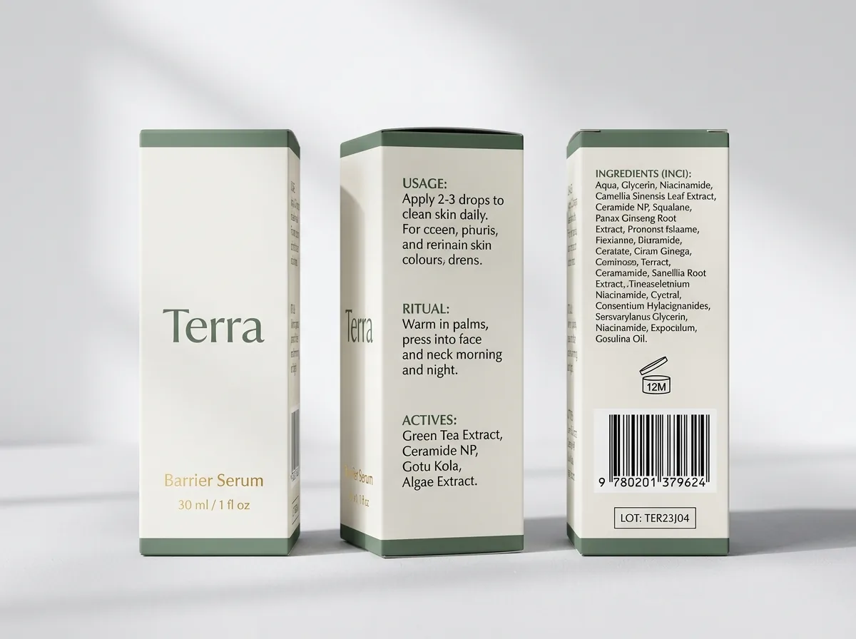
Short answer: Assign each carton face a clear job: put your brand mark, product identity and net weight on the front panel, directions and key actives on the side panels, the full INCI ingredient list on the back panel, and barcodes on the bottom or back of your custom skincare boxes.
On this page
- What belongs on each panel of a four-sided skincare carton
- How do I keep small INCI ingredient text sharp and readable on press
- When should I use inside printing instead of a paper instruction leaflet
- How do I set up bleed, safe margins and foil layers on a skincare dieline
- How can I design a multi-SKU skincare line that looks unified on the shelf
- Common mistakes
- FAQs
Request a custom quoteFree dieline & 3D mockup
Designing a skincare folding carton means balancing clean shelf presence on the front panel with dense technical information across the back, sides and flaps. Because a 30 ml serum carton is often only 1.5 inches wide, trying to squeeze marketing copy, layering instructions, warnings, company address and a 35-item INCI ingredient declaration onto one face makes the typography cramped and difficult to read. Dividing your copy across all four vertical walls, the bottom flap and the interior panels keeps your front principal display panel calm while giving retail shoppers every detail they check before buying. Use dark ink on a light background for 6 pt to 7 pt ingredient text, keep all text at least 1/8 inch inside fold scores and cut lines, and extend background colors 1/8 inch past the outer cut line. CubitPack provides free custom dielines, free design help and a digital proof before payment.
What belongs on each panel of a four-sided skincare carton?
When you open a flat folding carton dieline in your design software, you see four main vertical panels side by side, plus the glue tab on the far edge and the tuck and dust flaps at the top and bottom. Treating those surfaces as a structured grid prevents visual clutter and makes it easy to adapt one master layout across cleansers, toners, serums and creams. In US cosmetic retail, the front face (called the Principal Display Panel) carries four essentials: your brand name, the product name, a clear statement of identity (such as "Brightening Facial Serum" or "Barrier Repair Cream"), and the net quantity of contents in both US fluid ounces/avoirdupois weight and metric milliliters/grams (for example, "1 fl oz / 30 ml"). Moving secondary claims, usage directions and ingredient lists onto the adjacent panels lets your front typography breathe when you order custom printed skincare cartons.
| Carton panel | What to place here | Typography & prepress notes |
|---|---|---|
| Front panel (Principal Display Panel) | Brand logo, product name, identity statement, net contents (e.g. 1 fl oz / 30 ml) | Keep 1/8 in inside fold scores; ideal spot for foil stamping or embossing |
| Back panel | Full INCI ingredient list, warnings, distributor name & city/state/ZIP, PAO jar icon | High-contrast dark text on light stock; avoid metallic foil behind small type |
| Left side panel | How to use (AM/PM directions), skin type match, patch-test note | Use short numbered steps or icons for quick scanning in store aisles |
| Right side panel | Key active ingredients (e.g. 10% Niacinamide + Zinc), brand story or refill note | Good location for a vertical accent band that color-codes the routine step |
| Top tuck flap | Routine step number (Step 02 · Treat), monogram or seal sticker target | Helps customers spot the right bottle from above in a vanity drawer |
| Bottom panel | UPC/EAN barcode, SKU code, unvarnished batch/lot stamp box | Leave a white box with no lamination where inkjet or stamped lot numbers go |
| Inside panels & dust flaps | Morning/evening layering order, QR code to tutorial video, thank-you note | Replaces separate paper leaflets and turns unboxing into a guided routine |
How do I keep small INCI ingredient text sharp and readable on press?
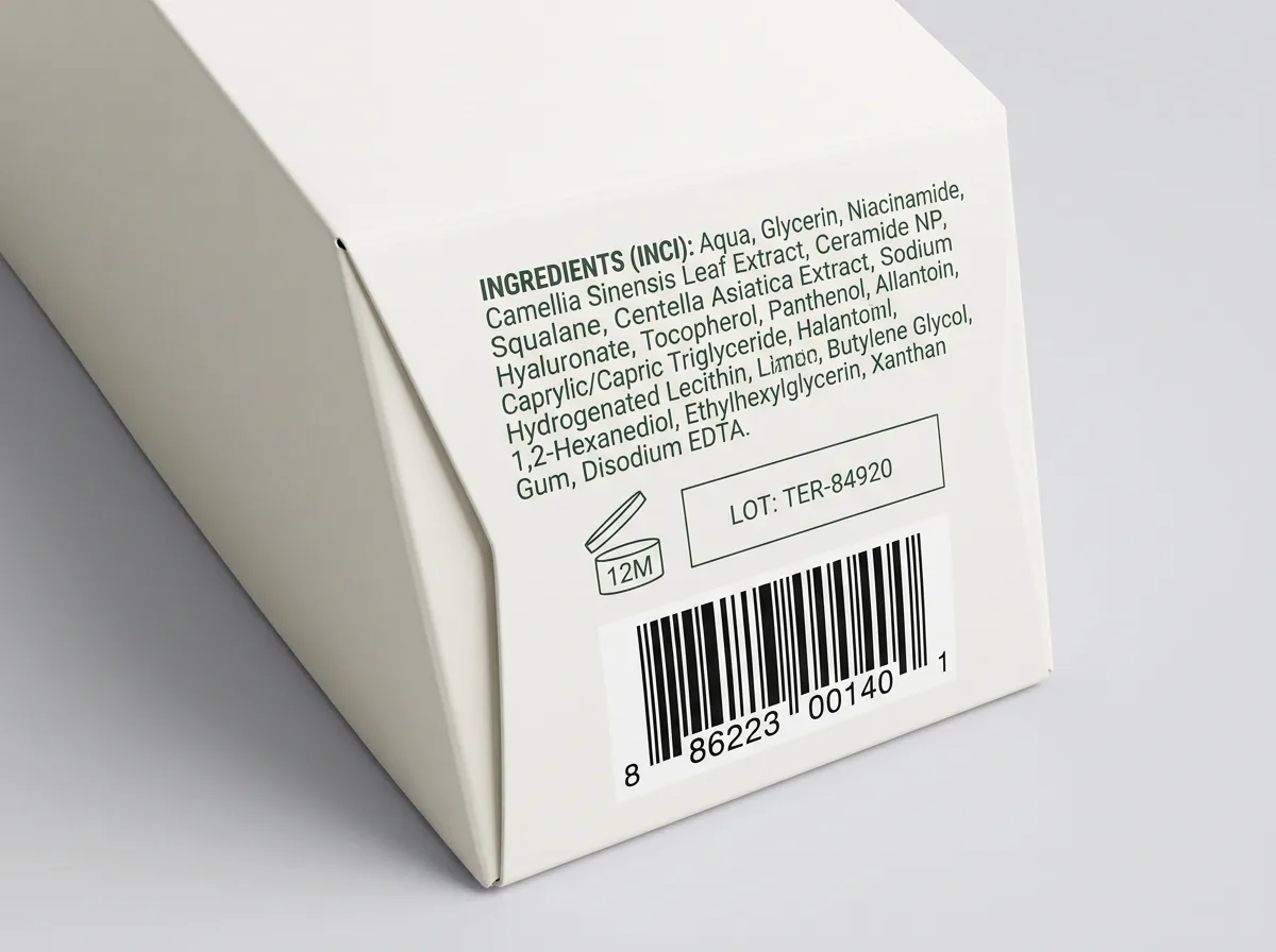
Skincare formulations routinely list twenty to forty botanical extracts, humectants, preservatives and emollients. On a narrow 1.25 inch or 1.5 inch serum carton, fitting that entire paragraph inside the safe zone requires disciplined typography and ink choices. The biggest prepress mistake on skincare boxes is printing 5.5 pt or 6 pt white knockout text over a rich four-color (CMYK) dark background or over metallic foil. If the printing plates shift by even a fraction of a hair during a high-speed press run, the surrounding cyan, magenta, yellow and black inks encroach into the tiny white letterforms and fill in the loops of letters like "e", "a" and "s". Instead, set your ingredient panel in a single dark ink (100% black or a single dark Pantone spot color) over white card or a very pale tint, or reverse out of a single solid Pantone ink rather than a four-color CMYK build.
- Font choice: pick a clean humanist sans-serif with an open x-height and regular or medium weight; avoid ultra-light or condensed hairline fonts.
- Single-ink small type: print 6 pt to 7 pt INCI lists in 100% K (black) or one dark Pantone spot ink so every character edge is razor-sharp.
- Line spacing: add at least 1.5 pt to 2 pt of leading above the font size so dense ingredient lines do not blur together.
- Lamination choice: pair small text panels with matte lamination or soft-touch lamination to eliminate overhead spotlight glare.
- Unvarnished lot box: leave a small unlaminated rectangle on the bottom flap if your filling partner stamps batch numbers and expiration dates after cartoning.
When should I use inside printing instead of a paper instruction leaflet?
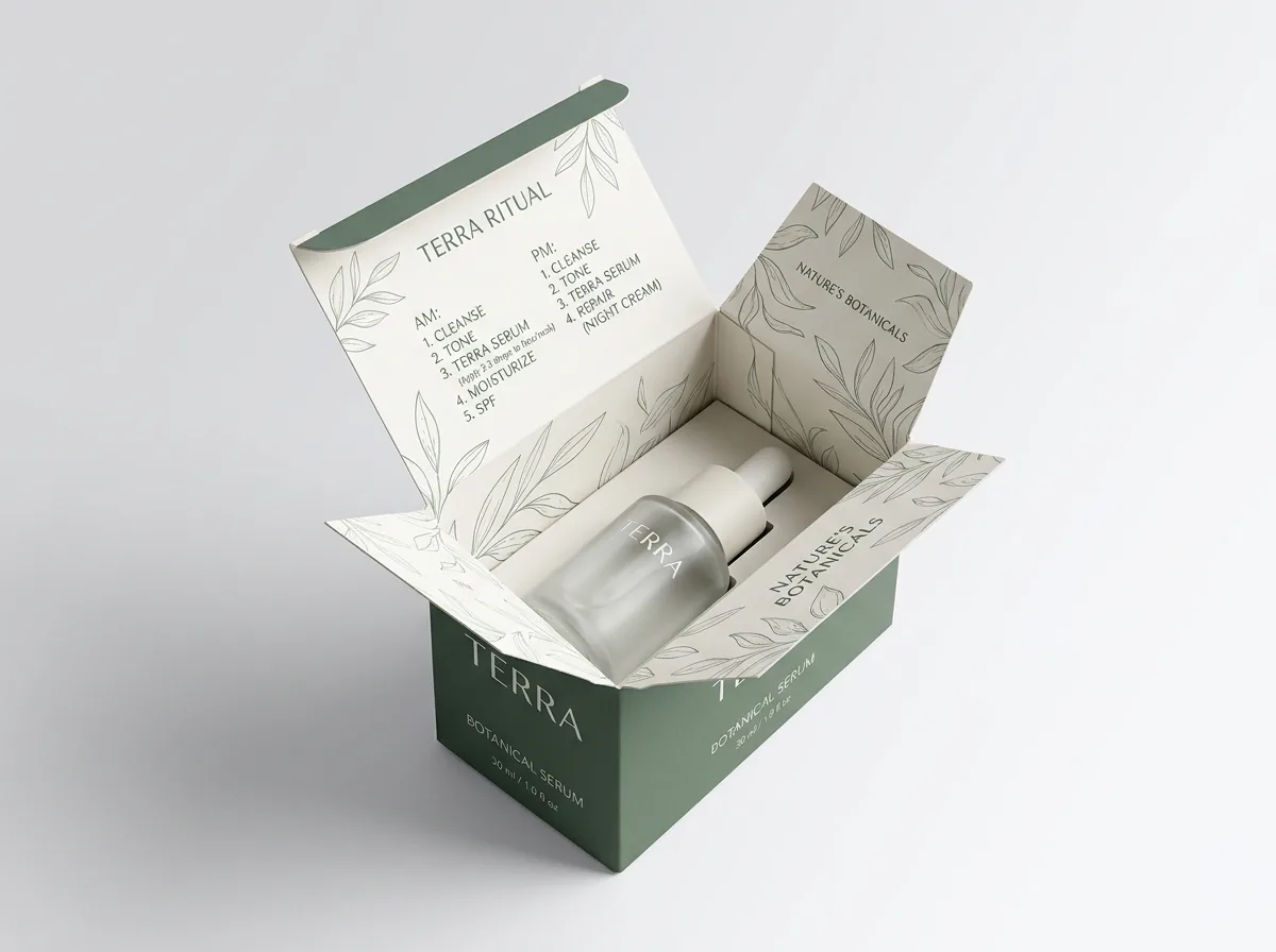
Many skincare founders default to folding a tiny tissue-thin instruction sheet and stuffing it beside the bottle inside every box. On a manual or semi-automated filling line, folding and inserting paper leaflets slows down cartoning, and the leaflet often catches on the bottle shoulder or tears when the customer pulls the serum out. Choosing inside printing on your folding carton solves both problems. When the customer flips open the top tuck flap, the interior dust flaps and inner back wall are right at eye level. You can print a clean 3-step application diagram, a morning-versus-evening compatibility chart (such as reminding users not to layer strong AHA acids with retinol on the same night), or a QR code that opens a 30-second application video. Because the carton stays on the customer's shelf for the first week of use, interior printing turns the box itself into your instruction guide.
Know your size? Compare pricing across up to 3 quantities.
Request a Quote →How do I set up bleed, safe margins and foil layers on a skincare dieline?
Once your structural size is locked in, our team sends you a flat vector dieline template with color-coded layers for cut lines, fold scores and glue tabs. Setting up your artwork file cleanly around those lines ensures that color blocks wrap smoothly around corners and metallic foil lands in exact register. Extend all background colors, patterns and flood coats 1/8 inch (0.125 in) past the outer cut lines so no unprinted white paperboard edge flashes if the die shifts slightly. Keep all logos, borders, barcodes and ingredient copy at least 1/8 inch inside every fold score and cut line. If you are adding foil stamping, embossing or spot UV, place those elements on a separate named vector layer in 100% solid black so our prepress team can generate the stamping die or UV screen cleanly.
How can I design a multi-SKU skincare line that looks unified on the shelf?
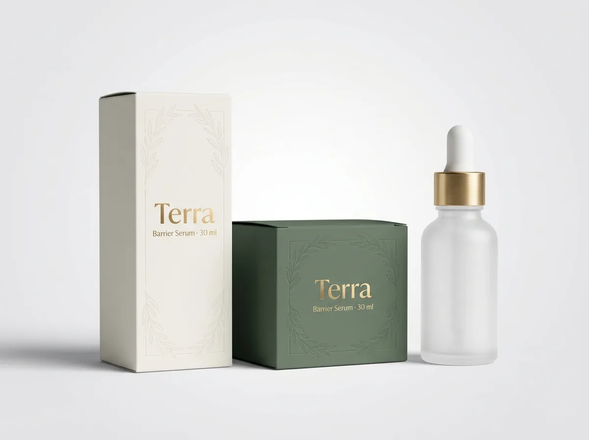
Most skincare brands launch with three to six products that share a common visual architecture: for example, a cleanser, a hydrating serum, a vitamin C treatment, a retinol oil and a barrier cream. Designing a master grid where the brand logo sits at the exact same distance from the top fold score and the net weight sits at the exact same baseline near the bottom edge makes the entire line look deliberate and trustworthy. To help shoppers tell formulas apart in two seconds, assign each SKU or routine step a distinct Pantone accent band (such as across the top tuck flap and a narrow vertical bar on the right side panel) while keeping the primary board color and finish identical across the range. Adding a clear step number on the top flap (for example, Step 01 Cleanse, Step 02 Treat, Step 03 Moisturize) also helps customers grab the right carton from a bathroom drawer without reading the front panel. When you order multiple SKUs that share the same bottle and box dimensions, grouping them on one quote lets you run them together with no die or plate charges.
What are the most common skincare box design and prepress mistakes?
Even beautiful skincare branding can run into production or retail hiccups if small technical details are overlooked. Check these five prepress items before approving your digital proof
- Printing 6 pt white knockout ingredient text over a 4-color CMYK dark background where slight ink spread makes tiny letters hard to read.
- Placing text or border frames right on a vertical fold score, causing the letters to crack or warp around the corner when folded.
- Applying gloss or soft-touch lamination over the bottom batch-code box where your filling facility needs to ink-stamp lot numbers.
- Scaling a barcode below 80% magnification or printing it in low-contrast metallic gold or red ink that retail laser scanners cannot read.
- Forgetting to convert fonts to vector outlines or embed high-resolution (300 DPI) linked images before uploading the print file.
Find your size
Suggested inside size: 1.25 × 1.25 × 4.75 in
A starting point. Your account manager confirms the size with you before the proof.
Quote this size →Packaging for this
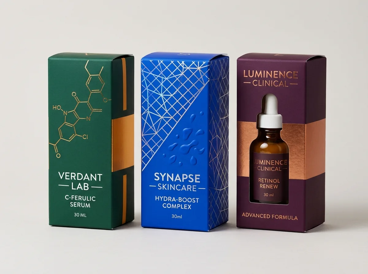
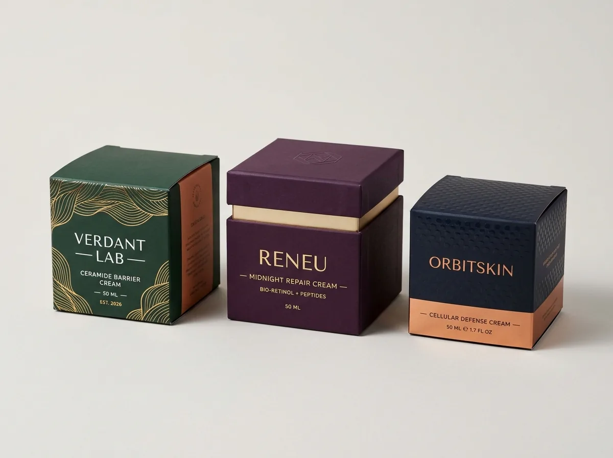
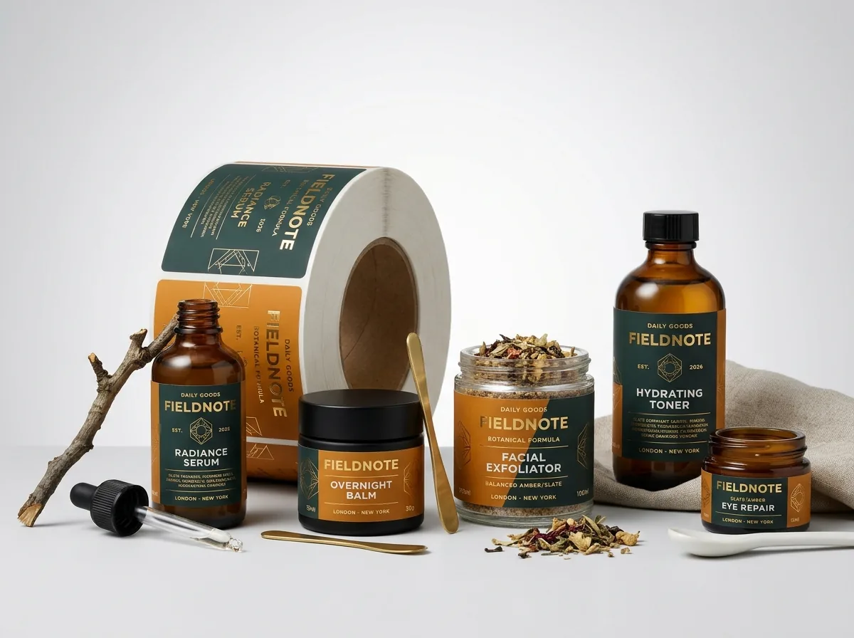
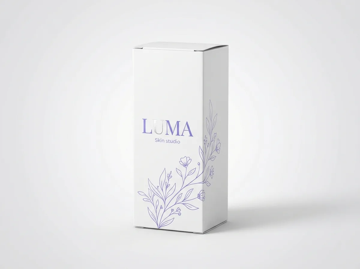
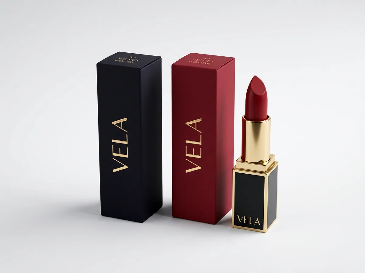
Ready to order skincare boxes? Compare up to 3 quantities with a free 3D mockup.
Request a Quote →Questions about skincare boxes
Do I need to build my own skincare box dieline before requesting a quote?
No. Simply enter your inside Length × Width × Height in the quote form (or tell us your bottle dimensions) and our structural team builds a custom vector dieline for free. If you need help laying out your panels or fixing an AI-generated concept, our design help is free too.
What is the smallest font size that prints clearly on a skincare folding carton?
For positive dark text printed on white or light-colored card stock, 6 pt is a reliable minimum for INCI ingredient lists and warnings. If you are printing light knockout text reversed out of a dark background, keep the font at 7 pt or larger with a medium weight.
Can I stamp batch numbers and expiration dates onto a laminated skincare box?
Standard inkjet and rubber stamps can smudge on matte, gloss or soft-touch lamination film unless your co-packer uses UV-curable or thermal transfer ink. To make stamping easy for any filling line, we leave a small unlaminated knock-out window on the bottom panel.
How do I set up gold foil stamping or embossing in my artwork file?
Put any logo, border or badge that should be foil stamped, embossed, debossed or coated in spot UV on its own vector layer filled with 100% solid spot color, labeled clearly. If you only have a flat file, our prepress designers separate the finish layers for you at no charge.
What color mode should my skincare box artwork use: CMYK or Pantone?
Set full-color photography and soft gradients in CMYK at 300 DPI, and specify Pantone (PMS) spot codes for solid brand color blocks and typography. Our Pantone match is guaranteed: if a Pantone color is clearly off from the approved spec, we reprint it.
Will I see how the four panels and inside flaps fold together before paying?
Yes. Every order includes a flat digital proof showing exact cut, fold and bleed lines plus a rotatable 3D mockup before you pay. That lets you check how the front, side, back and interior panels align from every angle.
Still have a question? Ask a packaging specialist.
Request a Quote →Request your skincare boxes quote
Tell us your size and quantities, and one dedicated account manager prepares pricing for each tier.
- Free design & AI-to-print studio + 3D mockup
- No die or plate charges · 4–5 day rush available
- Free shipping to all 50 states
- 10% off your first order
Panel placement recommendations in this guide follow the FDA Cosmetics Labeling Guide for outer packaging alongside standard offset prepress tolerances (1/8 inch bleed and safe zone, single-ink small type, unvarnished lot windows). Checked by a CubitPack packaging specialist. Spot something wrong? Tell us and we will fix it.
Sources
What changed
- October 22, 2026: First published.
- October 22, 2026: Updated specifications, terminology, and verified source links.
More guides
New packaging guides by email
Sizes, materials and design tips. Unsubscribe anytime.