
How do you design custom child-resistant mylar bags for headers, warnings and opacity?
Short answer: Divide your custom child-resistant mylar bags dieline into three vertical zones: a 1.75 to 2.25 inch top header reserved for two-step opening icons and tear notches, a flat middle body for branding and mandatory warnings, and a bottom gusset zone. Keep small type and barcodes off the heat-welded zipper flange.
On this page
- How do you divide a child-resistant mylar bag dieline into safe print zones
- What are the artwork and typography rules for each part of a CR pouch
- How should you design the top header so adults open the bag without tearing it
- How do you maintain 100% pouch opacity while adding metallic foil highlights
- Why should you build a dedicated reserve box for batch and compliance labels
- Common mistakes
- FAQs
Request a custom quoteFree dieline & 3D mockup
Designing artwork for a two-step locking barrier pouch requires stricter zone planning than an ordinary snack bag because the wide internal zipper flange, heat-seal seams and state legibility rules all compete for space on the flat panels. When our prepress team sets up your dieline, we mark the exact horizontal weld band where the thick locking track attaches to the front and back walls, with pinch-and-slide or press-to-lock zippers and certified partner facilities available on request. Any fine text, universal symbol or barcode placed over that ⅜ inch weld band can warp slightly under the heated sealing jaws. By placing step-by-step opening icons in the top header band, keeping mandatory warning blocks and batch-sticker boxes on the smooth middle panel, and specifying an opaque foil barrier core, your pouch prints cleanly and your warnings stay easy to read. Check your state's rules for what the warnings must say.
How do you divide a child-resistant mylar bag dieline into safe print zones?
Although edge-to-edge printing lets your background color or pattern cover 100% of the pouch exterior from lip to base, the structural hardware inside custom printed child-resistant mylar bags divides the front and back faces into three distinct functional bands. Understanding what happens to the film in each band during converting stops you from putting critical type where heated metal bars press the plastic. The top 1.75 to 2.25 inches is the locking header zone. From top to bottom, this zone contains the ⅜ inch open-top impulse seal area, the left and right V-cut tear notches, the textured thumb-grip pads, and the heat-welded zipper flange band. Below that flange lies the main billboard and compliance panel, where the film stays smooth and undistorted. Finally, the lower 1 to 2 inches above the bottom edge curves inward as the W-folded bottom gusset expands, and the left and right edges carry ¼ to ⅜ inch vertical side heat seals.
- Zone 1 · Top locking header (top 1.75 to 2.25 in): print only background color and bold 'Step 1 Pinch · Step 2 Slide' instructional arrows; keep logos and mandatory warnings out.
- Zone 2 · Zipper weld line (1.5 to 2.0 in from top): a ⅜ inch horizontal band where heated jaws weld the locking plastic flange to the barrier wall; avoid small text and barcodes here.
- Zone 3 · Flat middle panel: the prime distortion-free canvas for your brand mark, universal symbol, net weight and back warning table.
- Zone 4 · Perimeter heat seals (¼ to ⅜ in left/right) and lower gusset curve (bottom 1 in): extend background bleed ⅛ inch past the outer cut line, but keep all text at least ⅜ inch inside the side edges.
What are the artwork and typography rules for each part of a CR pouch?
Regulated wellness, botanical, veterinary and household chemical pouches carry more mandatory copy than almost any other package format: universal symbols, keep-out-of-reach statements, ingredient disclosures, net weight in both metric and US customary units, and variable batch or track-and-trace labels. Squeezing all of those elements onto a 4 × 6.5 inch or 5 × 8 inch bag without visual clutter takes disciplined typography. Use the prepress checklist table below when laying out your front, back and bottom gusset panels. Because CubitPack guarantees Pantone color matching and charges zero die or plate fees, you can use a crisp matte outer lamination and a high-contrast white or cream panel on the back so 6-point and 7-point text stays razor-sharp.
| Pouch zone or element | Recommended placement | Typography & contrast rule | What to keep out of this zone |
|---|---|---|---|
| Opening instructions | Top 1.75 in header band (front & back) | Bold 8 pt+ sans-serif + directional arrows | Mandatory legal warnings (torn off with top seal) |
| Zipper flange weld band | 1.5 to 2.0 in below top edge | Continuous background color or pattern only | Fine text, universal symbols, QR codes, barcodes |
| Front brand & net weight | Center and lower-middle front panel | High contrast; keep ½ in above bottom edge | Crowded ingredient tables that belong on the back |
| Mandatory warning block | Upper-middle back panel below zipper weld | Dark ink on solid light background (matte preferred) | Metallic foil or dark-on-dark low-contrast type |
| Batch / UID sticker reserve | Lower back panel (e.g. 2 × 3 in or 1.75 × 2.5 in) | Unvarnished or matte light box for thermal transfer | Heavy silicone coatings that repel sticker adhesive |
| UPC / EAN retail barcode | Flat back panel at least ½ in from side seal | 100% black bars on solid white box (no metallic) | Bottom gusset fold crease or zipper rib bump |
How should you design the top header so adults open the bag without tearing it?
When an adult customer buys a pinch-and-slide or dual-track press-to-lock pouch for the first time, their muscle memory tells them to grab the top edges and yank outward. Because the locking zipper is engineered to resist that exact one-step pull, an unguided customer will either think the bag is defective or rip down the front face of the pouch. Good header graphic design solves that usability hurdle in two seconds. First, run a subtle horizontal rule or a contrasting color block across the top header to visually separate the locking zone from the main brand panel. Above the V-cut tear notches, print a tiny dashed line with a scissor or tear icon labeled 'Tear top seal here first.' Directly over the textured thumb pads below the tear line, print two opposing horizontal arrows labeled '1. Pinch thumb pads firmly · 2. Slide panels in opposite directions to open.' Never place mandatory regulatory warnings above the tear notches, because that top strip is discarded the moment the customer opens the tamper seal.
Know your size? Compare pricing across up to 3 quantities.
Request a Quote →How do you maintain 100% pouch opacity while adding metallic foil highlights?
Some state rules for regulated products call for opaque packaging so the product is hidden on the shelf. Check your state's rules. At the same time, brands still want metallic gold badges, shimmering strain or flavor borders, and vibrant Pantone colors that stand out in locked display cases. You get both opacity and metallic effects by building your artwork on an aluminum-foil or high-density metallized barrier laminate (such as PET/AL/PE or PET/VMPET/PE ) rather than a clear film base. Because the foil or metallized barrier layer is opaque, knocking out the white ink underbase behind your logo or border lets the metallic core shine through your CMYK inks to create gold, silver, bronze or colored metallic accents while the pouch wall stays opaque. If your product category is not subject to strict opacity rules and you want a peek zone, see our custom mylar bags with window.
- Solid CMYK + Pantone areas: backed by a 100% opaque white ink plate so colors print true and bright.
- Metallic foil highlights: knock out the white ink plate in those vector shapes so transparent ink tints the metallic barrier core.
- Matte + Spot UV contrast: laminate the entire pouch in low-glare matte or soft-touch film so small back-panel warnings are easy to read, then apply gloss Spot UV over the front brand mark.
- Child-appealing graphics check: in regulated categories, avoid cartoon mascots, bubble lettering or candy-imitation illustrations that state boards prohibit.
Why should you build a dedicated reserve box for batch and compliance labels?
Even when you print your core brand artwork, universal symbol and general warning statements directly onto the barrier film, almost every regulated botanical, supplement or veterinary brand still applies a variable sticker during pack-out containing the batch number, harvest or manufacture date, potency test table, or state track-and-trace UID barcode. If you do not reserve a flat, uncluttered home for that sticker on your back-panel dieline, your fulfillment crew will end up sticking it crookedly over your brand story or across the lumpy zipper flange. Measure the exact width and height of your thermal-transfer or roll compliance sticker - or order matching custom roll labels and custom cannabis labels from CubitPack - and draw a clean rounded rectangle ⅛ inch larger on the lower-middle back panel. Keeping that reserve box at least ¼ inch below the zipper weld line and ⅜ inch inside the left and right side seals ensures the sticker lies 100% flat so barcode scanners read it on the first pass.
- Size the reserve box: make the printed outline ⅛ inch wider and taller than your physical batch or UID label.
- Keep it on the flat zone: position the box below the 2-inch zipper flange and above the bottom gusset crease.
- Multi-SKU ganging tip: keep the exact same bag dimensions, closure and back reserve box across all flavors or strains so you can group multiple designs in one production quote.
What are the most common artwork mistakes on child-resistant mylar bags?
Our prepress specialists check every file before printing, but catching these five layout errors early speeds up your proof approval
- Placing mandatory warning text above the V-cut tear notches where the customer rips and discards the top strip on first opening.
- Running small 6-point ingredient type or a retail UPC barcode across the ⅜ inch horizontal zipper flange weld band where heat sealing distorts the film.
- Printing required legal warnings in low-contrast metallic ink or dark gray over a black background instead of high-contrast dark type on a light matte box.
- Forgetting to leave a flat, uncrowded back-panel reserve box for variable batch, potency or track-and-trace roll stickers.
- Knocking out a clear window on an opaque child-resistant bag when the target state requires 100% opaque packaging.
Packaging for this
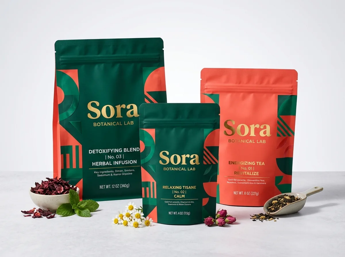
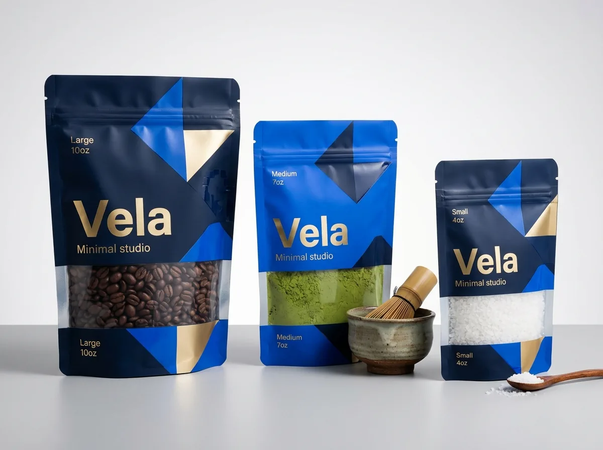
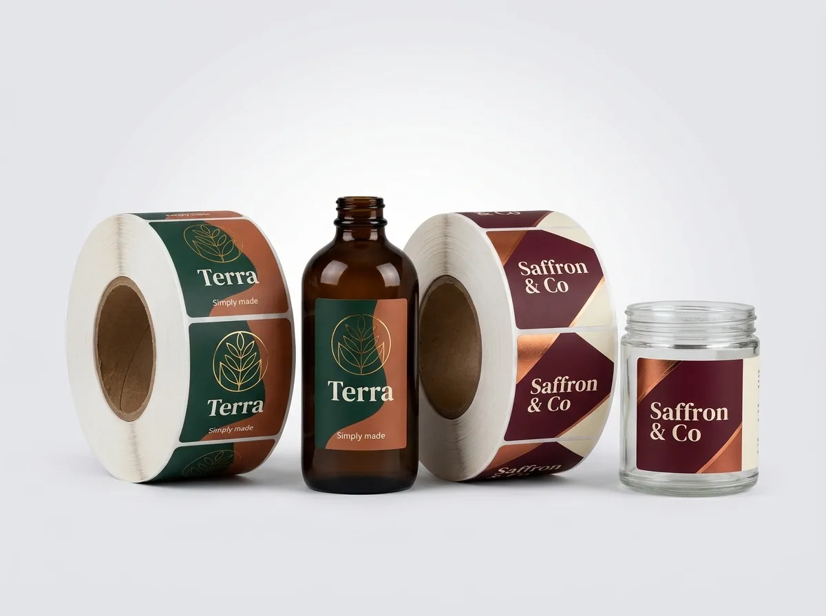
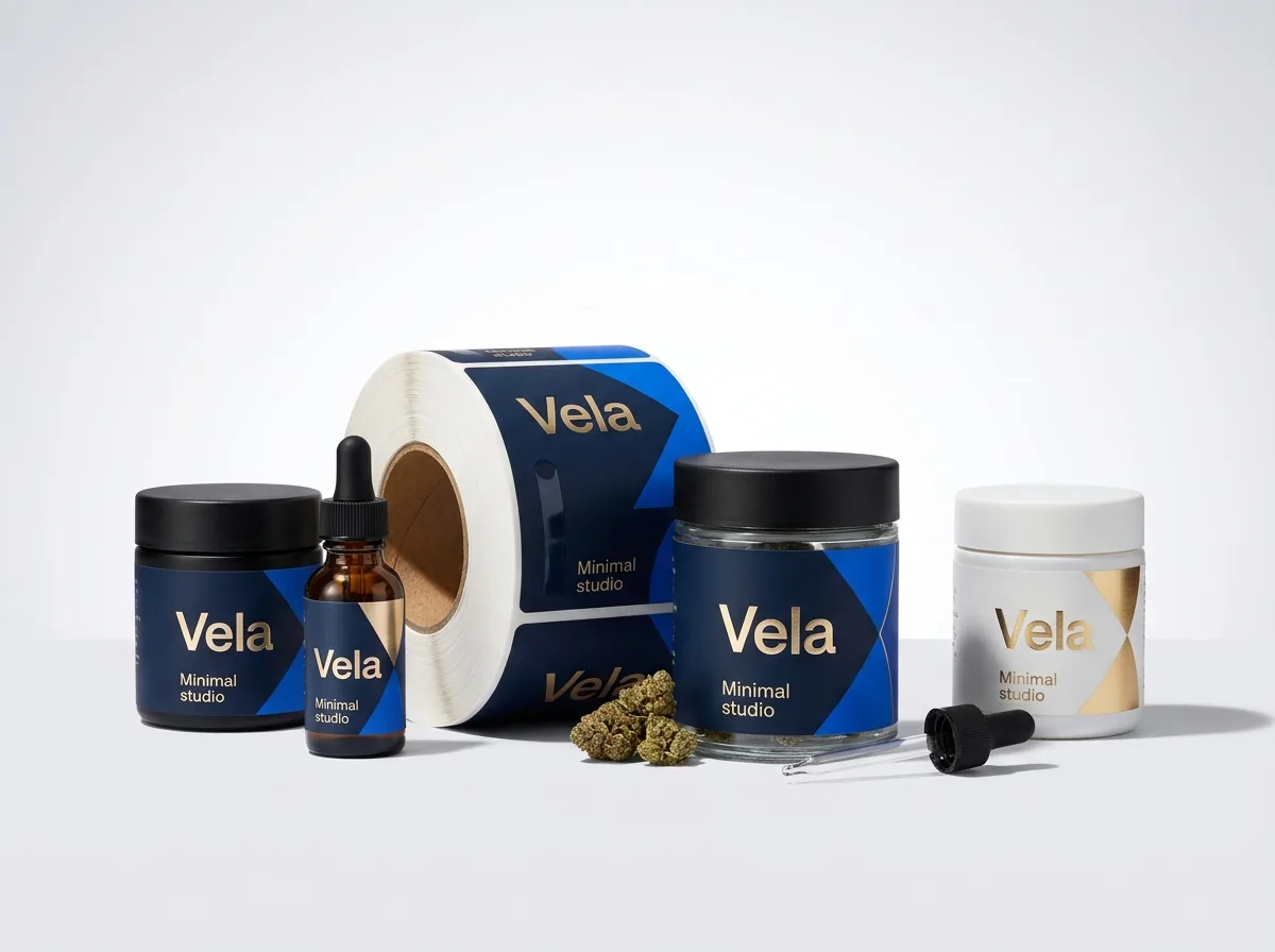
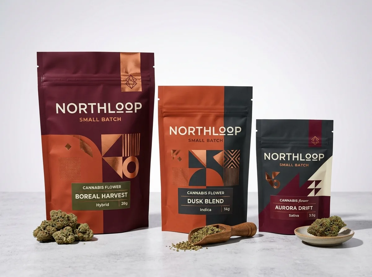
Ready to order child resistant mylar bags? Compare up to 3 quantities with a free 3D mockup.
Request a Quote →Questions about child resistant mylar bags
Where on the dieline should pinch-and-slide opening instructions go?
Place your two-step opening instructions inside the top 1.75 to 2.25 inch header zone, directly below the V-cut tear notches and right over the zipper thumb pads. Never place mandatory product warnings above the tear notches, because that top strip is torn off and thrown away when the customer removes the tamper seal.
What is the smallest font size that prints clearly on a matte mylar bag?
For mandatory warnings, dosing tables and ingredient lists, we recommend at least 6-point sans-serif type when printing dark ink on a light background, and at least 7-point type when reversing white text out of a dark background. Matte lamination removes surface glare and makes small text much easier to read.
Can I print metallic gold or holographic effects on an opaque child-resistant bag?
Because the foil or metallized barrier layer is opaque, knocking out the white ink in selected areas lets the metallic layer show through while the wall stays opaque.
Do I need to draw the dieline and zipper flange zone myself?
No. Tell us your desired bag dimensions and closure type on your quote, or upload your logo or AI artwork, and our prepress team builds the custom dieline with the exact header, tear-notch, zipper-weld and side-seal zones marked for free. You review a 2D proof and 3D mockup before payment.
Why shouldn't a barcode sit over the zipper track or bottom gusset crease?
The heated sealing jaws that weld the thick plastic zipper flange to the bag wall leave a slightly raised horizontal ridge, and the bottom gusset has a fold crease. Placing your UPC or QR barcode on the smooth flat middle panel ensures retail scanners read the bars every time.
Can you print both my child-resistant mylar bags and my batch roll labels?
Yes. You can order your custom pouches and matching roll labels in one quote with one account manager. Our Pantone match is guaranteed: if a Pantone color is clearly off, we reprint. We can size your back-panel sticker box to match your roll label.
Still have a question? Ask a packaging specialist.
Request a Quote →Request your child resistant mylar bags quote
Tell us your size and quantities, and one dedicated account manager prepares pricing for each tier.
- Free design & AI-to-print studio + 3D mockup
- No die or plate charges · 4–5 day rush available
- Free shipping to all 50 states
- 10% off your first order
The dieline zone measurements, zipper-weld clearances and typography guidelines in this post come from flexible pouch prepress standards and were checked by a CubitPack packaging specialist. Spot something wrong? Tell us and we will fix it.
Sources
- Poison Prevention Packaging Act (16 CFR 1700.20) context for two-step special packaging instructions and closures
- GS1 barcode contrast, quiet zone and flat surface placement guidelines on flexible pouches
- Flexible pouch heat-seal seam tolerances, white ink underbase and opaque foil laminate structures
What changed
- October 22, 2026: First published.
- October 22, 2026: Updated specifications, terminology, and verified source links.
More guides
New packaging guides by email
Sizes, materials and design tips. Unsubscribe anytime.